However, for many designers and marketers, incorporating experimental typography presents some challenges. Balancing creativity with readability, aligning design with brand tone, and optimizing typography for different platforms are all important considerations. In this article, we’ll discuss ten innovative typography techniques that have been successful for major brands like Spotify. In this post, you’ll learn how to master these styles, make bold statements, and ultimately create a more engaging brand presence on social media and beyond.
What is Experimental Typography?
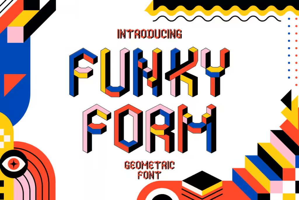
Experimental typography transcends the limitations of traditional type design to turn text into an engaging element. This style is not restricted by readability norms or grid structures, allowing creative freedom. Instead of standard fonts, designers use shapes, colors, and effects to bring text to life, making it as much a visual element as images or graphics.
In branding and social media, where first impressions are important, experimental typography can give a brand a unique identity and encourage audience engagement.
Why Use Experimental Typography in Social Media and Branding?
Visual Differentiation
With millions of posts shared daily, experimental typography helps brands stand out. For example, Nike often uses unique fonts and styles to make each campaign memorable, strengthening their brand identity while attracting attention.
Emotional Impact
Typography can also evoke emotions, just like images or colours. Using styles such as glitch or 3D typography can make content feel modern or trendy, helping brands connect with their target audience on a deeper level. This emotional appeal is why brands such as Spotify use bold, unconventional typography in their visual content.
Higher Engagement
Attractive visuals motivate users to keep scrolling and increase the rate of interaction. Experimental typography can encourage users to stop and engage with the content, making it ideal for platforms like Instagram and TikTok, where visual storytelling is everything.
10 Innovative Experimental Typography Ideas
1. Kinetic Typography for Motion Graphics
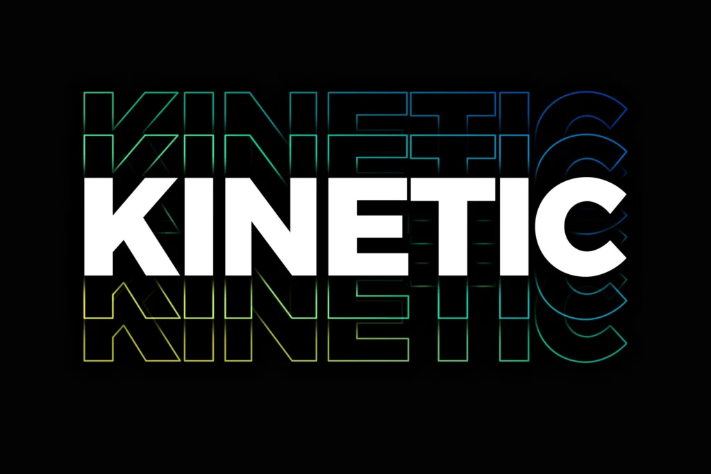
Kinetic typography is animated text designed to grab attention through movement, ranging from subtle transitions to full-blown transformations. Unlike static typography, kinetic typography keeps viewers engaged, making it particularly useful in video content and stories.
Using kinetic typography effectively means balancing readability and creativity. For example, brands like Apple and Nike often use subtle animations to emphasize product names or features, guiding the viewer’s eye without being too distracting. A common problem is the excessive use of motion, which can distract rather than enhance. To solve this, keep animations aligned with key brand messages, ensuring that text transitions enhance readability rather than hinder it.
Key Tips for Designers:
- Use animations to emphasize essential messages or calls to action.
- For video content, use kinetic typography with background music or sound effects to enhance the immersive feel.
- Test across devices to ensure text readability, especially if using fast-moving effects.
2. Layered Typography for Depth
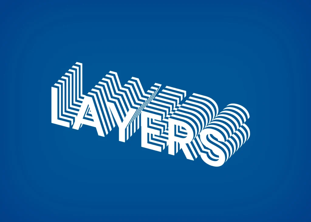
Layered typography involves overlapping multiple fonts, colors, or styles to create depth. This technique can add visual interest without overwhelming the design. It is particularly effective in brand banners, as seen with companies like Coca-Cola that mix fonts and colors in the same composition for a 3D feel.
A common challenge with layered typography is maintaining clarity. Too many layers can make text difficult to read, especially on smaller screens. Solve this by limiting layers and using contrasting colors to differentiate different elements. Another solution is to keep the background simple; this reduces distractions and keeps the layered typography front and center.
Key Tips for Designers:
- Use no more than two or three layers to maintain readability.
- Apply layering selectively, such as in headlines, to avoid clutter in longer text.
- Pair with simple or neutral backgrounds for maximum impact.
3. 3D Typography for a Modern Feel
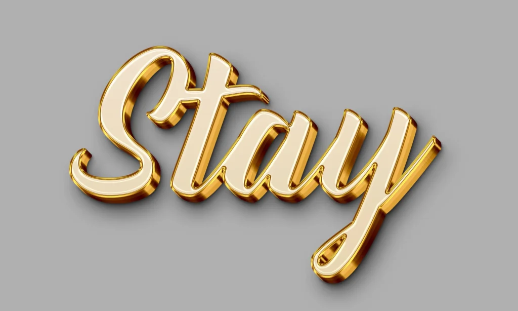
3D typography adds dimension and realism to text, using shadows, highlights, and gradients to make it stand out on screen. This style resonates in sectors such as technology and sports, where brands such as Adidas use 3D typography to create a bold, powerful look that symbolizes strength.
One challenge with 3D typography is scalability, as intricate details can get lost on smaller screens. To combat this, simplify shapes and use bold shadows to emphasize the structure of the text. Another common problem is achieving balance; an overly complex 3D effect can overwhelm the viewer. To solve this, aim for a minimal but impactful design, reserving complex 3D elements for logos or key brand visuals.
Key Tips for Designers:
- Use software like Adobe Dimension or Blender to create realistic 3D effects.
- Test the text size across multiple platforms to ensure readability.
- Use high contrast to enhance the 3D illusion without compromising legibility.
4. Glitch Typography for a Digital Edge
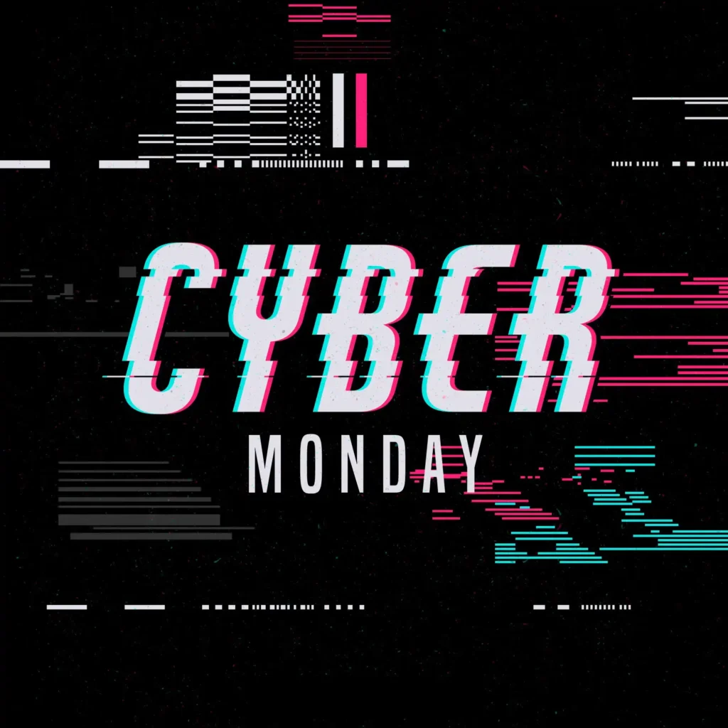
Glitch typography is characterized by digital “errors” — fragmented, distorted text that looks futuristic. The style resonates well with tech and entertainment brands, attracting younger audiences who associate glitch effects with modern aesthetics. Spotify often incorporates glitch typography into its playlists, giving off a cool, rebellious vibe.
The challenge with glitch typography is to maintain readability amid the distortion. To address this, designers should apply glitch effects sparingly and experiment with lighter distortion levels. Avoid heavy distortion for long sentences or important messages; instead, use it for short, impactful words. Another tip is to use contrasting colors that prevent the effect from dissolving into the background.
Key Tips for Designers:
- Limit glitch effects to key phrases or titles for maximum impact.
- Combine glitch with minimal backgrounds for clarity.
- Test designs at various zoom levels to prevent pixelation issues.
5. Minimalist Abstract Typography for Simplicity
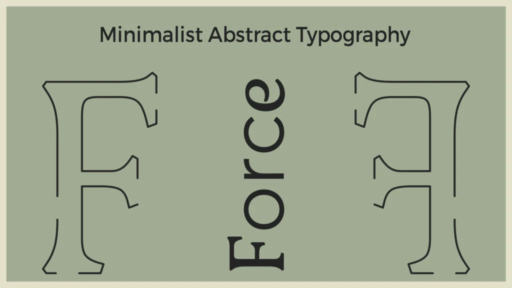
Abstract typography simplifies text to its essential shapes, lines, and forms, resulting in a clean, sophisticated aesthetic. This style works well for luxury and minimalist brands like Louis Vuitton, which use smooth, abstract fonts that add elegance without complexity.
One potential problem with abstract typography is that it can sometimes be unreadable. To solve this, experiment with different levels of abstraction while ensuring that the text remains recognizable. Avoid too much abstraction in primary messages; reserve this style for decorative text elements or branding visuals.
Key Tips for Designers:
- Prioritize readability over complexity by using straightforward shapes.
- Apply high contrast to make abstract forms stand out.
- Test designs in black and white to ensure clarity without reliance on color.
6. Psychedelic Typography for Vibrant Visuals
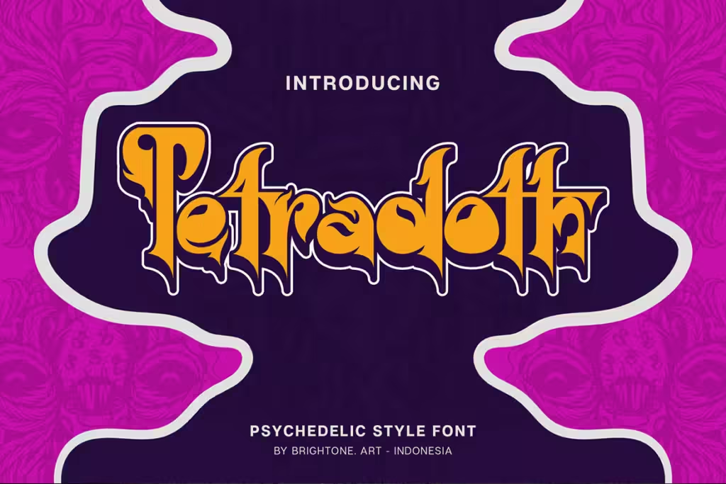
Inspired by 1960s design, psychedelic typography combines vibrant colors, intricate patterns, and bold shapes. This style is perfect for art, music, or fashion brands targeting a younger audience. Brands like Urban Outfitters use psychedelic typography in promotional graphics, evoking nostalgia while staying relevant.
The challenge with psychedelic typography is to balance color and detail to avoid overwhelming the viewer. To overcome this, designers should simplify patterns in text-heavy designs and limit psychedelic elements to headlines or main visuals. Another solution is to choose a calm background that allows the psychedelic elements to emerge without clashing.
Key Tips for Designers:
- Use bright, contrasting colors to achieve a psychedelic look.
- Apply intricate patterns only to short text to maintain legibility.
- Experiment with balance to avoid creating an overly busy design.
7. Collage Typography for Mixed Media Aesthetic
Collage typography creates a mixed-media effect by combining text with textures, images, and other graphics. Often used in lifestyle and beauty brands like Glossier, this style adds a personal, handmade feel that resonates with audiences seeking authenticity.
One challenge with collage typography is maintaining consistency. Mixing different textures can lead to visual clutter if not done carefully. To address this, choose a limited color palette and theme that aligns with the brand’s visual identity. Another solution is to simplify the surrounding design elements so that the collage text remains the focal point.
Key Tips for Designers:
- Use textures or images that align with brand values.
- Balance complexity with simplicity to avoid overwhelming viewers.
- Opt for neutral backgrounds to allow collage elements to stand out.
8. Geometric Typography for Bold Statements
Geometric typography uses sharp, clean shapes like triangles, circles, and lines to create structured, modern text. This style works well in fields like technology, fitness, and architecture, where brands like Adidas use geometric typography to reinforce strength and precision.
The risk with geometric typography is that it can appear rigid and limit expression. To solve this, consider combining geometric elements with soft shadows or gradients for depth and warmth. Alternatively, use geometric typography for headlines or logos, where the bold structure is most effective.
Key Tips for Designers:
- Limit shapes to a few strong forms for visual clarity.
- Contrast geometric text with organic backgrounds to create balance.
- Avoid overly intricate designs that might affect readability.
9. Responsive Typography for Adaptable Branding
Responsive typography adapts easily to screen sizes, which is important for ensuring readability across a variety of devices. This style benefits brands with a large online presence, such as the BBC, which adjusts its typography to provide consistent readability across all platforms.
A major challenge is preserving typography’s impact on smaller screens. To address this, designers should use scalable vector fonts and test readability on multiple devices. Avoid overly complex effects on responsive designs; simplicity works best for adaptability.
Key Tips for Designers:
- Use responsive design principles to ensure scalability.
- Test typography across devices, focusing on legibility on small screens.
- Go for simple, clear fonts that don’t require adjustment.
10. Transparent Typography for Unique Layering Effects
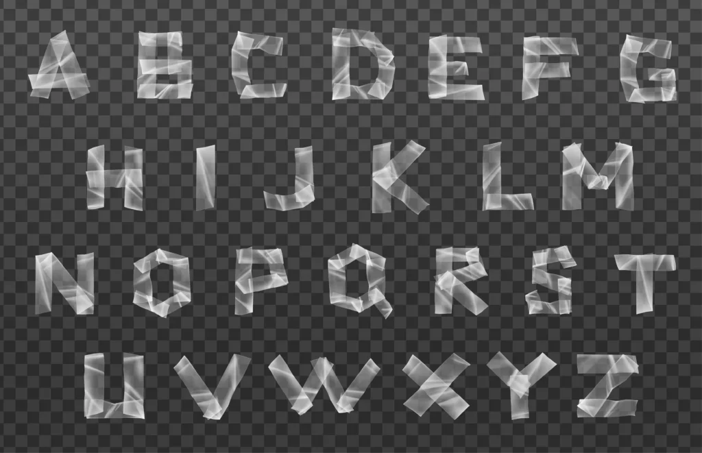
Transparent typography overlays text on images, allowing the text to interact with the background visuals. This style is popular in lifestyle and travel branding, where brands like Airbnb use transparency to seamlessly blend text with photos.
One common challenge with transparent typography is ensuring readability, as it can sometimes blend too much into the background. The solution is to adjust opacity levels until the text is visible without affecting the image. For high-contrast images, use subtle shadow effects to increase clarity.
Key Tips for Designers:
- Adjust transparency levels to balance visibility and aesthetics.
- Pair transparent text with high-quality images that support the brand story.
- Test in both high and low contrast settings to ensure clarity.
Tools and Resources for Creating Experimental Typography
- Adobe Illustrator – Great for custom typography and vector-based design.
- Canva – Easy-to-use platform for quick experimental typography effects.
- Figma – For responsive typography, particularly in web design.
- Behance and Dribbble – Ideal platforms for finding typography inspiration.
Tips for Integrating Experimental Typography into Branding
- Consistency is Key: Align typography with brand visuals.
- Balance with Simplicity: Avoid overwhelming audiences with overly complex designs.
- Test and Refine: Use A/B testing to see which typography style resonates most with your audience.
In Conclusion
Experimental typography opens up endless opportunities for brands looking to make a bold, memorable statement in the visually competitive digital space. As we’ve seen, styles like kinetic typography, glitch effects, and 3D text can transform simple words into engaging visuals that communicate brand personality and connect with audiences on a deeper level. However, it’s important to remember that the key to effective typography lies in balance. The best experimental designs are those that maintain a connection to brand values while offering a fresh perspective that engages audiences.
When you incorporate these ideas into your branding, keep in mind the importance of testing and refining. A/B testing can be particularly useful in measuring audience reactions and ensuring that your experimental typography is both visually appealing and functional on a variety of devices. By exploring these typography techniques and finding the right fit for your brand, you’re not just enhancing your visual style – you’re creating an experience that invites your audience to connect, engage, and remember your message. So, why wait? Start experimenting with these styles and watch your brand come across in a whole new way.

