As we prepare to step into 2025, it’s time to consider the most striking logo designs of 2024. This year has seen remarkable creativity in logo design, with rebrands, new updates, and entirely new concepts dominating the landscape. Logos constantly evolve, reflecting cultural shifts, adapting to technological advancements, setting trends redefining brand identity.
In this article, we highlight the best logos of 2024 – those that caught our attention for their innovation, storytelling, and design brilliance. We’ll look at what makes each logo special, why it deserves recognition, and what lessons it offers for designers and brands looking to make an impact.
Rebrands That Made Waves
01. Perkins

Perkins’ new logo strikes a great balance between modernity and nostalgia. The American restaurant chain’s rebrand features clean lines and a bold typeface that retains the retro charm of its old logo while updating it for today. The muted color palette feels warm and inviting, blending the familiar with the new. It’s a great example of a rebrand that honors its past while moving forward.
Why It Is in the List of Best Logos
The Perkins logo’s rounded serif typography and warm tones evoke a sense of history while also being modern. The slight curvature in the letters adds friendliness and consistent colors ensure it works across a variety of formats. Its eye-catching design promotes nostalgia, reminding patrons of its history and signalling growth and renewal. It teaches us the importance of striking a balance between nostalgia and modern appeal to keep a brand relevant.
02. Verizon
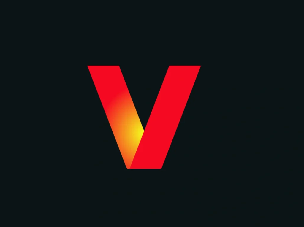
Verizon’s updated logo may remind you of Netflix, but that’s part of its genius. By adopting a bold red gradient glow on the “V,” Verizon steps away from a purely corporate look, signalling a focus on entertainment and gaming. The choice to retain Neue Haas Grotesk keeps it familiar while the vibrant colors show a shift in priorities.
Why It Is in the List of Best Logos
The bold red glow and clean font make Verizon’s logo attractive and eye-catching. The sans-serif typography keeps it professional, while the color adds vibrancy and warmth. The gradient effect conveys dynamism and innovation, which aligns with its extensive streaming and gaming offerings. It shows how small changes in color and shape can refresh a brand’s image.
03. GOSH Charity
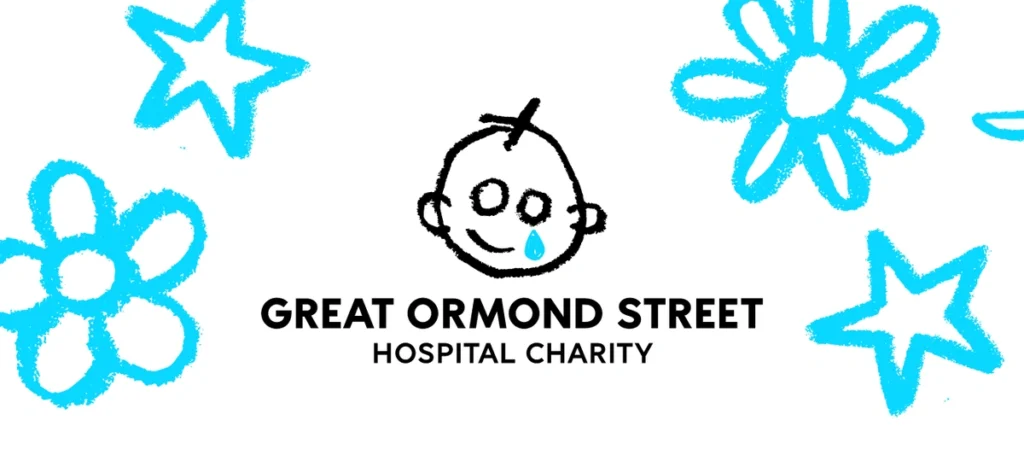
The Great Ormond Street Hospital (GOSH) charity logo has undergone a subtle but powerful makeover. Designers Pentagram and Stuart Gough have replaced the smooth lines of the old logo with crayon-like outlines, giving it a more authentic, childlike feel. The change fits perfectly with the charity’s focus on children.
Why It Is in the List of Best Logos
The crayon-inspired design touches the heart of a children’s charity. Its irregular lines feel organic and accessible, reflecting the creativity and innocence of childhood. The simplicity and playfulness make it deeply relatable, showing how adding texture can deepen a logo’s emotional connection. This new design teaches the value of aligning aesthetics with the organization’s mission.
04. National Football Museum
The new logo of the National Football Museum proves that simplicity can speak volumes. Inspired by the shape of a football goal when viewed from an angle, this minimalist design conveys the essence of the museum. It is versatile, modern and full of meaning.
Why It Is in the List of Best Logos
The geometric simplicity ensures instant recognizability and versatility. The monochromatic design adds a sleek, modern feel while symbolizing the goal of preserving football’s heritage. Its clever visual metaphor shows how minimalism with clear symbolism can create powerful logos that resonate with audiences.
05. Jaguar
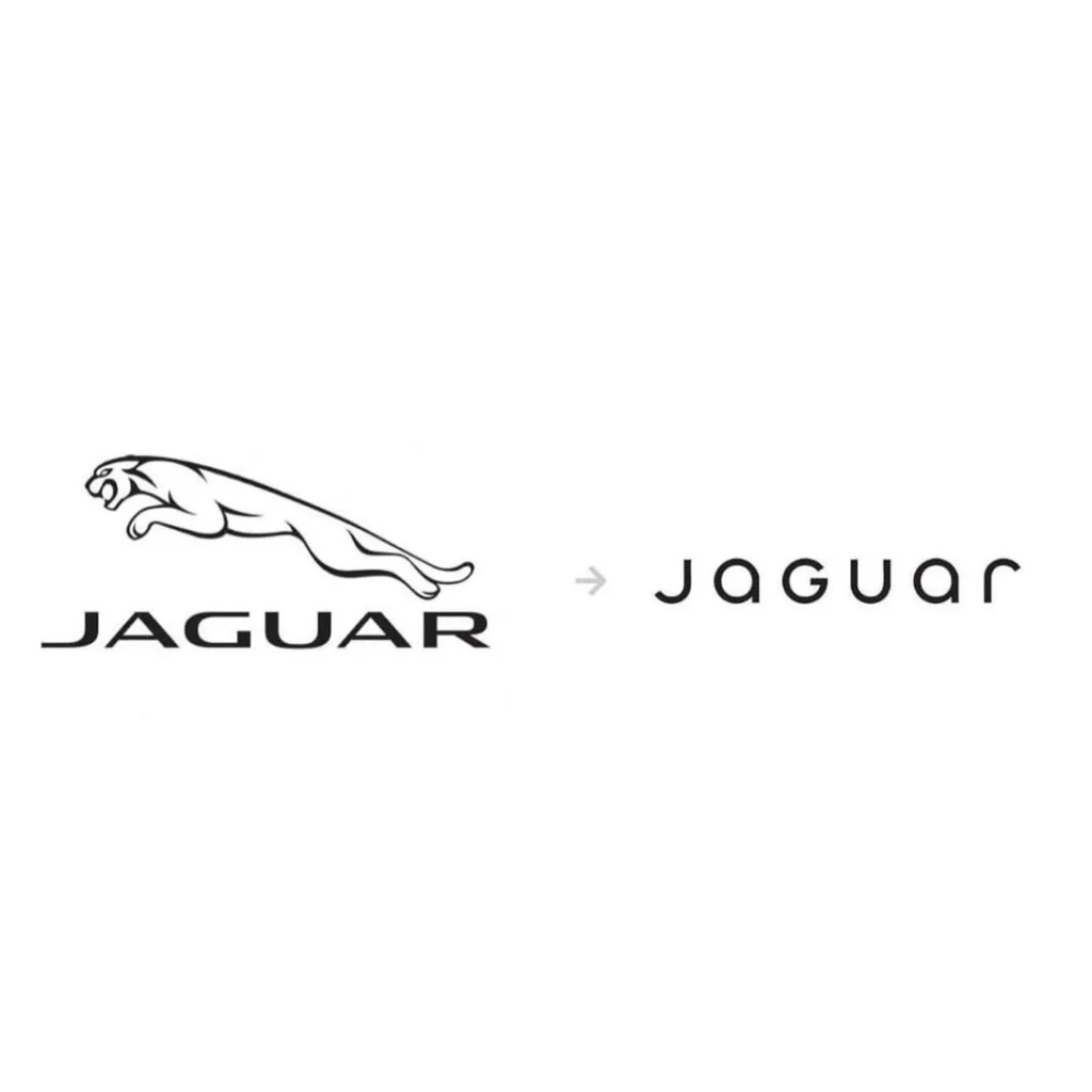
In November 2024, Jaguar unveiled a completely reimagined brand identity as part of its transformation into an all-electric luxury carmaker. The new logo features a stylized “Jaguar” wordmark, a mix of upper and lower case letters, and introduces a redesigned “Leaper” cat emblem with a more angular appearance. This rebrand reflects Jaguar’s “spirited modernity” philosophy, which aims to promote originality and artistic expression.
Jaguar Media
Why it’s on the best logos list
Jaguar’s new logo marks a bold departure from its traditional image, aligning with its commitment to innovation and electrification. The modern typography and angular “leaper” reflect a forward-thinking look, while the minimalist design ensures versatility across different platforms. This rebrand teaches us the importance of evolving brand identity to reflect technological advancements and changing market conditions.
06. Lamborghini
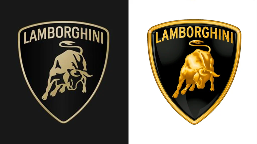
After more than two decades, Lamborghini introduced a refreshed logo earlier this year. The updated emblem retains the iconic raging bull within the shield but adopts a flat design, wider typeface, and a black and gold color scheme. This subtle evolution reflects Lamborghini’s strategy of adapting its visual expression to contemporary aesthetics while preserving its heritage.
Why it’s on the best logos list
Lamborghini’s logo update is an example of how minimal changes can modernize a brand’s image without losing its core identity. The flat design and refined typography provide a sleek, contemporary look, enhancing readability and appeal. This rebrand demonstrates the effectiveness of subtle design adjustments in maintaining brand relevance in a rapidly evolving market.
New Logos That Stood Out
07. Nike A’ja Wilson Logo
Nike has unveiled A’ja Wilson’s signature logo: pic.twitter.com/EUjaN6XwxR
— Front Office Sports (@FOS) June 22, 2024
Nike’s A’ja Wilson logo is known for its personal touch. Inspired by the star shape A’ja used in her signature, this design embodies her “diamond in the rough” personality. Although opinions on it are mixed, its bold symbolism and unique aesthetic make it memorable.
Why It Is in the List of Best Logos
The asymmetrical star and bold lines reflect individuality and strength. Its storytelling feature makes it deeply personal, enhancing its connection to Aja’s identity. The slightly unrefined feel aligns with the “diamond in the rough” theme, conveying a raw but impactful message. This logo reflects the importance of creating designs that embody the personalities of its subjects while taking creative risks.
08. Chengdu 2025 World Games

The Chengdu 2025 World Games logo, created by John Fairley, combines geometric shapes with a playful optical illusion. The top of the logo subtly features the face of a panda, the iconic symbol of Chengdu. This clever touch reinforces the themes of cultural harmony and ecological respect.
Why It Is in the List of Best Logos
The hidden panda within the geometric forms is charming and culturally meaningful. The vibrant colors and clean lines make it adaptable and visually appealing. Its playful symbolism and thoughtful execution inspire designers to integrate cultural elements seamlessly. The overall design strikes a balance between fun and professionalism, making it an exceptional example of culturally inspired branding.
09. Mountain Dew
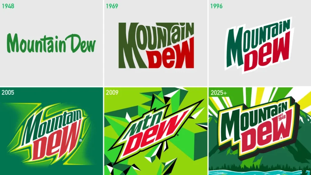
The first major change to Mountain Dew’s logo in 15 years adopts a vintage-inspired look. The new design includes curved angles and a beautiful forest background, creating a more accessible and nostalgic feel. It’s a nod to adventure and the great outdoors.
Why It Is in the List of Best Logos
The forest backdrop and curved typography enhance the brand’s bold image. The green tones feel fresh and energetic, while the retro style evokes familiarity. The design cleverly connects Mountain Dew to nature and exploration, making it appealing to outdoor enthusiasts. This rebrand is an example of how classic design elements can modernize a brand while staying true to its roots.
10. Mazda

Mazda’s monochrome logo signals a shift toward sophistication and luxury. Moving away from its “Zoom-Zoom” branding, the clean, minimalist design reflects a sophisticated image. This rebrand establishes Mazda as a high-end player in the automotive world.
Why It Is in the List of Best Logos
Monochrome simplicity exudes elegance and precision. Sharp typography conveys sophistication and reliability, setting a high standard for automotive branding. It demonstrates how minimalism can enhance a brand’s perceived value and appeal to a discerning audience. The black-and-white palette adds timelessness, ensuring the design ages elegantly and signalling a commitment to innovation.
11. Golden State Valkyries
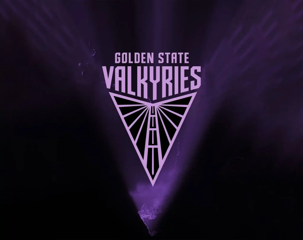
The Golden State Valkyries, a new WNBA team, has introduced a logo that blends strength and elegance. The design is inspired by Norse Mythology’s Valkyries, creating a connection with fans and setting a high standard for sports branding.
Why It Is in the List of Best Logos
A blend of bold typography and intricate symbolism captures the essence of the Valkyrie myth. The balance of strength and beauty in the design resonates with the team’s identity. The winged elements evoke a sense of speed and empowerment, which aligns with the team’s competitive spirit. It reflects the power of storytelling combined with contemporary branding to create a unique identity.
12. Toronto Tempo
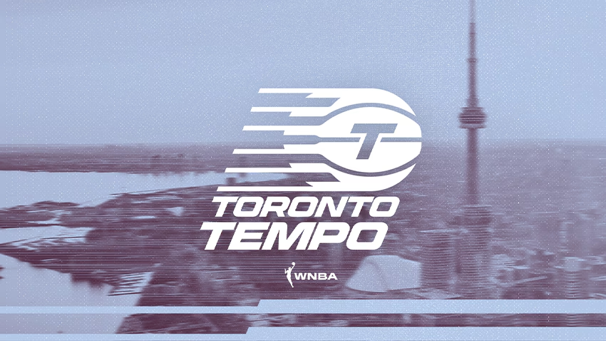
Toronto Tempo’s logo has received mixed reviews. Critics say it lacks depth, but its clean lines and vibrant colors represent the “Tempo” concept well. It’s a lesson in striking a balance between simplicity and uniqueness.
Why It Is in the List of Best Logos
Rhythmic typography and bright colors fit the theme of speed and energy. Although there is room for improvement, the design aligns well with its identity and demonstrates the importance of adding visual elements to a brand’s message. Its boldness ensures visibility, teaching that simplicity and clarity can sometimes outweigh overcomplication.
Broader Design Trends in 2024
1. Minimalism with Meaning: Designs like the National Football Museum’s show that minimalism paired with storytelling resonates deeply.
2. Nostalgia Meets Modernity: Brands like Perkins and Mountain Dew blend retro elements with modern updates for wide appeal.
3. Personalization in Branding: The Nike A’ja Wilson logo emphasizes creating unique, personal identities.
4. Playful Symbolism: The Chengdu World Games logo shows how hidden details can make logos more engaging.
5. Sophisticated Monochromes: Mazda’s rebrand highlights a growing preference for elegant simplicity.
6. Bold Cultural Statements: Corteiz shows how challenging norms can set trends.
Tips for Evaluating a Logo Design
- Clarity and Simplicity: Is it instantly recognizable?
- Alignment with Brand Values: Does it reflect the brand’s mission?
- Timelessness: Will it remain relevant?
- Versatility: Can it adapt across formats?
The Takeaway
Logos aren’t just symbols—they’re visual ambassadors of brand identity. The best logos of 2024 so far show us that thoughtful design can combine history and innovation, balance simplicity and boldness, and create an emotional connection. Whether rebranding or starting afresh, the key lies in creating designs that resonate, inspire, and stand the test of time.


