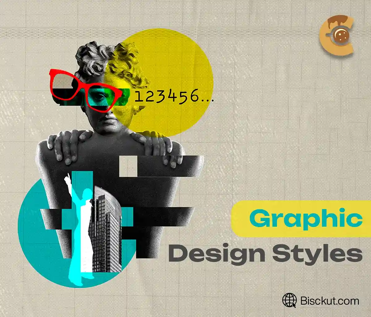
Graphic design styles form the backbone of visual communication, shaping the way we view brands, campaigns, and creative projects. From the sleek minimalism of Swiss design to the bold vibrancy of Pop Art, each style carries a unique identity that connects with audiences on a deep emotional level. Choosing the right design style isn’t just about aesthetics; it’s about effectively conveying a message, influencing perceptions, and leaving a lasting impression.
Whether you’re creating a logo, designing a marketing campaign, or building a user-friendly website, it’s important to understand these iconic graphic design styles. Each style has a rich history and a set of principles that make it effective in different contexts. This knowledge helps designers choose the right approach to amplify their message and resonate with their audience.
In this article, we’ll explore 17 inspiring graphic design styles, from the revolutionary Bauhaus movement to the nostalgic appeal of retro design. We’ll dive deep into their origins, key features, and relevance in today’s design landscape, providing information that will enhance your creative toolkit and help you take your designs to a professional level.
1. Bauhaus Design
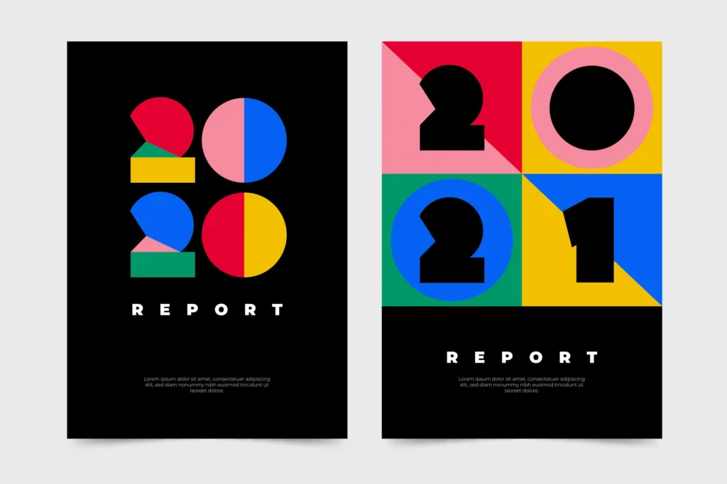
The Bauhaus design style is a timeless tribute to the principle that “form follows function.” Originating from the famous Bauhaus School of Design in the early 20th century, this style revolutionized design by moving away from excessive decoration and embracing minimalism with practicality. The goal was to create designs that were not only visually appealing but also functional and accessible to everyone. Bauhaus design is essentially the perfect blend of art and industry.
Bauhaus design is all about simplicity and structure, using basic shapes like circles, squares, and triangles as a foundation. It often combines primary colors—red, yellow, and blue—with neutral tones to create visuals that are both striking and simple. A key aspect of this style is its experimental approach to layout, where bold use of asymmetry and white space helps create balance and focus.
Characteristics
Bauhaus design focuses on simplicity, removing unnecessary details while maintaining an impressive visual appearance. It integrates various fields of design, from typography and industrial design to fine art, all into a unified look. The designs often feature clean lines and shapes that can be mass-produced, reflecting the technological advancements of the time.
One of the most famous examples of Bauhaus design is the Wassily Chair created by Marcel Breuer. The chair’s use of tubular steel was revolutionary for its time, reflecting the Bauhaus’ emphasis on modern, industrial materials. In graphic design, László Moholy-Nagy’s posters, which combine photography with sharp geometric patterns, are a great representation of this style.
Bauhaus design isn’t just a style; it’s a legacy. It continues to influence everything from websites to architecture, proving that simplicity and functionality never go out of fashion. Whether you’re designing a product, poster or app interface, the Bauhaus philosophy of simplicity and utility is still relevant today.
2. Minimalism
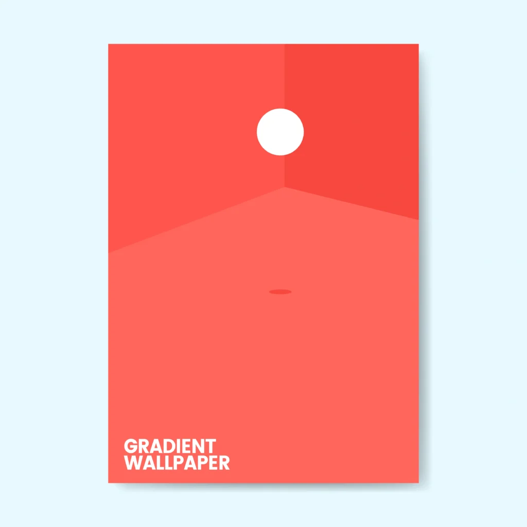
If the Bauhaus set the stage for clean and purposeful design, minimalism took it a step further by turning simplicity into an art form. Minimalism isn’t just about removing the unnecessary; it’s about highlighting the essentials. This design style focuses on creating clarity in a cluttered world, focusing the viewer’s attention on the main message without distractions.
Minimalism is defined by the use of ample negative space, which creates room for the design to “breathe.” The color palette often leans toward monochromatic tones or neutral colors, allowing design elements to stand out with subtlety. Typography is chosen to complement the simplicity of the layout, often using sleek, sans-serif fonts that emphasize clarity. The guiding principle of “less is more” governs every design decision, ensuring that each element plays a clear and purposeful role.
Characteristics
- Typography: Clean, sans-serif fonts paired with ample spacing.
- Imagery: Sparse use of images, with a focus on only the most necessary visuals.
- Color Palette: Neutral tones like white, black, and gray, occasionally accented with a bold color.
- Composition: Strong use of grids and alignment to create balance and harmony.
Apple’s branding is the perfect example of minimalism. The sleek, intuitive interfaces of its products, combined with product packaging that uses simple, beautiful design, demonstrate how minimalism can enhance a brand’s visual identity. Similarly, modern websites like Google’s homepage are prime examples of minimalism design in action. They focus on providing a clean user experience by removing unnecessary details to keep the user’s attention on the main content.
Minimalism proves that design doesn’t need to be over the top to make an impact. It emphasises functionality and sophistication, making it the perfect style for modern brands looking to stand out in a crowded market. Its ability to create timeless designs has ensured its continued popularity across many industries, particularly in branding, advertising and the digital space. By focusing only on the essentials, minimalist design conveys a message of clarity and sophistication that resonates universally.
3. Art Deco Design
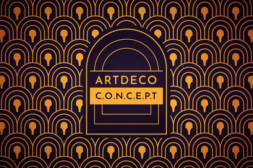
Art Deco is a style that emerged in the 1920s and 1930s, known for its opulent, symmetrical, and geometric qualities. Drawing on both traditional craftsmanship and modern industrial techniques, Art Deco conveys sophistication, elegance, and modernity using bold lines and opulent materials.
Art Deco is characterized by geometric shapes such as chevrons and zigzags, paired with metallic finishes and luxurious textures. This style combines simplicity with glamour, using bold designs and high-end materials.
Characteristics
- Typography: Geometric fonts with sharp angles and ornate details.
- Imagery: Stylized designs like sunbursts, floral patterns, and angular forms.
- Color Palette: Rich metallics like gold, silver, and bronze, combined with deep colors such as navy, black, and emerald green.
- Composition: Symmetrical, balanced layouts that convey a sense of order and elegance.
The Chrysler Building located in New York City is a classic representation of Art Deco design. Luxury brands such as Cadillac and Chanel use Art Deco principles in their designs to create a sense of timeless elegance and sophistication.
Art Deco is a celebration of beauty, luxury and boldness. Its intricate details and opulent feel make it a favourite style for projects that want to exude elegance and high energy. Whether you’re designing a luxury brand logo or creating a retro-inspired poster, Art Deco’s timeless appeal ensures that it remains a popular choice for projects that demand attention and sophistication.
4. Pop Art
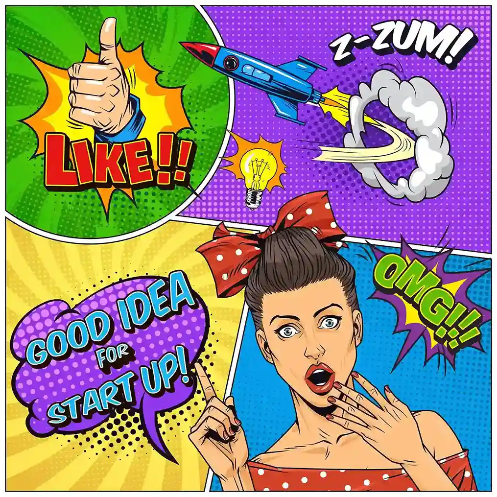
Pop Art is the rebellious teen of design – bold, colourful and unabashedly loud. Emerging in the 1950s and 60s as a reaction to the elitist world of fine art, Pop Art brought elements of mass culture into the spotlight. The style is all about celebrating everyday life, transforming ordinary objects and popular symbols into striking pieces of art that speak directly to the masses.
Pop Art is characterised by bold, contrasting colours, thick black outlines and repetitive patterns that copies the visual language of mass production. The style often incorporates imagery from advertisements, comic books and popular culture to blur the lines between high art and consumerism. Bright, vibrant colours such as primary red, yellow and blue dominate, while techniques such as Ben-Day dots (popularised in comic book printing) are often used to add texture and depth.
Characteristics
Pop Art is known for its playful and vibrant style. It uses everyday objects and popular images alongside traditional art methods. This mix of humor and pop culture makes Pop Art easy for many people to understand and enjoy. By turning ordinary items into art, Pop Art questions what we think of as “high” or “low” culture. This approach helps it attract a wide audience.
Andy Warhol’s Campbell’s Soup Cans and Roy Lichtenstein’s comic-inspired artworks are quintessential examples of Pop Art. In graphic design, this style is often used in marketing campaigns to create bold visuals that grab attention. The use of bright, eye-catching colors, along with familiar imagery, makes Pop Art an ideal choice for projects aiming to stand out and resonate with modern audiences.
Pop Art is more than just an aesthetic—it’s a powerful way to connect with audiences by tapping into the cultural atmosphere. Its bold and often playful nature ensures it continues to resonate, particularly in an era obsessed with pop culture and instant gratification. When used in branding, Pop Art can create a lasting connection with consumers, offering a fresh and energetic approach to visual storytelling.
5. Swiss Design (International Typographic Style)
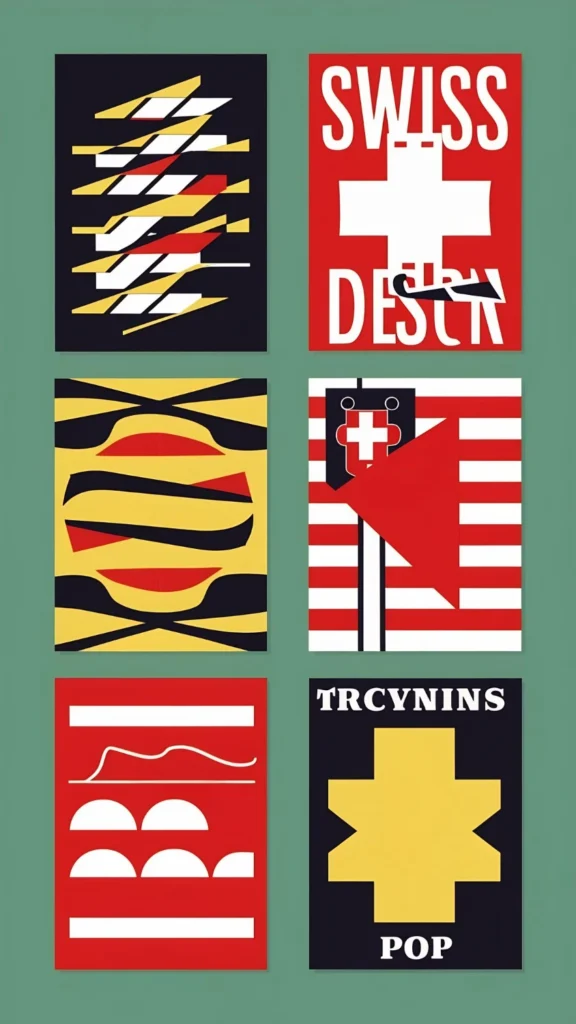
Swiss design is the foundation of modern graphic design, focusing on precision, clarity, and functionality. Also known as the International Typographic Style, it is built around the belief that design should communicate in the clearest, most efficient way possible, without unnecessary embellishments.
Grid-based layouts dominate Swiss design, providing structure and balance. The use of sans-serif fonts such as Helvetica ensures readability, while asymmetrical compositions guide the viewer’s eye. These design choices help emphasize the importance of clarity and coherence in communication.
Characteristics
Swiss Design strips away any decorative elements, focusing purely on functionality. It uses limited colors to avoid visual clutter and focuses heavily on the hierarchy to organize information in a clear, aesthetic way. The goal is to create a seamless experience for the viewer, making the design intuitive and easy to navigate.
The Zurich Opera House posters are a perfect representation of Swiss Design. Clean, grid-based layouts combined with a simple color palette and clear typography create an easily digestible visual language. Corporate branding, such as transportation signage systems, often follows this style for its focus on clarity and universality.
Swiss Design’s legacy shows that less can indeed be more. Its minimalist, efficient approach to communication makes it timeless and influential, shaping everything from magazine layouts to corporate branding. Its enduring popularity is proof that good design prioritizes clear communication over ornamental decoration.
6. Retro Design
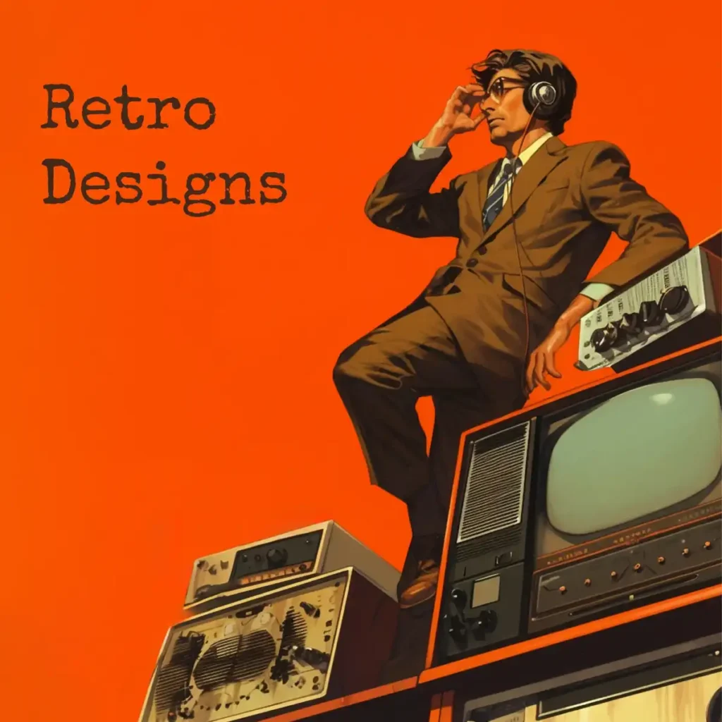
Retro design is a nostalgic trip through eras of the past, bringing vibrant colors, quirky patterns, and iconic symbols of earlier decades into contemporary design. Whether inspired by the bold typography of the 1950s or the psychedelic twists of the 1970s, retro design connects with audiences by evoking emotions associated with cultural moments of the past.
Retro design often includes vintage fonts, distressed textures, and bright, saturated colors, evoking a sense of nostalgia. Depending on the era it’s inspired by, retro design may also include bold typography, grainy textures, and iconic images from popular culture, such as cassette tapes or neon signs
Characteristics
- Typography: Bold, often decorative fonts from the past (e.g., diner-style fonts or those found on old movie posters).
- Color Palette: A mix of vibrant primary colors or muted tones, paired with grainy or faded textures to emulate vintage prints.
- Imagery: Includes nostalgic elements such as vintage gadgets, neon signs, and old-school iconography.
- Textures and Patterns: Grainy overlays, halftone effects, and hand-drawn illustrations give a retro feel.
Coca-Cola’s branding often uses retro aesthetics with vintage fonts and colors to create a nostalgic feel while still being modern. The design of “Stranger Things,” particularly the 1980s-inspired title font, reflects the vibrant and playful essence of retro design.
Retro design is more than just nostalgic; it connects emotionally with audiences by combining familiar comfort with fresh, modern creativity. It’s perfect for projects that want to evoke memories while also being relevant and fun.
7. Grunge Design
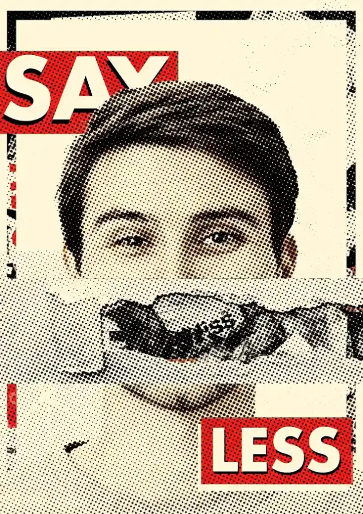
Grunge design is about imperfection, raw authenticity and a rejection of polished aesthetics. Rooted in the 1990s music scene, particularly the grunge movement, this style celebrates distressed, rough visuals that feel real and raw.
Grunge design is chaotic, using layered textures, torn edges and distressed backgrounds to create a tactile, worn-out feel. It thrives on asymmetry and breaks traditional design rules, making it stand out for its authenticity and rebellious spirit.
Characteristics
- Textures: Rough, scratched surfaces and dirt effects give a worn and raw look.
- Typography: Irregular, grunge fonts or handwritten styles reflect individuality and imperfection.
- Imagery: Collages, smudges, splatters, and ink effects capture the grunge aesthetic.
- Color Palette: Dark tones and muted colors evoke a gritty, earthy feel.
Nirvana’s Nevermind album cover is an iconic example of grunge design, with its grungy visuals and bold typography. Sports-related brands or streetwear companies frequently use grunge design to project a bold, authentic image.
Grunge design is a bold way to show individuality. It works well for brands that want to break away from conventions and create a unique identity. Its rough, real-world look helps brands appear genuine and authentic.
8. Flat Design
Flat design embodies simplicity, focusing on clean, two-dimensional visuals that eliminate unnecessary decorations. Gaining popularity with the rise of digital platforms, this style creates sleek, user-friendly interfaces and straightforward visuals that prioritize function over form.
The flat design avoids gradients, shadows, and textures, and favours bold colors, simple shapes, and clean typography. It is optimized for digital platforms, providing a straightforward, intuitive user experience. The emphasis is on clarity and visual appeal, ensuring that users can quickly navigate through content.
Characteristics
- Color Palette: Bright, vibrant colors or contrasting hues dominate, creating bold visuals.
- Shapes and Icons: Simple geometric shapes and icons, often minimalist but easily recognizable.
- Typography: Clean, sans-serif fonts ensure readability across digital screens.
- User Experience (UX): The focus is on creating intuitive, easy-to-use interfaces, especially for mobile apps and websites.
Microsoft’s Metro design and Google’s Material Design are great examples of flat design. Both systems use vibrant colors and straightforward layouts to improve user interaction and navigation to simplify the digital experience for the user.
Flat design is the cornerstone of the modern digital interface. Its focus on simplicity and usability makes it ideal for contemporary web and app design, ensuring that designs are not only visually appealing but also user-friendly and functional.
9. Futuristic Design
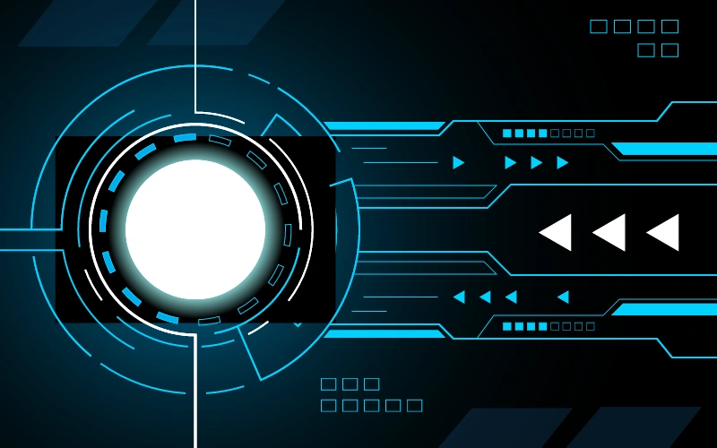
The futuristic design imagines a world that is yet to come, inspired by innovation and the awe of space and technology. Inspired by sci-fi, space exploration, and cutting-edge technological advancements, this style evokes a sense of wonder and progress, often incorporating sleek, streamlined forms and digital aesthetics to offer a glimpse into the future.
Futuristic design thrives on metallic textures, glowing neon accents, and geometric patterns. These elements come together to create a sense of speed, progress, and technological sophistication. Abstract layouts with fluid or dynamic forms contribute to a sense of forward motion, while gradient overlays suggest fluid transitions between periods.
Characteristics
- Typography: Bold, sans-serif fonts with sharp edges or tech-inspired characters.
- Imagery: Holographic visuals, space-age themes, and digital aesthetics.
- Color Palette: Electric blues, purples, silvers, and neon gradients.
- Textures: Chrome finishes, glass-like surfaces, and digital elements such as grids or glitches.
Sci-fi movie posters, like those for Blade Runner 2049, represent futuristic design with their glowing typography and high-tech visuals set against dark, moody backgrounds. Brands like Tesla use sleek, futuristic design elements to communicate innovation and cutting-edge technology.
Futuristic design plays a crucial role in brands focused on technology, gaming, or forward-thinking industries. It positions companies as visionaries, drawing in audiences who are eager to explore new possibilities and innovations.
10. Psychedelic Design
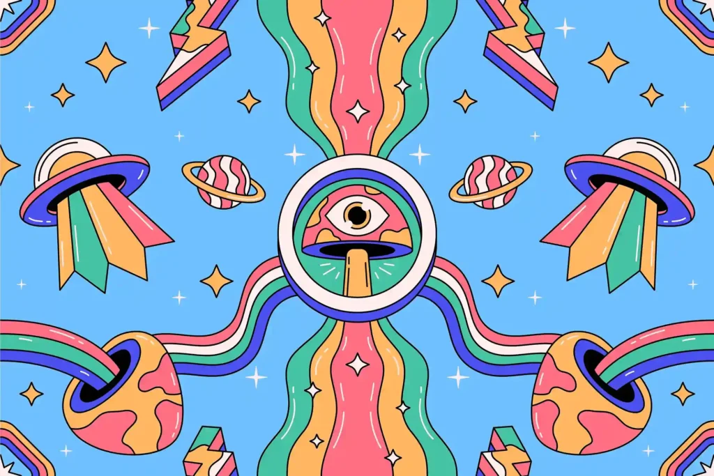
Psychedelic design is a vibrant, dynamic aesthetic that transports viewers into an alternate reality of swirling colors, intricate patterns, and surrealist images. Originating in the counterculture movement of the 1960s, this style was deeply influenced by hallucinatory experiences, and it continues to capture a sense of freedom and artistic exploration.
Psychedelic design is known for its use of bright, clashing colors and distorted visuals. It often features surrealist or organic forms that twist and bend in unconventional ways, creating a sense of visual movement and disorientation.
Characteristics
- Typography: Flowing, warped fonts designed to mirror the hallucinatory experience.
- Imagery: Intricate, kaleidoscopic visuals and celestial motifs.
- Color Palette: Vivid, clashing colors often arranged in a tie-dye effect.
- Patterns and Effects: Hypnotic spirals, optical illusions, and detailed linework.
The Beatles’ Sgt. Pepper’s Lonely Hearts Club Band album artwork and the iconic posters from the Woodstock Festival are quintessential examples of psychedelic design, embodying the vibrant energy and experimental spirit of the era. Brands targeting bohemian or festival cultures often use this aesthetic to evoke a sense of freedom and creativity.
Psychedelic design isn’t just visually appealing – it’s an immersive experience. It’s perfect for brands or campaigns that want to connect with an audience that values freedom, creativity, and individuality.
11. Steampunk Design

Steampunk design blends Victorian aesthetics with industrial technology, resulting in a fantastical but historically based style. It celebrates a time of innovation, bringing together ornate Victorian styles with an imaginative sense of steam-powered machinery and speculative technologies.
Steampunk design is known for combining industrial elements, such as gears and cogs, with Victorian-era aesthetics. The style often includes brass and copper tones, as well as intricate mechanical visuals that suggest a blend of history and futurism.
Characteristics
- Typography: Vintage-inspired fonts with mechanical detailing.
- Imagery: Gears, steam engines, and airships, often with exposed mechanical components.
- Color Palette: Earthy tones like browns and sepias, combined with metallic finishes like brass.
- Textures and Patterns: Aged, worn textures that evoke a sense of nostalgia and historical charm.
The film Sherlock Holmes (2009) and the video game BioShock Infinite are iconic examples of steampunk design, combining Victorian-era grandeur with speculative technologies. Steampunk is also prominent in niche fashion brands and fantasy-themed product designs.
Steampunk design appeals to people drawn to adventure, history, and fantasy. It’s perfect for storytelling or products that seek to evoke a sense of mystery, wonder, and imaginative exploration.
12. 3D Design
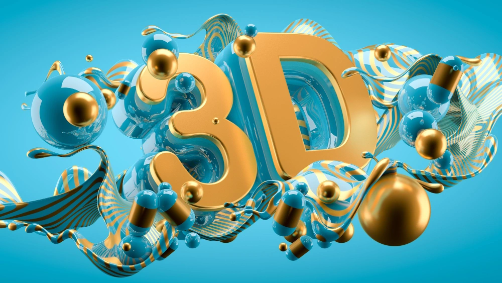
The 3D design brings depth and realism to the visual arts, transforming flat images into dynamic, lifelike objects. With the rise of virtual environments and interactive media, 3D design has become essential for creating engaging and immersive experiences, especially in advertising and gaming.
The 3D design uses sophisticated rendering techniques to create light, shadows, and textures, creating tangible-looking visuals. This can range from highly realistic models to stylized, abstract representations.
Characteristics
- Lighting and Shadows: Realistic lighting effects add depth and dimension to objects.
- Textures: Detailed surfaces like glass, metal, and fabric enhance the lifelike quality of designs.
- Motion: Often animated, adding dynamic elements to the design.
- Applications: Product mockups, virtual environments, and AR/VR experiences.
Nike’s advertising frequently incorporates 3D elements, showcasing shoes with realistic textures and dramatic lighting. Pixar’s animated films also utilize 3D design to bring characters and environments to life in a highly engaging way.
3D design captivates viewers by providing a sense of immersion and realism. It is particularly effective in presenting products or concepts where dimension enhances the viewer’s experience, such as in interactive or virtual platforms.
13. Gothic Design
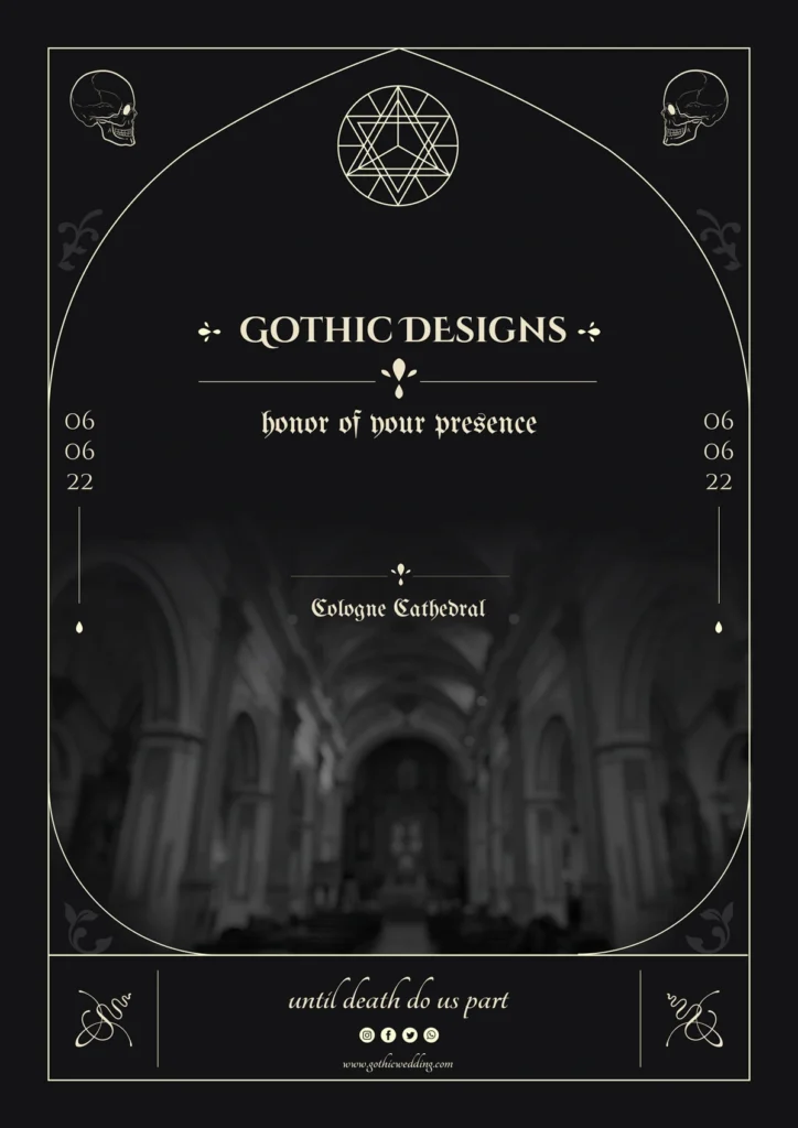
Gothic design reflects dark, dramatic, and ornate aesthetics stemming from medieval architecture. It is closely associated with a sense of mystery, elegance, and horror, making it ideal for projects that aim to evoke a deep emotional response.
Gothic design displays intricate details, elaborate typography, and dramatic contrasts. This style often appears in book covers, album art, and branding for industries such as fashion or music, especially for edgy or luxurious brands.
Characteristics
- Typography: Black letter fonts or decorative serif fonts with intricate flourishes.
- Imagery: Stained glass, gargoyles, or dark, atmospheric landscapes.
- Color Palette: Deep hues such as black, crimson, and gold, often set against high-contrast backgrounds.
- Mood: Dark, mysterious, and sophisticated, often with a sense of grandeur.
The cover art of Dracula or Frankenstein showcases Gothic design through its intricate typography and eerie visuals. High-end fashion brands like Alexander McQueen incorporate Gothic elements in their collections, conveying both luxury and edginess.
Gothic design enhances visual storytelling by creating a vibe of Enchantment and sophistication, making it a strong choice for projects looking to captivate and evoke mystery or luxury.
14. Abstract Design
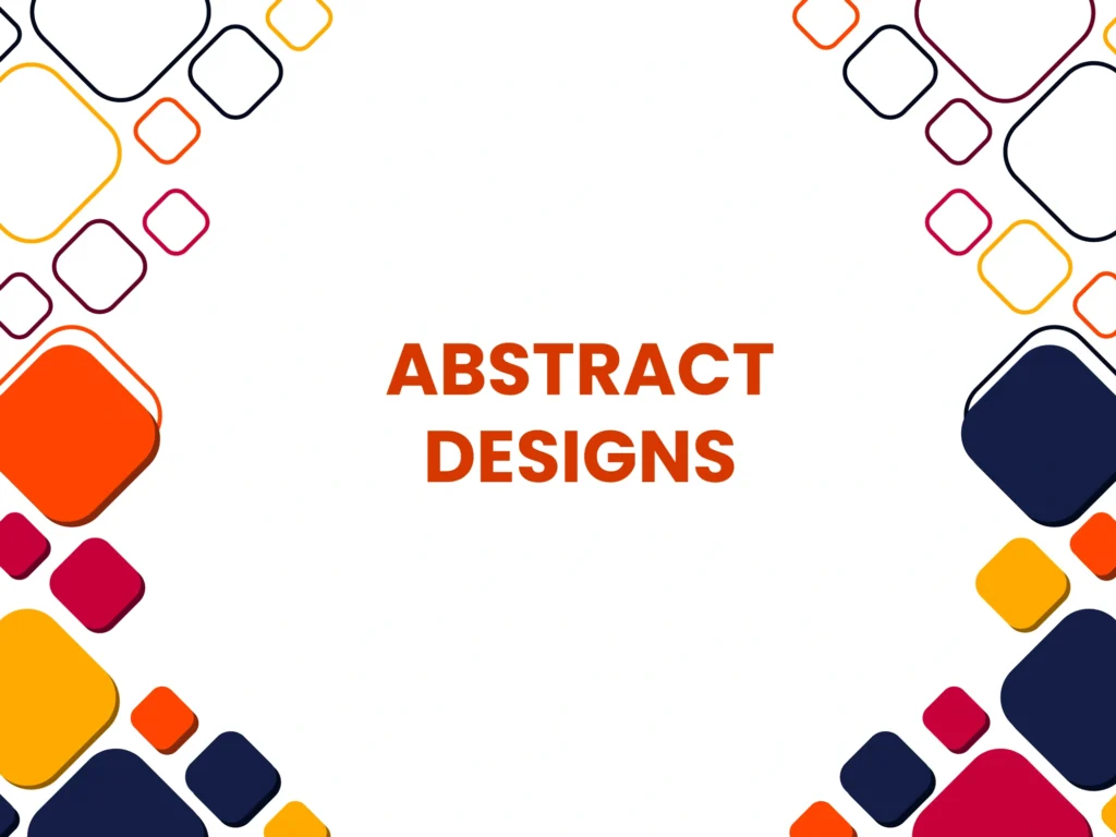
The abstract design focuses on expressing emotions, ideas, or concepts through shapes, colors, and forms, often without representing real-world objects. This offers freedom of interpretation, allowing the viewer to make connections with the visual elements.
Abstract design thrives on dynamic composition, color theory, and the creative use of shapes, often blending organic and geometric forms in innovative ways.
Characteristics
- Typography: Often experimental, with fragmented or distorted letterforms that complement abstract visuals.
- Imagery: Geometric shapes, organic forms, and splashes of color.
- Color Palette: Vibrant or muted tones, often with high contrast to emphasize certain elements.
- Layout: Asymmetrical designs focused on balance and harmony, sometimes chaotic yet aesthetically balanced.
Artists like Wassily Kandinsky and Piet Mondrian were pioneers of abstract art, and their influence extends to graphic design. Modern brands like Absolut Vodka incorporate abstract visuals in their campaigns to communicate creativity and energy.
The abstract design allows brands to evoke powerful emotions and communicate complex ideas without relying on literal imagery. It’s particularly effective in creative industries like art, fashion, and high-end branding, where conceptual communication is valued.
15. Vaporwave Design Style
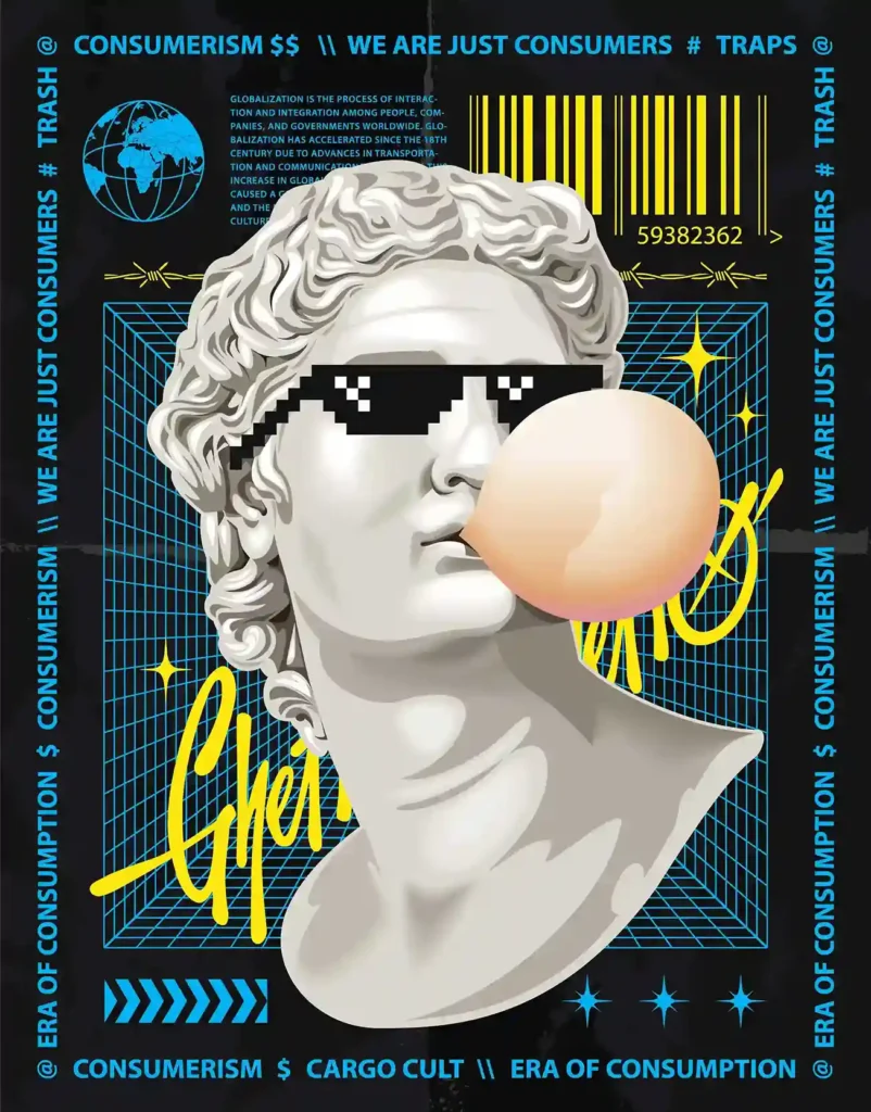
The vaporwave design style is a striking blend of retro-futuristic aesthetics, nostalgia, and sarcasm, often presenting visuals reminiscent of 80s and 90s pop culture. It combines neon colors, glitch art, pixelated graphics, ancient sculptures, and Japanese text to create surreal, dreamlike compositions. The style reflects themes such as consumerism and a longing for the past that feels familiar yet artificial.
Characteristics
- Color Palette: Bold neon colors such as pink, blue, and purple mixed with pastel shades.
- Visual Elements: Incorporates designs like ancient statues, retro computer graphics, VHS glitches, and sunsets that seem lifted from early video games.
- Cultural Touchpoints: Draws heavily on 80s advertisements, 90s internet aesthetics, and cyberpunk themes.
- Philosophy: Explores critiques of consumerism, technology, and the digital era, often through a satirical or melancholic lens
The Vaporwave aesthetic has influenced digital art, fashion, and even mainstream media. Popular examples include music videos like The Weeknd’s Blinding Lights, TV shows such as Stranger Things, and video games like Hotline Miami. These works leverage Vaporwave’s unique ability to blend nostalgia with futuristic overtones
This style’s captivating mix of retro and modern makes it ideal for creating visual art and branding projects that aim to stand out by evoking both familiarity and innovation.
16. Kawaii: The Charm of Cuteness in Graphic Design
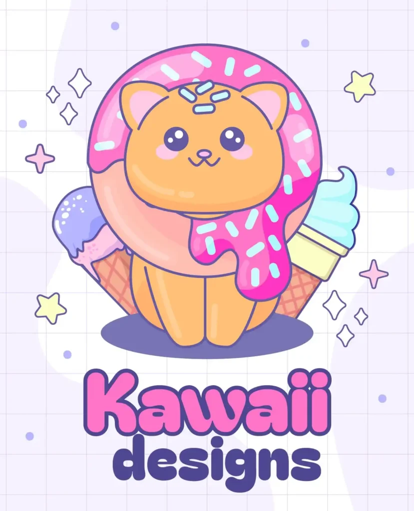
The kawaii style comes from Japan and focuses on cuteness and playfulness. This style includes fun designs with bright, soft colors and childhood themes. It often features big, exaggerated facial expressions, simple shapes, and soft textures. Its appeal lies in making people feel happy and nostalgic, using a cheerful and straightforward approach.
Characteristics
- Visual Elements: Bright, pastel hues dominate the palette, with soft pinks, baby blues, and creamy yellows being particularly popular. Iconic characters like Hello Kitty exemplify this aesthetic with their simple yet adorable designs.
- Typography: Kawaii fonts are often rounded, bubbly, and playful, adding to the childlike charm.
- Imagery: The style incorporates motifs like hearts, stars, clouds, and cuddly animals, alongside humanlike objects like smiling food items or stationery.
- Cultural Significance: It extends beyond design into fashion, lifestyle, and consumer products, becoming a global symbol of fun and carefree creativity
Kawaii aesthetics thrive in industries that appeal to younger audiences or those seeking to convey a message of friendliness and warmth. From packaging and product design to digital illustration and animation, this style makes products accessible and enjoyable. It is also used in social media content, video games, and merchandise, increasing their emotional connection with audiences.
Subgenres of Kawaii
- Gurokawa: Combines grotesque elements with cuteness, creating a “creepy-cute” aesthetic that contrasts with traditional Kawaii’s innocence.
- Erokawa: Blends cute visuals with a slightly provocative edge, often seen in adult-themed Kawaii fashion
The universal appeal of the Kawaii style lies in its ability to balance simplicity and expressive charm, making it an enduring favorite for brands and designers. Its adaptability ensures that it remains relevant in diverse cultural and artistic contexts.
17. Visible Grid Lines: Structuring Graphic Design with Precision
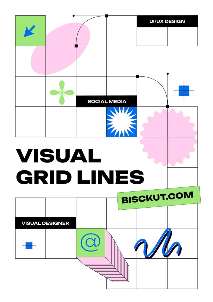
Visible grid lines refer to the intentional inclusion of a grid framework in graphic design. Traditionally used as hidden guides to align elements, these grids are made a visible part of the design, blending functionality with aesthetics. The use of grid lines creates a structured and modern appeal, emphasizing clarity, organization, and balance in the composition.
Characteristics
- Alignment and Symmetry: The grid provides a clear visual structure, ensuring all elements are aligned harmoniously. It enhances readability and visual flow.
- Transparency of Process: By making the grid visible, the designer highlights the construction of the composition, often giving it a technical or minimalist look.
- Neutral Color Palettes: Often, subtle gray or light tones are used for the grid lines, contrasting softly with bolder design elements.
- Flexibility Across Media: Visible grids can be used in print layouts, UI/UX designs, and modern digital art to emphasize structure.
Modern tech companies, especially those focusing on user-centric design, like Adobe or Squarespace, often incorporate visible grid lines in tutorials or UI wireframes. This approach reflects a commitment to usability and transparency, resonating with audiences seeking clarity.
The visible grid line design appeals to audiences who value precision and intentionality. It’s ideal for brands or projects emphasizing modernity, professionalism, and a blend of technical finesse with creative flair.
In Conclusion
Mastering graphic design styles is essential to creating designs that not only stand out but also connect with audiences on a deeper level. Each style brings with it its own unique set of visual elements, emotional triggers, and cultural relevance, making it important for designers to carefully select the right approach for their project. Whether you’re inspired by the dynamic, playful energy of Pop Art, the structured clarity of Swiss design, or the timeless beauty of Art Deco, these graphic design styles offer endless possibilities to enhance your work and effectively communicate your message. Understanding their nuances will enable you to create designs that are both visually appealing and strategically impactful.

