2024 Logo Design Trends: How to Keep Your Brand Fresh and Modern
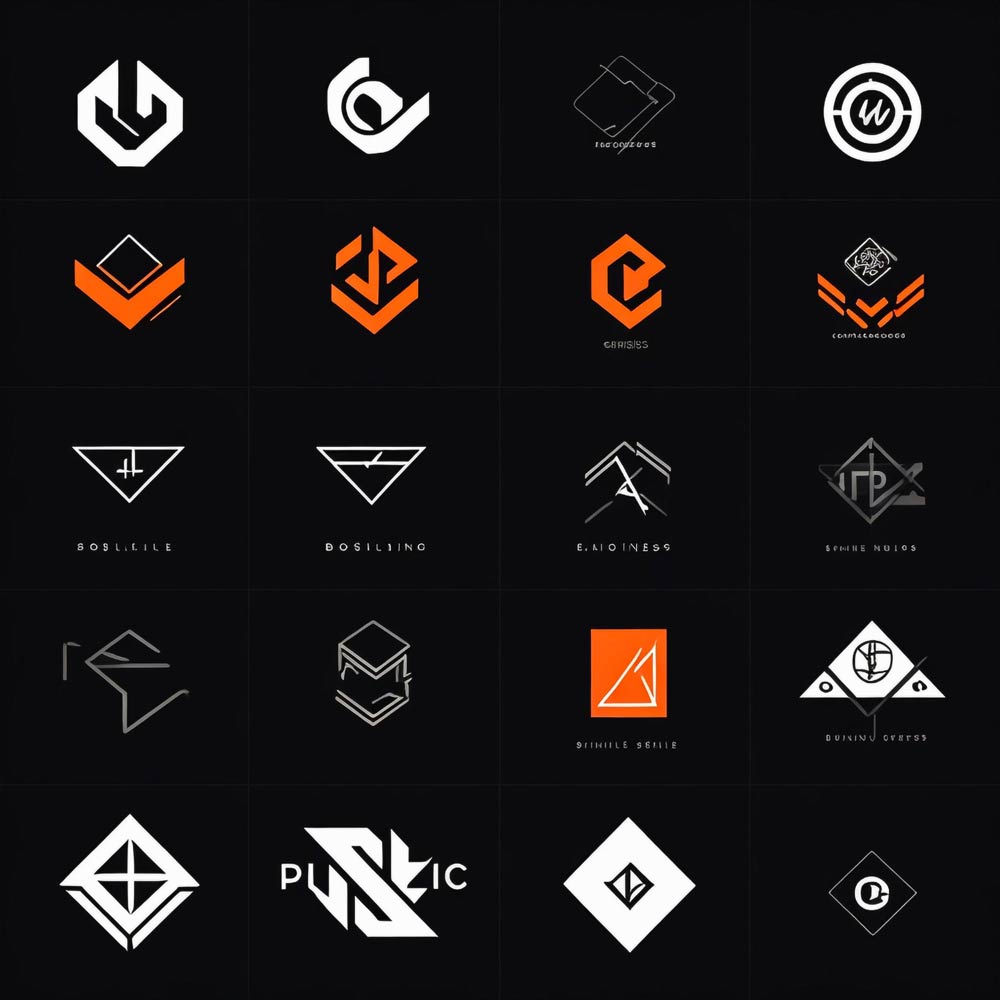
As we enter 2024, logo design is constantly evolving, bringing new ideas and innovative concepts that redefine brand identity. We’re seeing a shift toward designs that not only grab attention but also resonate with today’s audience.
Whether you’re a designer looking to stay ahead of the curve or a brand looking to refresh its image, understanding these top 10 trends will help you keep your logo fresh and modern.
1. Minimalism with a Bold Twist
Minimalism is still popular, but in 2024, it’s about to get a bold update. Designers keep the logo simple, but add a little something extra – like a bright color or an unusual shape – that makes the design stand out.
This trend aims to keep things clean and straightforward, while also making sure the logo grabs attention.

For example, Apple’s logo is simple, but when they use bold colors for special editions, it gives the minimalist design a fresh, exciting look. This approach not only helps create a strong brand identity, but also ensures that the logo remains versatile across different media, from digital screens to print.
Case Study: Apple’s Product (RED) Campaign
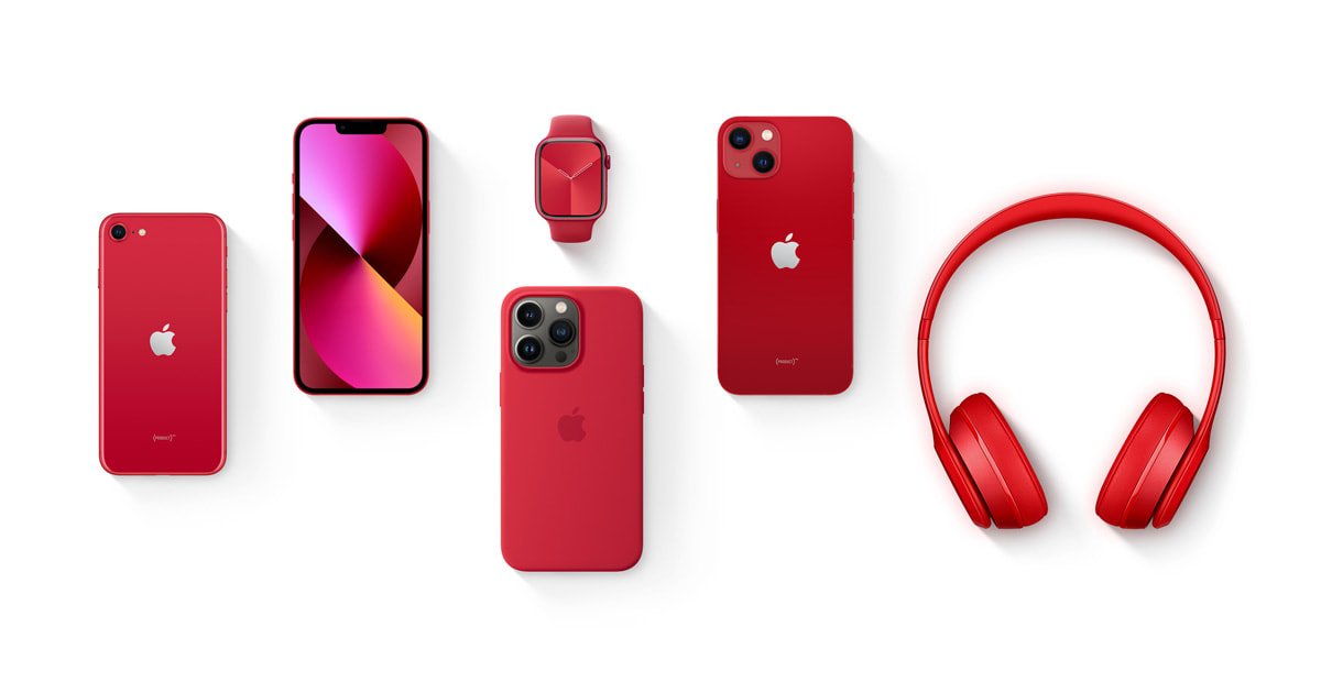
Apple’s Product (RED) campaign is a great example of minimalism with a bold twist. Normally, Apple’s logo is all about simplicity, but during this campaign, they change it to a bright red color. This small change makes a huge impact.
It not only grabs your attention, but also shows Apple’s commitment to fighting AIDS, as a portion of sales go to the Global Fund. This case shows how a simple logo can be made much more powerful with a touch of bold color.
2. Dynamic Logos That Adapt
This year, we’re seeing more brands using dynamic logos—logos that can change based on where they’re used. These logos can change in color, size, or shape depending on the platform or time of day.
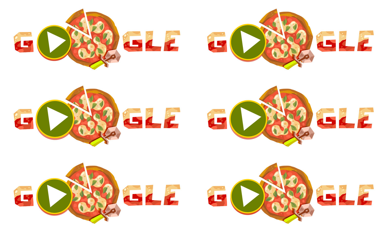
Google is a great example of this with its changing doodles. These adaptive logos keep a brand fresh and relevant, especially in today’s fast-paced digital world.
Case Study: Google Doodles
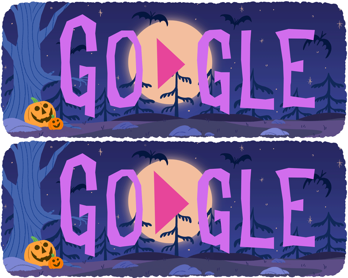
Google Doodles are a great example of a dynamic logo. These logos often change to celebrate holidays, commemorate important events or honor famous people.
For example, on Halloween, the logo might be spooky and on International Women’s Day, it might feature women making history. These changes keep the brand fun and interesting, showing how flexible logos can help keep a brand fresh and connected to its audience.
3. Retro Revival with a Modern Flair
Retro designs are coming back, but with a makeover that makes them more relevant to today’s world. Designers are combining vintage styles like old-fashioned fonts and muted colors with modern design elements.
This creates logos that are reminiscent of a bygone era but still look up-to-date. A good example of this is Pepsi, which recently modernized its logo by combining its classic look with simple, bold lines that appeal to both old and new audiences. This trend enhances a sense of familiarity while refreshing the brand’s image, creating a bridge between the past and the present.
Case Study: Pepsi’s Logo Evolution
The evolution of Pepsi’s logo is a perfect example of a retro revival with a modern touch. Over the years, Pepsi has maintained its classic circular shape and red, white and blue colors, which remind people of the past. But the latest version is simple and bold, making it fresh and modern.
This balance between old and new helps Pepsi connect with older customers, while also appealing to a younger audience, showing how retro elements can be updated for today’s market.
4. Vibrant Color Gradients
Color gradients are back in a big way, but they’re much more complex than before. In 2024, designers are using gradients to add depth and movement to logos, making them eye-catching and vibrant.
Instagram’s logo is a perfect example of this—it uses a colorful gradient that blends pink, purple, and orange colors to create a logo that’s instantly recognizable and vibrant. This trend helps logos stand out in crowded digital spaces and adds a layer of visual interest that can make a brand more memorable.
Case Study: Instagram’s Rebrand
When Instagram changed its brand in 2016, it moved away from the elaborate camera logo to a simple, vibrant gradient icon. The gradient, with its bright pink, purple, and orange colors, made the logo look modern and fresh.
It also made Instagram’s app instantly recognizable. This case shows how a colorful gradient can refresh a brand’s image and make it more appealing.
5. Hand-Drawn and Personalised Touches
In a world full of digital design, hand-drawn logos stand out. More brands are using hand-drawn elements to give their logos a personal, human touch.
These logos often feature unique lines and custom illustrations that make them appealing and accessible.

For example, Ben & Jerry’s uses a hand-drawn style in its logo and packaging, giving the brand a fun and friendly vibe that resonates with people who appreciate creativity and authenticity. This trend is also effective in creating a sense of originality and differentiating the brand from competitors.
Case Study: Ben & Jerry’s Branding
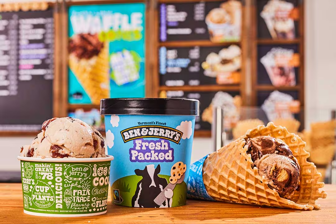
Ben & Jerry’s uses hand-drawn elements in its branding to make the company feel more friendly and down-to-earth. The playful lines and illustrations on their logo and packaging stand out among other brands that use flashy, digital designs.
For example, the hand-drawn cows on their packaging remind customers that Ben & Jerry’s sources its ingredients from small family farms. This case shows how hand-drawn elements can make a brand feel more genuine and creative.
6. Abstract and Asymmetrical Designs
Abstract and asymmetrical logos are becoming more popular as brands look for ways to stand out. These logos don’t follow traditional rules – they may use unusual shapes or layouts that are unexpected and refreshing.

The Adidas logo is a great example of this – the three stripes form an abstract shape that suggests a mountain, reflecting the brand’s adventurous spirit. This trend is perfect for brands that want to push boundaries and stand out from the crowd, creating a modern and innovative visual identity.
Case Study: Adidas’ Three Stripes
Adidas’ three stripes logo is a powerful example of abstract design. Created to distinguish their shoes, the three stripes have become a symbol for the brand.
This design suggests speed and energy, which fits well with Adidas’ focus on sports. Over time, the logo has remained the same but has been adapted for different uses, from shoes to clothing and digital media. This shows how a simple, abstract design can create a powerful brand symbol.
7. Vivid and Electric Colors
Bright, electric colours are coming into vogue in 2024. These vibrant colours are especially popular in the digital space, where they can really make a logo stand out.
Neon colours, bold colours and surprising colour combinations are being used to grab attention and represent energy.

Spotify often uses electric greens and purples, which makes their logo not only stand out but also feel energetic and youthful. This trend helps create a vibrant brand presence that resonates with a younger audience and attracts attention in a visually crowded online environment.
Case Study: Spotify’s Brand Colors
Spotify uses bright, electric colours to create a strong and vibrant brand image. Their use of bright green, often mixed with black or purple, makes their logo stand out both online and offline.
These colours make Spotify look modern and energetic, which appeals to young people who love music and technology. This shows how the use of bold colours can make a brand more memorable and exciting.
8. Geometric Patterns and Shapes
Geometric patterns and shapes are making a strong comeback. These elements add structure and make logos interesting to look at.
Designers are using circles, triangles, and other shapes to create logos that are simple but powerful. MasterCard’s logo, with its two overlapping circles, is a great example of how geometry can create a logo that is both modern and meaningful.
This trend is ideal for brands that want to convey a sense of precision and reliability while maintaining a sleek and contemporary look.
Case Study: Mastercard’s Logo Rebrand
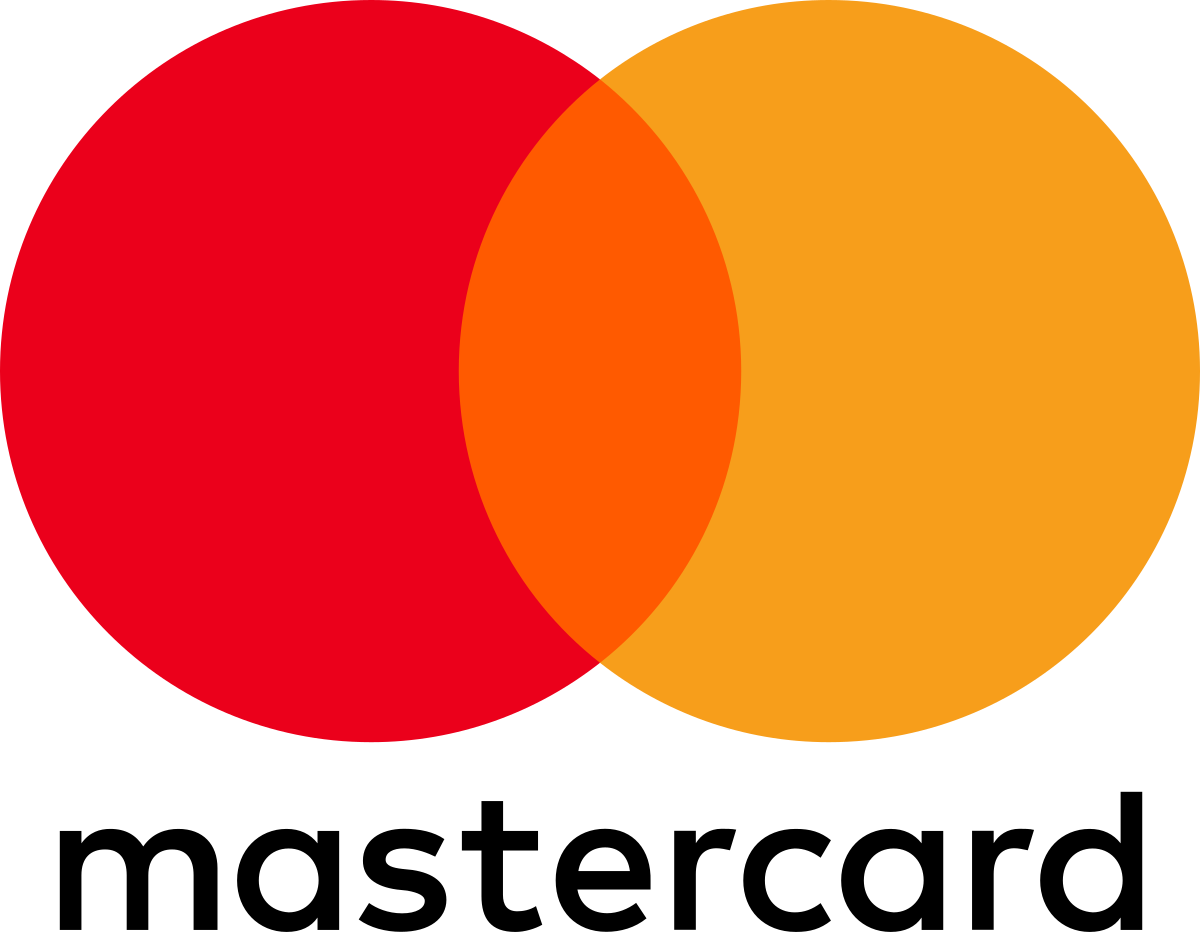
MasterCard’s logo rebrand in 2016 is a great example of the use of geometric shapes. They simplified their logo to two overlapping circles, making it flat and modern. This change not only made the logo up-to-date, but also made it easier to recognize around the world.
Simple shapes in a logo convey a message of trust and reliability, which is important for a financial brand. This rebrand shows how using basic geometric shapes can keep a logo timeless and adaptable.
9. Negative Space Mastery
In 2024, designers are using negative space in innovative ways to create logos that are both clever and eye-catching.
Negative space refers to the empty areas around and between the subjects of an image, and when used creatively, it can reveal hidden elements or messages within a logo.
This trend is all about subtlety and intelligence, turning a simple design into a thought-provoking visual puzzle.
Case study: FedEx’s Hidden Arrow
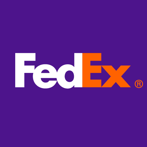
The FedEx logo is a great example of negative space mastery. Within the simple design, the space between the “E” and the “x” cleverly forms an arrow, symbolizing speed and precision.
This hidden element is not immediately obvious, but once noticed, it leaves a lasting impression.
10. Layered Typography
There is a greater focus on typography in 2024, with designers experimenting with layered and complex text styles. Logos that use layered typography create depth and make the text an important part of the design.

The New York Times has updated its classic typeface by adding text layering and subtle textures, making the logo both authoritative and fresh.
This trend helps create a distinctive brand identity where typography becomes a central visual element, adding uniqueness and modernity to the logo.
Case Study: The New York Times’ Typeface Update
The New York Times typeface update is a great example of how layered typography can modernize a brand. The newspaper’s logo, with an old-fashioned font, was updated to add more depth and clarity.
By making small changes to the thickness and spacing of the letters, the designers made the text easier to read while retaining its classic look.
This update gives the logo a more three-dimensional feel, making it stand out more in print and online. This case shows that even small changes to typography can keep a brand fresh while staying true to its roots.
Learn More about typography “here”
How to Keep Your Logo Fresh and Modern?
To keep your logo fresh and modern, it’s important to stay up to date with the latest trends while staying true to your brand identity.
Don’t follow trends just because they’re popular—choose trends that fit your brand values and appeal to your audience. A good logo should be timeless but also flexible enough to evolve with your brand.
Final Thoughts
2024 is all about bold, creative, and innovative logo design. By embracing these trends, you can keep your brand fresh, modern, and relevant to today’s audience.
Whether you’re updating an existing logo or creating a new one, these insights will help you create a design that’s on trend and right for your brand.
Are you ready to update your logo? Start exploring these trends and designs with the future in mind!

