What is Brutalism in Graphic Design?
Brutalism in graphic design is all about raw, unrefined elements, reflecting its roots in architecture. To me, it feels like a style that deliberately avoids the smooth, polished look of modern design. Instead, it goes for sharp edges, simple shapes, and limited colors. It focuses on features rather than aesthetics. This style doesn’t try to be “pretty” in the traditional sense, which is why it stands out. It challenges common design standards, which is why I think it’s perfect for brutalist posters – where making a strong impression is important.
Key Elements of Brutalist Poster Design
Bold Typography
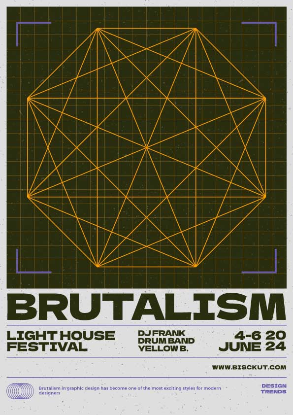
One of the most notable features of Brutalist posters is the bold, oversized typography. In my designs, these elements are not meant to be decorative; they serve a purpose – to get the message across loud and clear. I often use heavy, sans-serif fonts, which help create that raw, straightforward feel.
Raw, Geometric Shapes
A big part of Brutalist poster design is the use of simple geometric shapes. In my projects, I like to play with squares, rectangles, and circles, arranging them in a way that they seem almost mechanical. These shapes add to the raw, honest vibe of the design, breaking away from the polished look of modern styles.
Limited, High-Contrast Colors
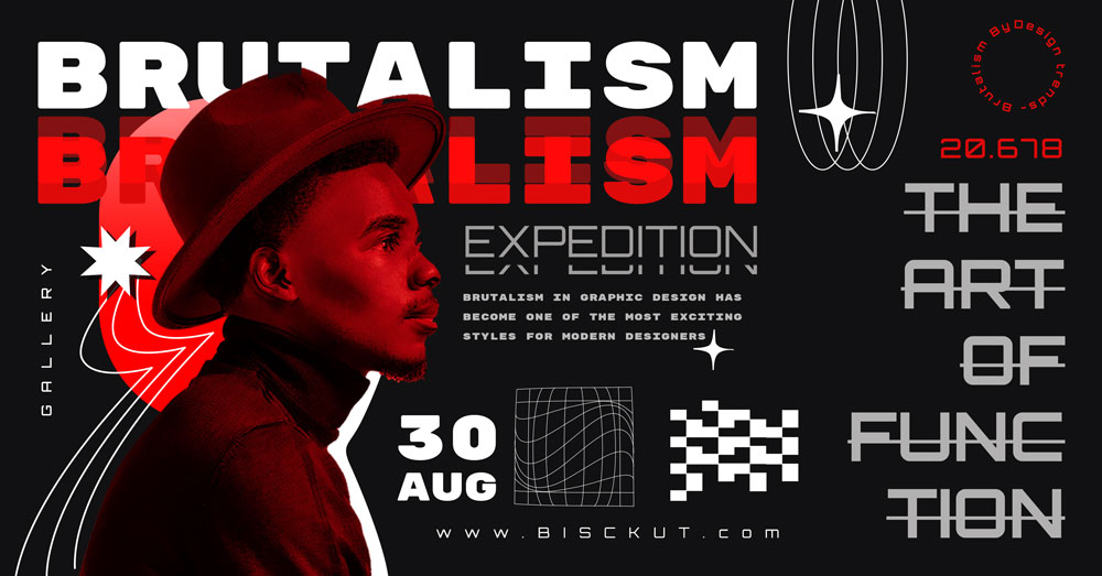
I like to keep colors simple when working in the Brutalist style. Most Brutalist posters stick to basic colors like black, white, and maybe one bright color like red or yellow. The contrast between these few colors makes the design pop and draws attention.
Textured and Unpolished Look
Brutalism rejects perfection, and I always strive for a rough, textured finish in my designs. This could be through grungy backgrounds, rough edges or even pixelated parts that give the poster a grainy feel.
Asymmetry
In Brutalism, symmetry is not a priority. I’ve learned that the style thrives on asymmetry, which connects the viewer to the design. This off-balance look is one of my favorite ways to give a poster an edgy and unique feel.
How to Design a Brutalism Poster: Step-by-Step Tutorial
Start with a Simple Layout
Before choosing colors or fonts, I recommend starting with a basic layout. This helps you figure out where important elements like text and images will be placed. Brutalism designs often adopt a raw, harsh look, so you don’t have to worry about everything looking perfect at this stage. If you’re using an image, place it first to build the design around it. The goal here isn’t to keep it clean, but to make sure the elements look bold and impactful.
Pick Bold Fonts
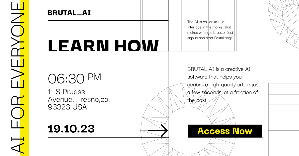
Fonts are a key feature of Brutalism design. Always choose bold, oversized, sans-serif fonts to create a strong, attention-grabbing message. The font shouldn’t just look good – it should communicate clearly. My favorite fonts for this style are Montserrat Black, Helvetica or similar, as they give off a raw, industrial feel.
Keep the Colors Simple
Brutalism designs use only a few colors, usually just 1 or 2. I like to use black and white and sometimes add a bright color like red or yellow. This makes the design stand out without being too busy. To add depth, I often use gradient maps with colors, which takes us to the next step.
Use Gradient Maps with Texture
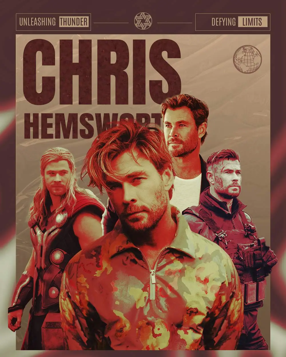
One of my favorite techniques in Brutalism design is applying gradient maps and adding noise or grain. Gradient maps help the colors blend together, and the noise or grain effect gives the poster a grainy, rough look. These details may seem small, but they make a huge difference in the poster’s uniqueness and modernity.
Add Simple Shapes
Once you’ve set the font and color, it’s time to add simple shapes. I like to use square, rectangular, round, and geometric shapes. These shapes can frame text or act as dividers, giving structure to the design while still keeping it raw and unrefined. Arranging these shapes unevenly makes the design feel fresh and unexpected.
Add Texture and Grain
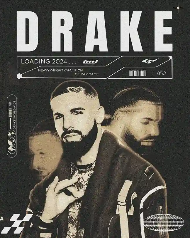
Textures are what make Brutalist posters stand out. I always add grain, rough edges or grunge effects to give the poster a realistic look. These textures give the poster a real, raw and professional look, and prevent it from looking too polished, which goes against the Brutalist style.
Final Tweaks: Adjust the Layout and Details
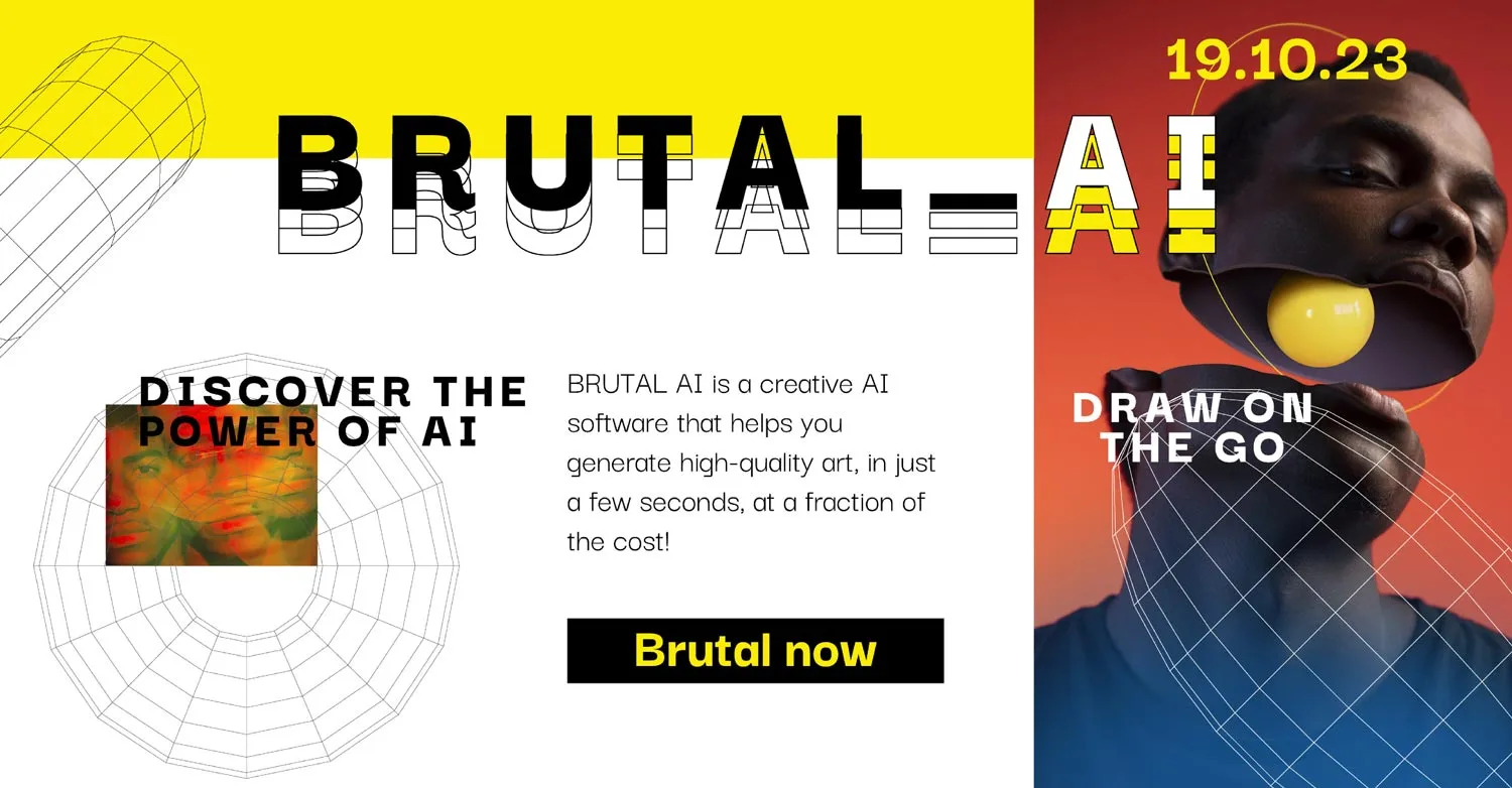
The final step is to refine your design. Adjust the placement of text, shapes, and any images until everything looks balanced. I often make small changes to gradient maps and texture effects in this step to make sure everything works well together.
The Rise of Acid Poster Design
Acid poster design emerged alongside Brutalism, but it is a much more vibrant and chaotic style. What I like about it is how it combines bright neon colors with distorted fonts to create a wild, eye-catching look. In contrast to the raw and rough elements of Brutalism, acid posters are loud, energetic, and full of movement.
One important thing about acid posters is their strong connection to underground music scenes, particularly electronic music and rave culture. These posters were designed to match the rebellious, free-spirited atmosphere of those events. By using neon colors and funky, twisted fonts, acid posters make a bold statement and draw you in, as if inviting you to the experience itself.
Glastonbury Music Festival
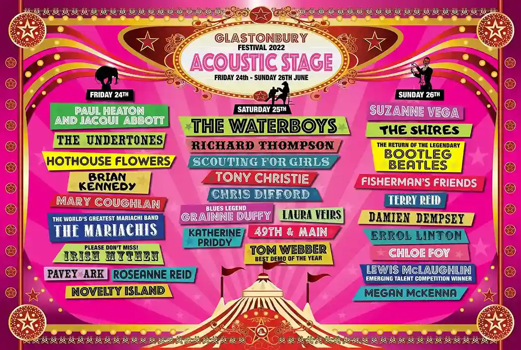
A great example of an acid poster design appeared at the 2022 Glastonbury Music Festival. The design team took inspiration from vintage rave posters, but gave them a modern twist. They used neon pinks and yellows on a dark background to make the colours pop. The text was stretched out and wavy, giving it a fun, fluid vibe, almost looking like it was in motion. It fits perfectly with the festival’s theme of creativity and expression.
The posters were a huge hit, especially on social media. Engagement on their posts increased by 40% compared to last year, which shows just how effective and attention-grabbing acid poster designs can be for big events.
Famous YouTube Channels to Learn Brutalism Poster Design
If you’re eager to learn more about brutalism poster design, several YouTube channels provide excellent tutorials and tips. Here are my top picks:
- Satori Graphics: They offer a wide range of graphic design tutorials, including minimalism and brutalism, broken down into easy-to-follow steps.
- The Futur: Led by Chris Do, this channel covers design principles and branding, often touching on emerging trends like Brutalism.
- Dansky: Known for easy-to-digest tutorials on Photoshop and Illustrator, Dansky has great content on minimalist and geometric designs that align with Brutalism.
- Adobe Creative Cloud: The official Adobe channel frequently posts tutorials on poster design trends, including experimental styles like Brutalism and acid posters.
Where Can I Find Brutalism Poster Elements?
If you’re looking to design brutalist posters, these are my favorite places to find elements:
- Creative Market: They offer a huge variety of brutalist fonts, textures, and templates perfect for creating unique designs.
- Envato Elements: With unlimited downloads, Envato is great for experimenting with different elements without breaking the bank.
- Brutalist Websites: These sites showcase real-world examples of Brutalism, offering inspiration and downloadable elements.
- Behance and Dribbble: I love browsing these platforms for fresh ideas and sometimes picking up free design assets.
- Free Design Resources: Sites like Pexels and Unsplash offer high-quality free images and textures that I often use as backdrops in brutalist designs.
Famous Brands Adopting Brutalism in Their Designs
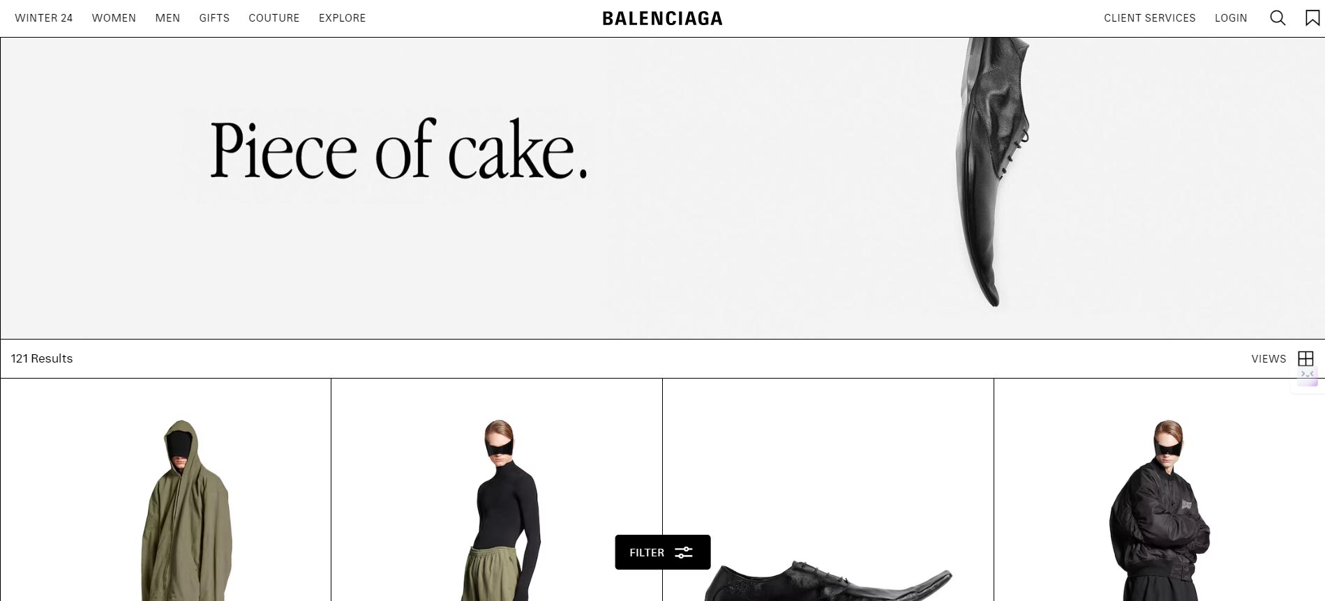
Brutalism isn’t just for niche designers. Big brands are adopting the style as well. For example, Balenciaga’s website uses a brutalist design, with oversized text and a simple black-and-white layout.

Bloomberg Businessweek also adopted brutalist elements in its redesign, proving that this bold style works for both high-end fashion and media.
Where Brutalism Fits in Today’s Graphic Design Trends
As we head towards 2025, brutalism is making a strong comeback. I think it’s the perfect contrast to the polished, sleek designs we see everywhere else. For brands that want to stand out – especially in the world of art, music or film – brutalist posters offer an authentic way to break the pattern.
Conclusion
Brutalism in graphic design offers a fresh break from the smooth, clean trends that have been popular in recent years. Whether you’re designing Brutalist posters or experimenting with acid poster design, the raw, bold style of Brutalism helps your work stand out. With its bold font, simple shapes, and focus on functionality, Brutalism is here to stay – and I believe it will become even more dominant in poster design as we move into 2025.


