Corporate Designs That Work: Build a Consistent Brand Identity
Building a recognizable and relevant brand image is crucial for any business. Design plays a key role in shaping how customers recognise your brand. From logos and colors to typography and brand guidelines, every graphic element defines your company’s identity. But how do you develop a design that stands out and works effectively? In this guide, we’ll break down the important points, offer tips for maintaining consistency, and discuss how to avoid common creative blocks.
1. Why Corporate Designs are Important?
Corporate design isn’t just about aesthetics; it’s about how your brand communicates with its audience. A well-executed design builds trust, enhances recognition, and can even influence a customer’s decision to choose your product or service. In today’s digital world, where brands extend across multiple platforms, maintaining a consistent and appealing design is more important than ever.
Whether you’re starting a new business or modernising an established brand, your design should reflect professionalism, uniqueness, and authenticity. It’s not just about looking good—it’s about telling a story that connects with your target audience.
2. What are Corporate Designs?
Corporate design refers to the visual identity of your company. It includes your logo, typography, color palette, and other graphic elements that shape the overall look and feel of your brand. While branding covers everything from messaging to strategy, corporate design focuses mainly on the graphics that communicate your brand’s personality and values.
Consider your logo as the face of your brand. A clean, modern logo can convey innovation and professionalism, whereas an outdated or cluttered design may give the impression that your company is disconnected from modern trends.
3. Elements of Effective Corporate Designs
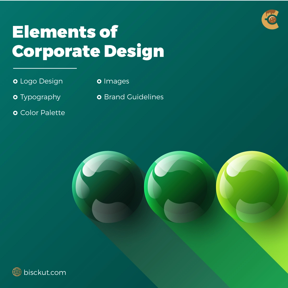
To create a powerful and unique corporate design, focus on the following key elements:
Logo Design
The logo is the most recognizable part of your brand. A great logo is simple, memorable, and adaptable across different platforms. Trends today favor minimalist designs and responsive logos that adjust perfectly to various screen sizes, making them mobile-friendly.
Instead of only focusing on aesthetics, ensure your logo is versatile and unique. Think about how it will appear in different sizes and formats. For example, a simplified version of your logo can be used as an app icon, ensuring consistency across both digital and print platforms.
Typography

Fonts communicate a lot about your brand’s personality. A bold, modern typeface might evoke strength and innovation, while a traditional serif font can imply trust and reliability. Make sure to choose fonts that match your brand’s identity and use them consistently across all your marketing platforms.
Choose a primary and secondary font that complement each other. To improve user experience, establish a clear hierarchy—primary fonts for headlines and secondary fonts for body text. Additionally, ensure readability on both small mobile screens and large desktop displays, as well as in print materials.
Color Palette
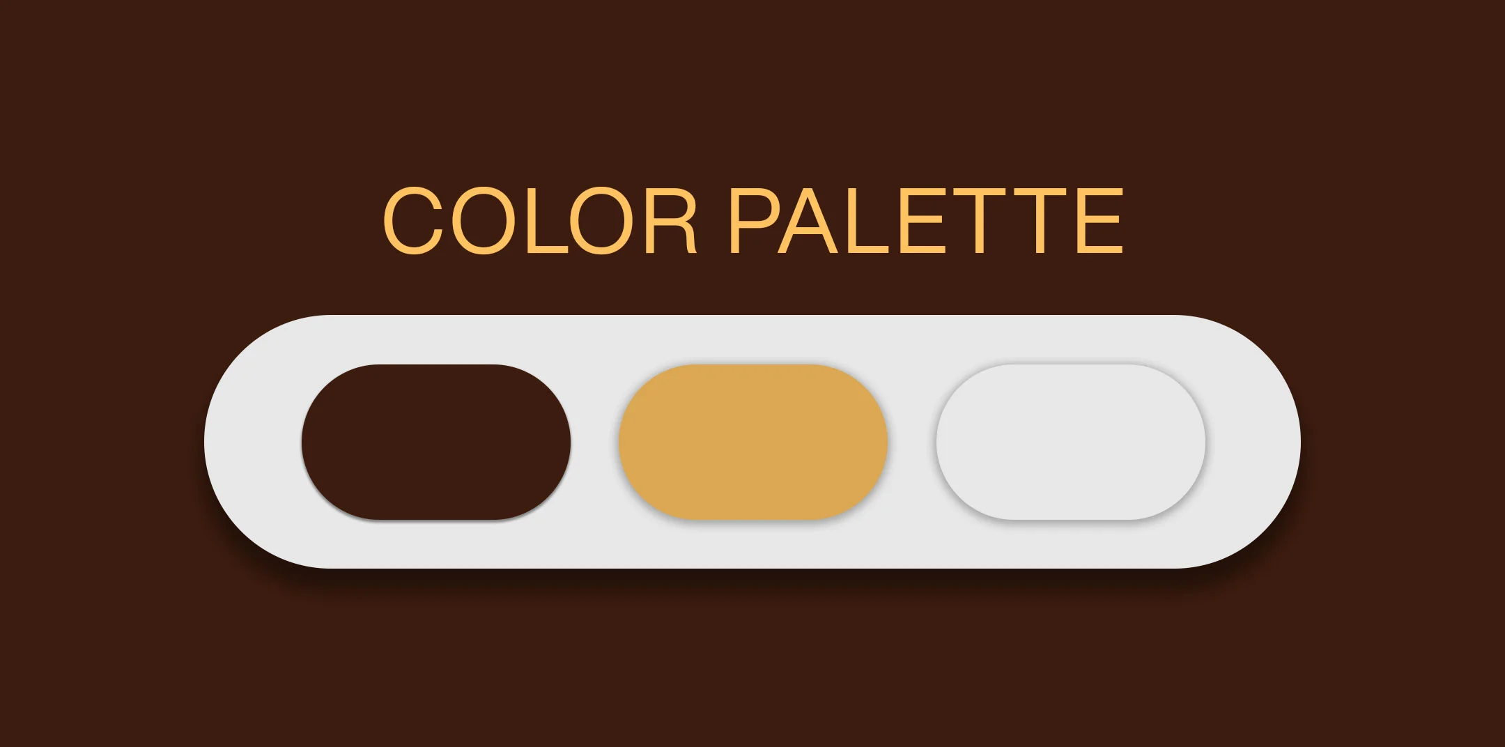
Colors are powerful tools for evoking emotions and shaping insights. For example, blue is often associated with trust and professionalism, which is why financial institutions and tech companies favour it. Green, on the other hand, suggests health, nature, and sustainability, making it a popular choice among environmentally conscious brands.
Once you’ve chosen your color palette, apply color psychology to target your audience effectively. If your brand is eco-friendly, shades of green will signal a connection to nature, while cool blues can enhance the feeling of trust. Create a palette that includes primary colors, accent colors, and neutral tones, ensuring you provide both print (CMYK) and digital (RGB/HEX) codes in your brand guidelines.
Images
The photos, illustrations, and graphics you choose should reflect your brand’s message and identity. High-quality graphics strengthen your brand, while low-quality images can decrease your credibility.
Brand Guidelines
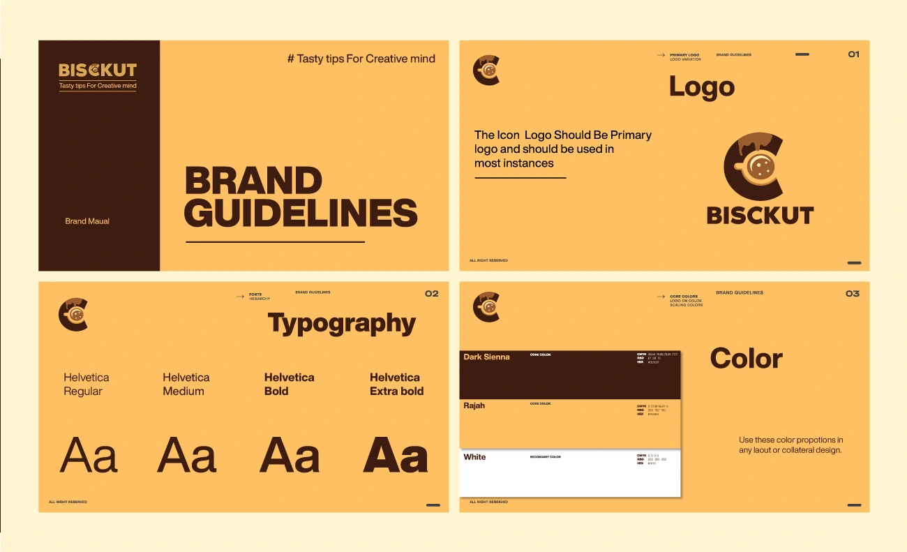
A comprehensive set of brand guidelines ensures your corporate design remains consistent across all platforms—whether digital or print. These guidelines should include logo usage, color codes, typography rules, and image style. Consistency is important for building a strong brand identity.
4. Designing a Consistent Brand Identity

Maintaining consistency is important for establishing trust and brand recognition. Think of iconic brands like Apple or Coca-Cola. No matter where you have seen them—on a billboard, online, or in-store—their brand identity is always consistent. This doesn’t happen by accident; it’s the result of strictly following brand guidelines and attention to detail.
Your brand’s design should maintain consistency across all places, from your website and social media profiles to your packaging and even employee uniforms. The goal is to ensure that everything looks like it belongs to the same cohesive brand family.
While consistency is necessary, it’s equally important to adapt your design to specific platforms. For example:
- Social Media: Keep profile pictures, cover images, and post templates aligned with your brand guidelines.
- Print: Ensure that business cards, brochures, and social media platforms reflect the same colors, fonts, and logo placement.
5. Corporate Logo Designs: Trends and Best Practices
Logo design is continuously evolving. Staying current with the latest trends can help keep your brand fresh and relevant. Here are some of the latest trends in logo design:
- Minimalism: Clean, simple logos are easier to recognize and more versatile across various platforms.
- Responsive Logos: With the rise of mobile devices, logos that adapt in size and shape to different screen sizes are becoming more popular.
- AI-Generated Logos: Artificial intelligence is making its way into the design world, allowing for unique, data-driven logo designs.
6. The Role of Color Psychology in Corporate Design
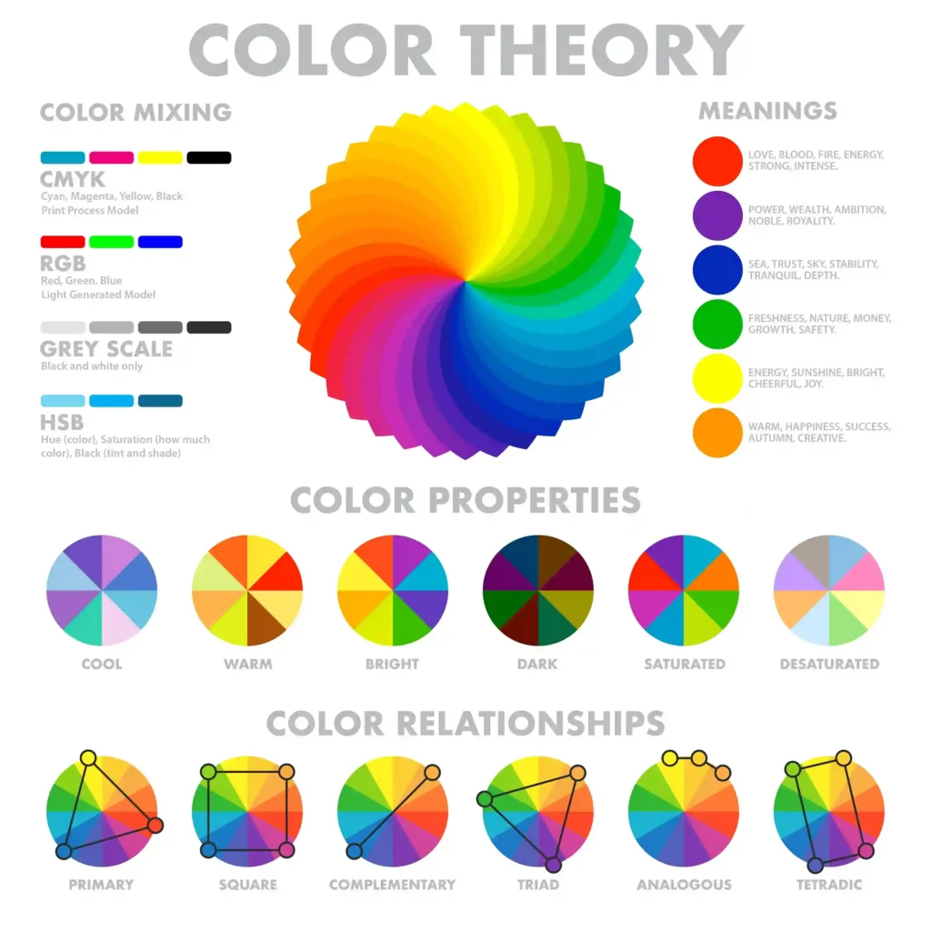
Colors play a significant role in how people identify your brand. Understanding color psychology can help you create a corporate design that resonates emotionally with your audience:
- Blue: Represents trust, professionalism, and calm, making it a popular choice for finance and tech industries.
- Red: Evokes urgency and excitement, commonly used in retail and fast food.
- Green: Symbolizes health, nature, and sustainability, which is why eco-friendly brands favor it.
Selecting the right color palette for your industry can significantly impact your brand’s identity.
7. Creating and Using Corporate Branding Guidelines
Brand guidelines are vital for maintaining consistency across your corporate design. They ensure that everyone involved in your brand’s visual creation—from designers to marketers—follows the same rules.
Here’s what your brand guidelines should cover:
- Logo Usage: Specify how your logo should appear on different backgrounds and in varying sizes.
- Color Codes: Include exact color codes (RGB, HEX, CMYK) to ensure consistent colors in both print and digital formats.
- Typography: Define which fonts to use and where to apply them.
- Imagery: Provide guidelines for photography and graphic styles to ensure a strong visual identity.
Beyond creating guidelines, make it easy for your team to maintain consistency by offering downloadable templates for social media posts, business cards, or presentations. Tools like Canva or Adobe Spark can also be used to create editable templates for non-designers.
8. Corporate Design Templates: Free Resources
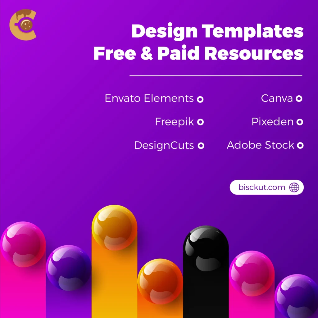
Offering free corporate design templates is an excellent way to help businesses, especially smaller ones, maintain design consistency while saving time. Templates ensure that even without a dedicated design team, your brand’s graphics stay consistent.
Use templates that are both practical and visually appealing. Examples include templates for business cards, letterheads, social media posts, and email signatures. Make sure these templates are available in multiple formats (e.g., PSD, AI, or Canva) to meet different users’ needs.
Here are some websites where you can download high-quality design resources:
- Canva
A popular platform offering a wide variety of free design templates for business cards, social media posts, presentations, and more. The user friendly drag-and-drop interface makes it easy to customize designs, even for non-designers.
Website: Canva - Envato Elements
Envato provides a huge collection of corporate design templates, including logos, letterheads, and branding kits. While it is subscription-based, it offers a great variety of high-quality resources for professional designers.
Website: Envato Elements - Freepik
Freepik is a grear resource for finding free and premium design assets, from corporate templates to vector graphics. It offers thousands of free design templates for business cards, posters, and more in editable formats.
Website: Freepik - Pixeden
Pixeden offers premium and free graphic resources, including a variety of corporate templates like business cards, brochures, and more. They have both free and paid versions of high-quality templates.
Website: Pixeden - DesignCuts
DesignCuts provides bundles of templates, fonts, and other design elements. While some resources are paid, they often offer high-quality free resources, and their bundles provide value for larger projects.
Website: DesignCuts - Adobe Stock
For Adobe users, Adobe Stock offers thousands of professionally designed corporate templates, including presentation slides, letterheads, and logos. While it’s subscription-based, Adobe frequently offers free trials and resources.
Website: Adobe Stock
9. Corporate Identity Design for Small Businesses
Small businesses often face unique challenges when it comes to corporate design due to limited budgets and resources. However, good design is just as important for small brands as it is for larger corporations.
Here are some tips to help small businesses create a strong corporate design:
- Start with a Simple Logo: A well-designed, simple logo can make a big impact.
- Create a Basic Style Guide: Even a simple style guide can help maintain consistency as your business grows.
- Focus on Key Platforms: Prioritize the platforms that matter most to your audience, like your website and social media channels.
Free and low-cost design software/tools like Canva, Figma, and Affinity Designer make it easier for small businesses to create professional designs. Encourage small business owners to start with a simple, memorable logo and gradually build their design assets as their brand grows.
10. Brands with Successful Corporate Design
Looking at real-world brands with successful corporate design can provide valuable insights. Brands like Apple and Nike are known for their design excellence, but smaller brands offer lessons as well.
- Apple: Their minimalist design philosophy has helped them become one of the most recognizable brands worldwide.
- Nike: Their consistent use of the “swoosh” logo and signature color scheme has built a powerful, iconic brand identity.
11. Common Mistakes to Avoid in Corporate Design
Even with the best intentions, brands can make design mistakes. Here are some of the most common ones:
- Inconsistent Logo Usage: Failing to stick to brand guidelines can lead to inconsistent logo usage, weakening your brand identity.
- Overcomplicating the Design: Simple, clean designs are usually more effective than cluttered, complex designs.
- Ignoring Typography: Fonts play an important role in how your brand is recognized. Using too many fonts can make your design look cluttered. Stick to two or three fonts to maintain a clear visual hierarchy. Go for font families with multiple weights so you can use bold fonts for headings and lighter fonts for body text, ensuring a professional and organized design.
Conclusion: Building a Strong and Consistent Brand Image
Corporate design is more than just aesthetics—it’s the backbone of your brand’s visual identity. From creating a memorable logo to ensuring consistency across platforms, every design element contributes to how your company is recognised.
By focusing on key elements like logo design, typography, color psychology, and maintaining consistency across all platforms, you can establish a powerful and powerful brand image that connects with your target audience.
Avoid common design mistakes such as inconsistent use of visual elements or overcomplicating your design. Instead, prioritize simplicity, clarity, and a well-defined visual hierarchy that speaks to your brand’s values and message. Whether you’re a small business or a large corporation, having a clear and consistent corporate design strategy will help you build lasting trust and recognition in the marketplace. Happy designing!

