In the world of typography, small adjustments often make a huge difference, and leading typography (the space between lines of text) is one of those details that can transform your design. It may seem subtle, but getting leading right affects how readable, visually appealing, and engaging your text will be. Whether you’re designing for a website, print, or mobile app, understanding leading can make your work stand out and make your design look polished and professional.
In this guide, I’ll explain leading typography, its importance, and how to use it effectively. By the end, you’ll be able to create designs that look professional and are pleasing to the eye.
What is Leading in Typography?

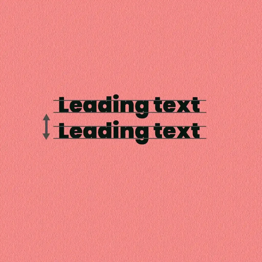
Leading, pronounced “ledding,” is the space between lines of text. This term originated in traditional printing, where thin strips of lead were placed between lines of type to adjust spacing. Today, in digital design software like Adobe Illustrator, Adobe Photoshop and InDesign, the leading is adjusted automatically, but its purpose remains the same: to ensure that the text is visually balanced and easy to read. Optimal leading creates a comfortable reading experience by preventing lines of text from appearing too crowded or too spaced apart, which enhances both readability and aesthetic balance.
Why Leading Matters?
Proper leading helps create a balanced look and feel. Too much space makes text appear cluttered, while too little space can make it restricted and difficult to read. Think of leading as a design tool that controls the rhythm of your text. This is especially important when working with long paragraphs or small font sizes, where poor spacing can quickly lead to readability.
Types of Leading: Auto vs. Manual
Leading is set to either auto, which is a percentage of the font size (typically 120%) or manual, where the designer specifies the exact value. Auto leading is time-saving but lacks customization, often resulting in inconsistent spacing, especially with complex fonts.
Manual leading is essential for precise control over typographic rhythm, allowing adjustments based on text density, language nuances, and font complexity. Designers working in bilingual layouts or dense text blocks benefit from manual leading, where spacing can be fine-tuned to each language’s typographic standard, ensuring consistency in readability.
Combine manual leading with kerning and tracking to maintain alignment across lines, especially in justified text, to prevent unwanted gaps and maintain smooth text flow.
How Leading Impacts Readability and Visual Flow
Leading defines the eye’s journey through the text, influencing how quickly and comfortably readers process content. Too much tight leading disrupts the visual flow, making the text feel cluttered and boring to the reader. Conversely, excessive leading creates “floating” text, which weakens engagement and reduces readability.
To optimize readability, designers often use a range of 1.25 to 1.6 times the font size, depending on the font style and reading distance. Serif fonts with complex strokes usually require increased leading, while sans-serif fonts, being simpler, allow for tighter spacing. A common approach is to test several ratios, adjusting based on feedback and the medium.
In editorial design, visual flow is particularly important. For example, in a magazine spread, wide leading for block quotes makes them distinctive and accessible, while tight leading in captions saves space, all of which contribute to a smooth reading hierarchy.
The Role of Font Choice in Leading
Each font has unique characteristics – weight, x-height and width – that affect leading needs. Serif fonts often require more spacious leading for decorative features and complex letterforms. Fonts with a high x-height (such as Helvetica) appear larger and may require tighter leading to avoid excessive line gaps, while condensed fonts or slab serifs often benefit from increased leading to prevent visual crowding.
Decorative fonts, especially those with long ascenders and descenders, require more space to avoid overlap. Also, script fonts, which are commonly used in headings, can benefit from loose leading to increased clarity and avoid readability issues caused by overlapping strokes.
Adjusting leading across font families in the same layout increases engagement. For example, when mixing serifs for body text and sans-serifs for headings in a document, align their leading for visual appeal, balancing readability with aesthetic consistency.
Leading Techniques for Different Mediums
Different mediums call for unique leading adjustments to maintain readability and coherence:
- Web Design: For screen, increase leading for readability, especially for long-form content where readers benefit from more line space. Responsive leading (adjusting based on screen size) is important here, where tight leading may work on mobile, but wider leading may work on desktop to prevent cramping on smaller screens.
- Print Design: Printed media relies on a fixed leading ratio, usually between 1.2 and 1.4x the font size, for a polished look. Tight leading saves space in print but risks compromising readability if done too much. Testing print proofs ensures that the main text remains readable, especially in long documents such as books or reports.
- Mobile Design: Mobile screens benefit from dynamic leading adjustments to avoid cluttering. Designers often employ CSS techniques like
calc()to adapt leading on mobile, allowing spacing adjustments based on viewport width and improving readability on the go.
Pro Tip: Grid-based responsive layouts in CSS allow for fluid adjustments, balancing leading with letter spacing as screen sizes change, maintaining a consistent reading experience.
Common Leading Mistakes and How to Avoid Them
- Overly Tight Leading in Dense Text: In dense text-heavy material (e.g., legal documents), tight leading increases pressure on readers. Always increase leading in documents with dense text and check for consistency across columns or blocks.
- Relying on Auto Leading for Multiple Font Sizes: Using auto leading for different font sizes (e.g., headlines vs. body text) creates an imbalance. Always test each font size and adjust leading manually where necessary for visual harmony.
- Ignoring Font Style Variations: Different text styles require different leading settings. Body text, captions, and headers benefit from customized leading, creating a clear visual hierarchy and effectively capturing the reader’s attention.
Advanced Adjustment: For multilingual designs, test with both languages, adjusting the text with the largest ascender/descendant to avoid overlap and maintain readability across languages.
Advanced Tips for Mastering Leading
- Leading in Multicolumn Layouts: In a multicolumn setup, it’s important to maintain the same leading value across columns to avoid uneven text distribution. Consider the effect of column width on leading – wide columns can handle tight leading, while narrow columns benefit from looser spacing for easier reading.
- Experimenting with Variable Leading: Variable leading adjusts dynamically based on the content. For example, wider leading at the beginning of a paragraph becomes thinner as it progresses, creating a flowing effect that looks appealing, especially in editorial design.
- Leading for Different Content Types: Different types of content require customized leading. For example, poetry benefits from airy leading, which visually enhances rhythm, while technical documentation may require less spacing to save space without sacrificing clarity.
Adaptive leading with CSS enables content-rich websites to deliver legible text across devices. line-height values can adjust according to media queries, providing balanced spacing on desktop, tablet, and mobile.
Practical Leading Adjustments Based on Design Goals
- Professional Look: For corporate materials, maintaining a leading value between 1.2 to 1.3x the font size enhances readability and professional polish, suitable for annual reports or business proposals.
- Creating Drama and Impact: In posters or magazine covers, use generous leading to create standout text, visually guiding readers to key phrases without overwhelming the layout.
- Luxury and Minimalism: For luxury branding, generous leading paired with a bold serif font gives the text a luxurious feel. Loose leading emphasizes the spacious, sophisticated aesthetic that luxury brands favour.
Pro Tip: Test luxury layouts with white space to balance leading and create a minimalist yet inviting design that reflects elegance.
Typography Trends in Leading

1. Variable Fonts with Adaptive Leading
With the rise of variable fonts, designers now have greater flexibility in adjusting both font characteristics and leading dynamically, enhancing readability and visual cohesion. Variable fonts can change in weight, width, and even optical size, allowing the leading to adapt based on screen size or user preferences. This adaptability helps designers create content that’s visually consistent across devices, especially beneficial in responsive web design.
For example, on mobile devices, variable fonts can maintain readability by subtly increasing leading for smaller screens. This technique is particularly effective in text-heavy applications, where text blocks need to remain visually manageable on every screen size. For longer reading material like online magazines or ebooks, adaptive leading in variable fonts keeps the flow of text smooth for readers, making long sessions easier on the eyes.
2. Generous Leading in Minimalist and Brutalist Design
Generous leading is a hallmark of minimalist design, which emphasizes simplicity and breathing space. By spacing lines apart, minimalist designs often create a refined, airy look that exudes calm and clarity. Here, leading acts as a visual break, guiding the reader’s eyes without overwhelming them. This is particularly relevant in minimalist branding and editorial layouts, where space enhances readability and focuses attention on the main message.
On the other hand, brutalist design, known for its raw and unrefined aesthetics, plays with unconventional leading, often using tight leading with bold typography to create visual intensity. Brutalist designs can also vary leading dramatically between elements, using ultra-tight leading for impressive headers and loose leading for body text, establishing a sharp contrast that draws attention.
Brutalist designs with exaggerated leading can be effective in industries that want to convey boldness and authenticity, such as music festivals or avant-garde fashion. Minimalist designs with generous leading work well in luxury branding and lifestyle publications, where elegance and restraint are key.
3. Responsive Leading in CSS Flexbox and Grid Systems
In web design, using CSS flexbox and grid systems for responsive layouts has transformed how designers approach leading. These systems allow for fluid adjustment of leading based on screen size, ensuring that text remains legible on all devices. With tools like minmax() and calc() functions in CSS, leading can be adjusted in real-time as screen dimensions change, providing a seamless reading experience from desktops to mobile phones.
For e-commerce or media websites with mixed content, responsive leading within a grid system ensures that product details and titles maintain optimal spacing on different screens. This approach also enhances accessibility, as leading adjustment allows users with visual impairments to better engage with the content, especially when combined with other responsive typography features like adjustable font sizes.
4. Retro Typography with Playful Leading
Retro typography, particularly inspired by designs from the 1970s to the early 2000s, evokes nostalgia by adopting unconventional and exaggerated leading. For example, in Y2K-inspired layouts, leading is often used liberally to evoke a sense of open, airy design that is visually appealing. Similarly, a design inspired by 70s or 80s pop culture might feature a mix of tight and loose leading to mimic old magazine layouts or posters, giving off a distinct throwback vibe.
In retro-inspired branding, playful leading can make headlines dynamic and engaging, often drawing readers into memories of a particular era. While it may not be suitable for text-heavy layouts, this approach is ideal for headlines, promotional banners or social media graphics that benefit from a bold, memorable look. Retro typography with playful leading is particularly impressive in the entertainment and lifestyle industries, where designs need to stand out and create a sense of fun.
5. Modular and Asymmetrical Leading for Experimental Layouts
An experimental approach to leading has emerged in modular and asymmetric layouts, where leading is strategically changed to break away from the traditional grid pattern. By using different leading values in the same layout, designers create visual rhythm and asymmetry that guide the eye in non-linear ways, often used in high-impact editorials, experimental magazines, and digital art.
Asymmetric leading, when paired with unique text placement, creates a layered effect, giving readers multiple points of attention that challenge normal reading patterns. This trend is common in editorial design where storytelling can benefit from dynamic layouts, making the reading experience more engaging. In modular grids, sections with different leading values create a contrast that draws the reader’s attention to different areas, which is ideal for layouts with different types of content like images, pull quotes and text blocks.
6. Dynamic Leading for User-Generated Content and Accessibility
Platforms with user-generated content, such as blogs or forums, have increasingly incorporated dynamic leading to improved accessibility. Leading that adjusts based on user preferences – such as options to increase line spacing or apply a high-contrast mode – ensures that content remains accessible to users with different visual needs.
Dynamic leading improves readability for users with dyslexia, visual impairments, or cognitive disabilities, as line spacing can be personalized to reduce crowding and visual fatigue. This trend aligns with broader accessibility standards such as the Web Content Accessibility Guidelines (WCAG), which advocate for customizable leading in accessible design.


