Typography is the cornerstone of movie poster design, acting as a silent storyteller that captures the emotion of a film and draws viewers in. From the tense curves of horror fonts to the futuristic lines of sci-fi epics, fonts set the tone before the viewer even reads the title. Think how the bold, modern typeface on the Avatar poster signalled an immersive futuristic world or how the vintage type in Stranger Things evoked 1980s nostalgia.
Why Fonts Matter in Movie Posters
Fonts aren’t just text; they’re visual cues. The typeface on a poster has the power to take you into the universe of a story, giving you an instant sense of style, tone, and mood. For example:
The Star Wars Saga
- Typography Analysis: Star Wars uses a bold sans-serif font with clean, futuristic edges. Over the years, this typography has become synonymous with space epics and intergalactic storytelling.
- Why It Works: The clean lines and simple geometry of the font mirror the advanced technology and grandeur of the Star Wars universe. Its bold presence immediately establishes a sense of scale and adventure.
- Cultural Impact: From the original trilogy to modern spinoffs, the typography remains iconic. It’s often imitated in sci-fi movie posters to evoke the same sense of cosmic wonder.
La La Land
- Typography Analysis: This musical masterpiece chooses a retro yet eye-catching serif typeface, reminiscent of classic Hollywood posters from the golden age of cinema.
- Why It Works: The font conveys elegance and nostalgia, perfectly aligning with the film’s tribute to the glamour of vintage Hollywood musicals. Its thin strokes and sharp serifs give it a timeless charm, mirroring the romantic and dreamy narrative.
- Cultural Impact: The font not only captured the aesthetic of old Tinseltown but also became a design staple for projects wanting to evoke classic Hollywood vibes. It highlighted the movie’s dual themes of ambition and nostalgia.
Joker
- Typography Analysis: The Joker poster utilizes a distressed, chaotic font that reflects the movie’s dark, gritty themes.
- Why It Works: The jagged and uneven design of the font evokes instability and tension, echoing the fractured psyche of Arthur Fleck. It gives a raw, handcrafted feel, symbolizing the societal breakdown at the heart of the film.
- Cultural Impact: This font choice set a precedent for modern thriller posters, showing that typography doesn’t need to be polished to make an impact. Instead, it can reflect raw emotion and chaos, much like the film’s protagonist.
General Takeaway
Each of these films used typography not just as a design element but as a storytelling device. From evoking nostalgia to creating a sense of unease, fonts can visually represent the themes and emotions of a movie, making them an indispensable part of poster design. Whether clean and futuristic or distressed and chaotic, the right font ensures that the poster becomes memorable and iconic.
Now, let’s look at a selected list of the top 10 movie poster fonts that can elevate your design to Hollywood-level quality.
The Top 10 Movie Poster Fonts That Will Make Your Design Go Viral
Using the right font is key to creating an eye-catching movie poster. Whether you’re designing for a science-fiction thriller or a romantic drama, the typeface you choose can instantly set the mood. Let’s explore the best fonts for movie posters that can make your design stand out.
1. Lumière by GabrielaPaiva21
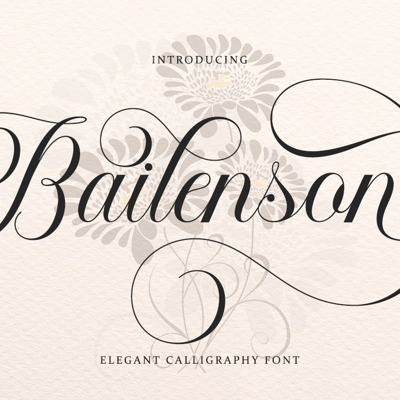
- Perfect for: Elegant period dramas or sophisticated thrillers.
- Overview: Lumière is a highly versatile font family boasting 58 unique fonts. Inspired by the golden age of cinema, this typeface captures the glamour and sophistication of the silver screen.
- Why It Works: With 58 fonts offering various weights and styles, Lumière is adaptable for a wide range of applications, from striking main titles to subtle supporting text. Its clean yet dramatic design bridges the gap between vintage charm and modern elegance, making it an excellent choice for projects with a timeless aesthetic.
2. PROGRESS Font by Billy Argel Fonts
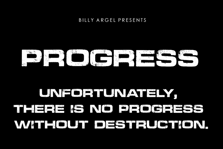
- Perfect for: War-themed movies and sci-fi blockbusters.
- Overview: A gritty and bold sans-serif, PROGRESS carries a sense of urgency and strength. Its sharp edges and strong strokes make it an excellent choice for high-intensity action movies or post-apocalyptic thrillers.
- Why It Works: The industrial design lends itself to themes of survival and combat. Its readability ensures that your movie title grabs attention even from a distance.
3. Alfrere Sans™ by Greater Albion Typefounders
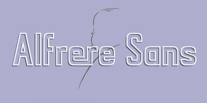
- Perfect for: Classic suspense and Hitchcock-inspired films.
- Overview: This font pays homage to mid-20th-century typography. Its subtle serif details and uniform structure add a retro charm, perfectly suited for classic mysteries or dramas.
- Why It Works: Its nostalgic appeal creates a timeless look, reminiscent of vintage movie posters.
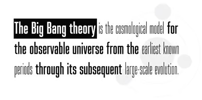
4. Spaceland by Pepper Type
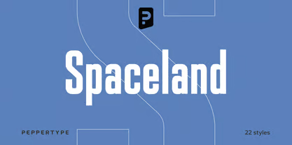
- Perfect for: Futuristic and space-themed movies.
- Overview: A Hollywood grotesque font, Spaceland blends geometric precision with bold lettering. It’s ideal for sci-fi movies, giving titles a modern yet otherworldly feel.
- Why It Works: The structured yet dynamic design creates a sense of exploration and wonder, aligning perfectly with space or futuristic themes.
5. Starfield by Scriptorium

- Perfect for: Cosmic adventures and epic space sagas.
- Overview: Designed with the charm of the galaxy, Starfield features celestial-inspired elements. Its unique shapes make it a great choice for titles that appeal to science-fiction enthusiasts.
- Why It Works: The font’s distinct celestial motifs help it capture the essence of cosmic tales, ensuring your poster feels grand and immersive.
6. Romántica Typeface by Santiago Arango
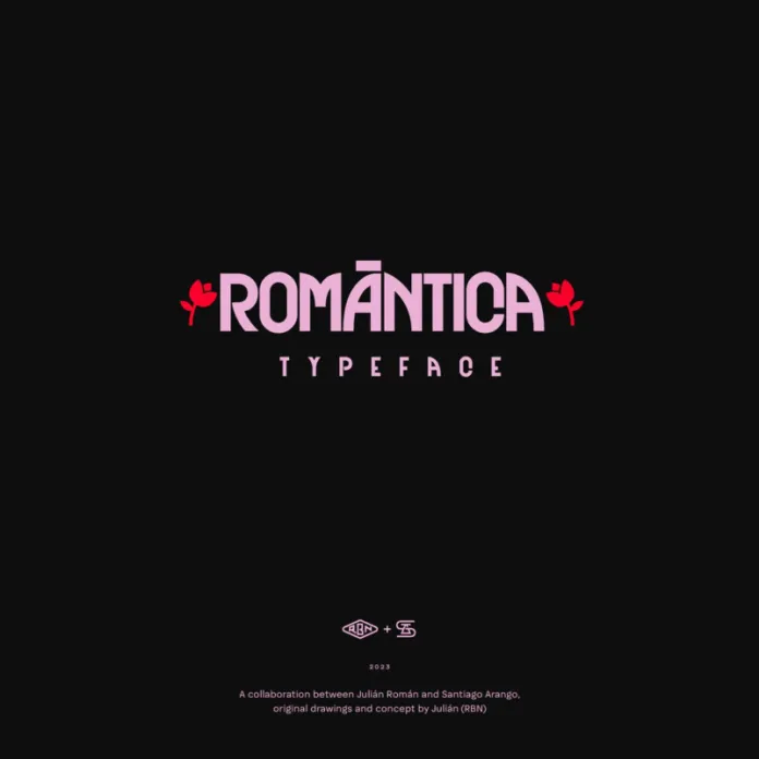
- Perfect for: Heartfelt dramas and romantic comedies.
- Overview: Typeface is a modern Art Deco-style font inspired by typography from the 1960s. It combines flowing lines and decorative touches to show elegance, luxury, and a touch of modernism. This elegant font is perfect for stories about love, human connection, or anything that requires a sophisticated, timeless appeal.
- Why It Works: Its subtle yet striking curves give a personal, emotional tone to any poster, drawing viewers into the story.
7. Beverly Drive Right – Retro Script Font
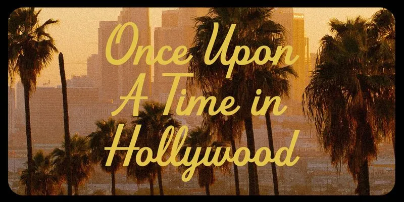
- Perfect for: Retro-themed films and nostalgic stories.
- Overview: A script font with a vintage flair, Beverly Drive is full of personality. Its handwritten look evokes the charm of old Hollywood signage.
- Why It Works: The retro vibe instantly transports viewers to a bygone era, making it perfect for period pieces or feel-good stories.
8. Exocet by Jonathan Barnbrook
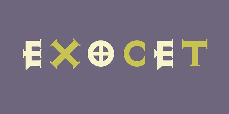
- Perfect for: Epic fantasies and historical dramas.
- Overview: A font inspired by ancient inscriptions, Exocet features a medieval aesthetic with modern precision. It’s ideal for creating a sense of timelessness in fantasy movie posters.
- Why It Works: Its bold, chiselled design gives it a powerful presence, aligning well with epic narratives.
9. Dream Catcher by Typeline Studio
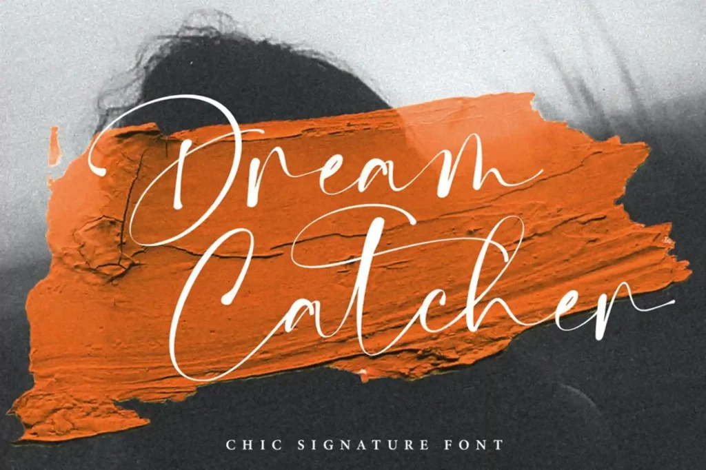
- Perfect for: Mysterious dramas and stories of coming of age.
- Overview: Dream Catcher by Typeline Studio is a beautiful modern chic script font, that blends both modern and vintage elements. With flowing, decorative lines and organic curves, it evokes themes of dreams, self-discovery, and life’s magical journey.
- Why it works: The font’s artistic brilliance and soft, graceful form instil a sense of wonder and intimacy, ideal for conveying emotional depth in movie titles.
10. Dr Phibes Font by Billy Argel Fonts
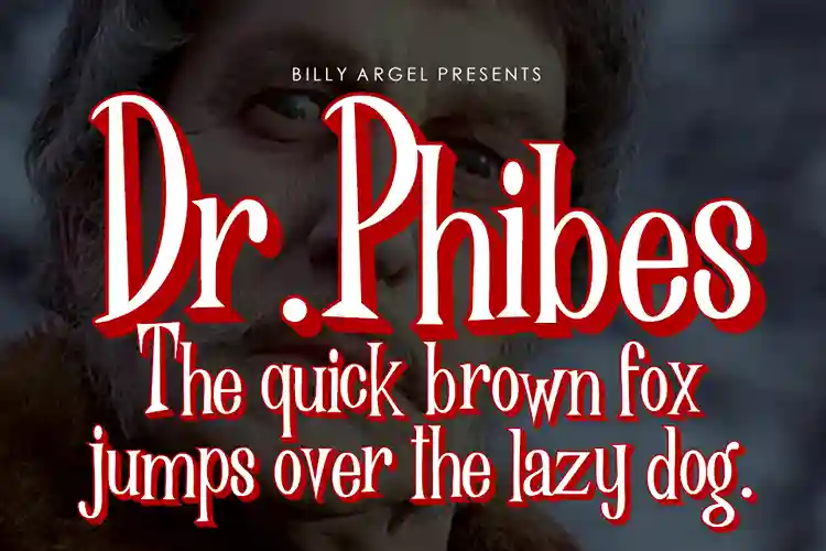
- Perfect for: Horror and gothic thrillers.
- Overview: Dr Phibes is a bold and eerie font inspired by vintage horror movie posters. Its jagged edges and dark style set the tone for chilling tales.
- Why It Works: It immediately signals horror, making it an ideal choice for films in the genre.
Note: Ensure you verify the licensing terms of the fonts you use to stay compliant, especially for commercial
In Conclusion
Typography is more than just the visual design of letters—it’s an essential storytelling tool. A carefully chosen font on a movie poster can instantly set the mood, convey the style, and highlight the essence of a film, making it just as powerful as the images themselves. Whether it’s the bold, geometric precision of a science-fiction font or the soft, flowing beauty of a romantic drama typeface, the right typography often makes a poster unforgettable.
The fonts listed above are more than just design elements—they’re the perfect tool for enhancing your story and evoking deep emotional responses from your audience. From the celestial beauty of Starfield to the whimsical, dreamlike quality of Dream Catcher, each of these fonts has the power to bring your movie poster design to life, ensuring that your project stands out and makes a lasting impression.
Typography can make or break a poster, influencing how the film is perceived by the audience before they’ve even seen a single frame. Whether you’re creating a thriller that needs tension or a romantic drama that needs sophistication, these fonts will give your movie poster a Hollywood-level shine. Don’t settle for just a good design – create something memorable, something that will grab the audience and leave them wanting more.
So, the next time you’re working on a movie poster, think beyond just the visuals and let the typography tell your story.

