Sunday, December 22, 2024

Latest Posts

8 Game-Changing Logo Design Trends for 2025

In 2025, logo design is taking creativity to a whole new level. From sleek minimalist styles to vibrant 3D gradients, designers are adopting trends that not only look great but also connect with audiences across digital and physical platforms. It’s no longer just about making a logo look appealing; it’s about telling a story that aligns perfectly with the brand’s values ​​and industry.

For example, brands focused on sustainability are leaning towards eco-friendly designs, while tech and media companies are exploring responsive and animated logos to enhance their digital presence. Each trend has its unique appeal and purpose, and the best part? These trends aren’t one-size-fits-all — they can be adapted to industries ranging from fashion and retail to tech and healthcare.

In this guide, I’ll walk you through the 8 most popular logo design trends for 2025, explore how they’re created and, most importantly, how you can tailor them to your specific needs. Whether you’re a graphic designer or a business owner looking to revamp your brand, you’ll find plenty of inspiration and practical tips for creating a logo that stands out and gets results. Let’s get started!

Modern Logo Design Trends 2025 and Adaptation Guides

1. Minimalist Logos

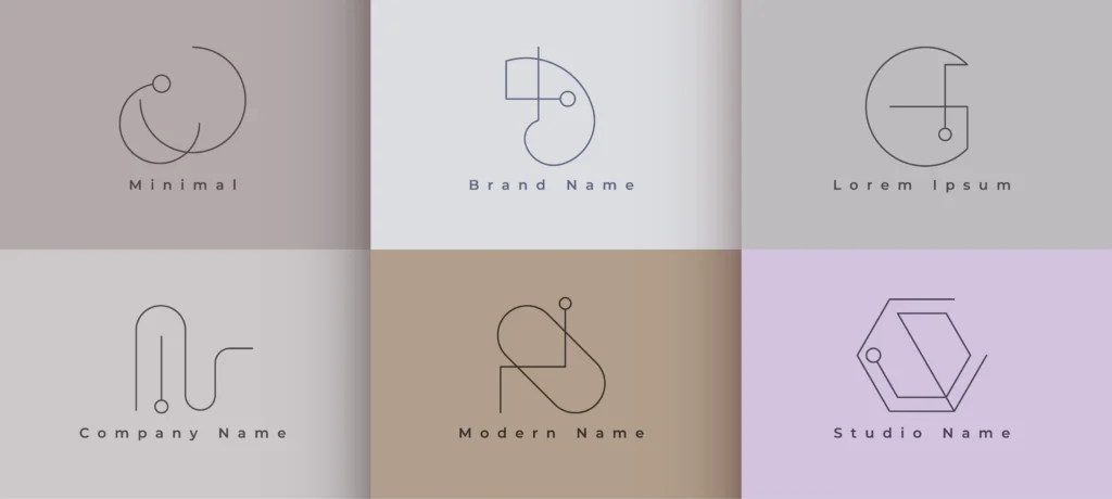
Visual representation and downloadable file of minimal logo set. logo design trends 2025

Minimalist logos dominate the design world due to their timeless appeal and effectiveness in creating a strong brand identity. These designs remove unnecessary elements, creating a clean, functional logo that precisely expresses the brand’s identity. Major brands such as Apple and Nike have long championed minimalism, demonstrating its lasting power.

Minimalist logos look appealing because of their versatility across a variety of platforms. Minimalist logos work seamlessly on everything from business cards to billboards. Agencies also emphasize that these logos appeal well to modern audiences who value simplicity in a cluttered digital space

While minimalist designs are praised for their clarity, some argue that oversimplification can hinder accessibility. For example, a minimalist logo can lose identity when resized for a smaller screen. Designers must balance simplicity and uniqueness to avoid such pitfalls.

For industries such as technology, minimalist logos symbolize innovation and reliability. In fashion, they show a sense of elegance. For startups, choosing geometric shapes or monograms can create a minimalist logo that will look attractive and also be cost-effective for branding.

Design Process

To create an effective minimalist logo:

  1. Research: Understand the brand’s core values and audience preferences.
  2. Draft Concepts: Try using basic shapes, white space, and text in your designs.
  3. Refinement: Test the design for scalability and readability across different mediums.

2. 3D Gradient Effects

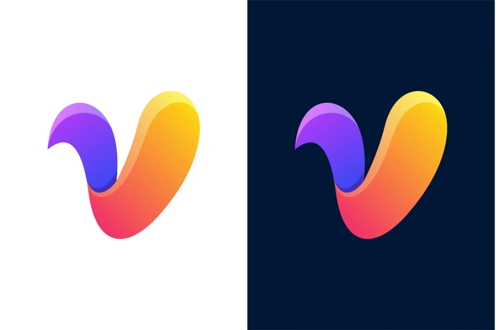
Visual representation of 3d gradient logo in logo design trends 2025

3D gradient logos are another emerging trend for 2025, providing depth and dynamism that captivates viewers. Combining vibrant colors and lighting effects, these designs offer a modern, interactive feel.

Experts suggest that 3D gradients are particularly suitable for tech and media brands, as they evoke innovation and energy. According to the branding agency, this trend aligns with the evolution of digital landscapes, enhancing logos for dynamic, screen-based environments.

Despite their appeal, 3D gradient logos can pose accessibility challenges, especially for visually impaired users. Simplified, high-contrast alternatives may be necessary for some applications.

Adapting 3D Gradients Across Industries

  • Technology: Use 3D gradients to reflect cutting-edge innovation.
  • Retail and eCommerce: Employ vibrant gradients to evoke excitement and modernity.
  • Health and Wellness: Softer gradients in cool tones can create a calming, trustworthy brand identity.

Design Process

  1. Color Selection: Choose complementary or analogous colors to create a cohesive gradient.
  2. Software Tools: Utilize advanced tools like Adobe Illustrator or Blender for precise 3D effects.
  3. Testing: Check the logo in grayscale to ensure usability for those with color vision deficiencies.

3. Responsive Logo Design

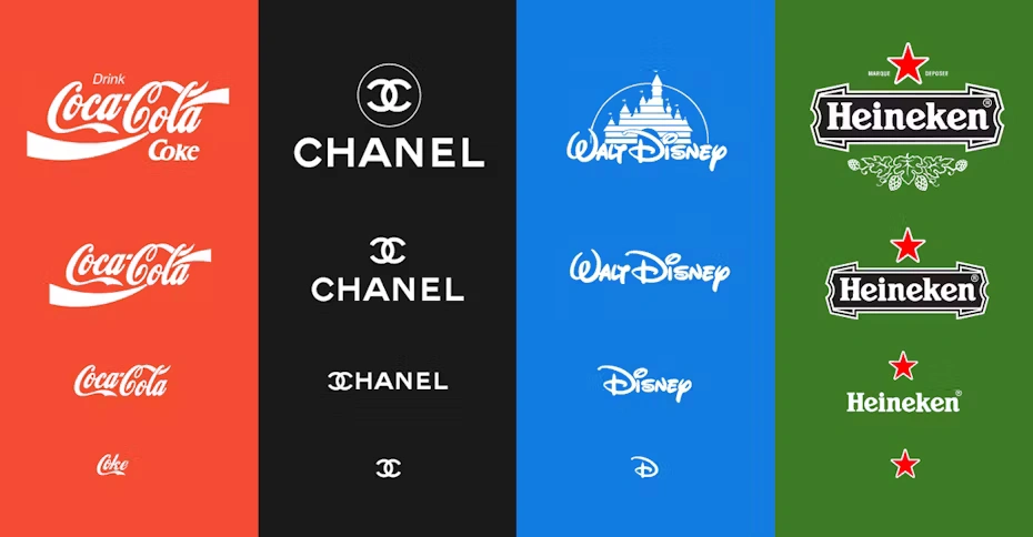
Visual representation of responsive logo

Responsive logos are designed to adapt easily to different formats and screen sizes, making them a must-have in a digital-first world. From billboards to smartphone screens, responsive logos ensure consistent branding while maintaining readability and aesthetic appeal. As mobile usage continues to grow, companies like Disney have successfully used different logo repetitions, clearing complex designs down to minimal elements for smaller displays. This trend underscores the growing need for flexibility in branding to meet modern accessibility standards.

Leading designers emphasize that creating a responsive logo isn’t just about changing the size – it’s about prioritizing the elements needed for each application. For example, incorporating a simplified version of the logo for mobile screens without losing its identity ensures clarity and impact. Agencies have highlighted the challenge of maintaining brand consistency while adapting logos for different digital touchpoints, calling for strategic planning during the design process.

While responsive logos are practical, some argue that oversimplification can weaken brand identity. Accessibility supporters also warn against overly minimalist designs that can obstruct readability for visually impaired users. This highlights the importance of striking a balance between simplicity and inclusivity when designing for responsiveness.

Adapting to Various Industries

  • Retail and eCommerce: Create scalable versions of your logo with distinct color schemes for app icons and digital storefronts.
  • Corporate Branding: Use typography-focused responsive logos to retain professionalism across print and digital platforms.
  • Creative Fields: Leverage bold icons or illustrations for smaller screens, keeping the design visually engaging and memorable.

Design Process and Practical Steps

  1. Sketch Variations: Start by identifying essential elements and draft multiple logo sizes for testing.
  2. Test in Context: Simulate logo placement across platforms like mobile apps, websites, and signage.
  3. Seek Feedback: Engage with users or clients to refine designs based on real-world usability tests.
  4. Iterate with Tools: Use design software like Adobe Illustrator to create scalable vector formats.

4. Geometric Shapes in Logos

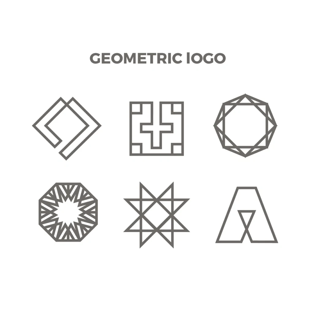
Visual Representation of geometric logos

Geometric shapes in logo design have become synonymous with modernity, versatility, and precision. Whether it’s circles representing unity or triangles symbolizing stability, shapes convey deep meanings that resonate with audiences. This trend is significant in high-tech, architecture, and education industries, where clean, structured designs reflect innovation and reliability.

Designers often emphasize the psychological impact of shapes. Squares reflect strength and dependability, while circles signify continuity and community. Combining geometric shapes with creative layering or gradients can create dynamic designs that appeal to diverse audiences. Agencies also recommend incorporating negative space within shapes to add depth and curiosity without cluttering the design.

Critics argue that geometric logos can sometimes seem impersonal or overused in certain fields. To counteract this, designers recommend personalizing geometric shapes with unique textures or asymmetry, ensuring the logo maintains originality while still standing out in a crowded marketplace.

Adapting to Various Industries

  • Technology: Utilize abstract shapes to reflect forward-thinking and creativity.
  • Education: Employ classic geometries like squares and circles for logos that convey trust and inclusiveness.
  • Fashion and Lifestyle: Add modern gradients or textures to make geometric logos trendy and visually appealing.

Design Process and Practical Steps

  1. Understand Brand Values: Align shape choices with the emotional and professional tone of the brand.
  2. Experiment with Layers: Stack or intersect shapes to create visual complexity.
  3. Leverage Color Theory: Use colors strategically within geometric forms to enhance emotional resonance.
  4. Refine for Simplicity: Ensure the logo remains adaptable and recognizable in monochrome and smaller formats.

5. Eco-Friendly Branding

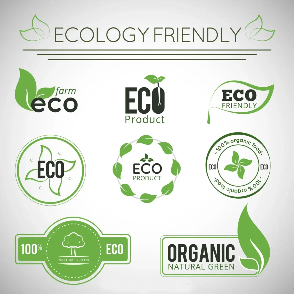
visual representation on some Eco friendly logos

Eco-friendly branding is a growing trend for 2025 as sustainability becomes a consumer priority. Logos with nature-inspired designs such as leaves, water droplets or earthy colors appeal to an environmentally conscious audience.

Designers advocate using organic shapes and natural textures to create an authentic eco-friendly experience. Brands such as Patagonia and The Body Shop highlight their environmental commitments through visual branding, ensuring alignment between design and corporate values.

Some argue that eco-friendly logos run the risk of becoming overly clichéd or predictable, blending into a saturated marketplace. Designers should strive to create unique, meaningful logos while avoiding superficial “greenwashing”—where sustainability is implied but not proven.

 Adaptation Guide for Designers

  1. Material Integration: Use sustainable materials like recycled paper or bioplastics for physical branding elements, aligning the logo’s aesthetic with real-world impact.
  2. Color Palette Selection: Choose soft greens, muted browns, and pastels for an eco-friendly look that avoids being overly simplistic.
  3. Nature Symbols: Incorporate elements such as trees, animals, or geometric representations of the planet to communicate environmental values​

Design Process

  1. Brand Research: Understand the brand’s sustainability goals and mission.
  2. Sketching Concepts: Explore nature-inspired designs through hand sketches or digital mockups.
  3. Testing: Validate the design’s emotional resonance with focus groups or surveys.

Lush’s eco-friendly branding integrates a black-and-white wordmark that conveys simplicity. Combined with its sustainable packaging, the brand achieves a consistent eco-friendly identity across its products and marketing channels.

These strategies ensure that brands not only follow trends but also communicate authenticity and commitment to their values.

7. Illustrative Logos and Edutainment

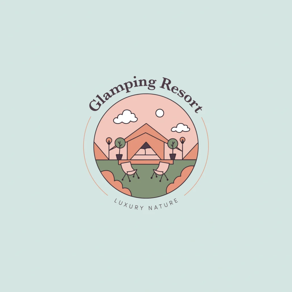
visual representation of Illustrative logo

Illustrative logos stand out by blending intricate drawings with branding elements, offering a highly creative and authentic representation of a brand’s identity. These logos often work well in industries like animation, education, artisanal crafts, and boutique businesses, where storytelling and detailed visuals enhance the brand narrative.

Key Characteristics

  1. High Detail: Incorporate detailed drawings or sketches, often hand-drawn or digitally created, to communicate the brand’s unique essence.
  2. Storytelling Focus: Highlight brand stories or values through imagery, making these logos more relatable and memorable.
  3. Customization: Each logo is tailored to reflect the specific identity of the brand it represents, fostering a strong emotional connection with the audience.

Adaptation Tips

  • Educational Platforms: Use characters or scenarios that reflect learning outcomes, such as a friendly mascot or a symbol of growth and knowledge.
  • Artisan and Boutique Brands: Illustrative logos can showcase craftsmanship, such as using detailed depictions of handmade products or tools that highlight the heritage and quality of the brand. For example, a pottery shop might feature a sketched vase as part of its logo.

Benefits

  • Enhances brand recall through visually appealing and distinctive designs.
  • Provides an opportunity for brands to narrate their story visually, increasing engagement.

Challenges

  • Scalability: The complexity of illustrative logos may make them difficult to simplify for small-scale applications like app icons or merchandise. Designers can overcome this by creating modular versions: one detailed for large formats and another minimal for smaller uses.
  • Time-Intensive Creation: Designing illustrative logos can require significant time and artistic skill, making them a more premium option.

Illustrative logos are increasingly being paired with earthy tones, geometric patterns, and natural textures to align with sustainability and modern design sensibilities​

By carefully balancing creativity and functionality, illustrative logos can resonate across diverse industries and stand the test of time.

8. Human Touch in Logo Design

Human touch logo

The “human touch” trend in logo design is all about incorporating authentic, personal elements into a brand’s identity. With consumers placing a greater value on transparency and authenticity, this trend focuses on making logos feel less sterile and more connected to real people. Hand-drawn elements, imperfect shapes, and personalized fonts are often used to create a sense of warmth and creativity. Designers are now embracing natural brushstrokes, sketches, and organic shapes that stand out from the cold precision of AI-generated logos.

A key aspect of this trend is that it creates a more emotional connection with the audience. According to expert designers, incorporating a human touch can make a brand feel more accessible and relatable, which is important for businesses that rely on strong community connections. However, it’s also important to balance this trend with professionalism to avoid a logo that feels too informal for certain industries. For example, tech companies may want to adopt more polished hand-drawn elements, while creative studios may fully embrace the free-form, artistic nature of this trend.

Design Process

  1. Brand Research: Understand the brand’s core values, mission, and target audience. The “human touch” trend thrives on authenticity, so start by aligning the design with the brand’s desire for personal, trusting relationships with consumers.
  2. Sketching Concepts: Explore nature-inspired or hand-drawn designs through rough sketches or digital mockups. The goal is to capture a sense of personality and warmth. Focus on organic lines, imperfect shapes, or custom typography that feels authentic and unique.
  3. Testing: Validate the emotional resonance of the design by testing it with focus groups or surveys. Collect feedback on how the logo evokes trust, warmth, and accessibility, ensuring the final design feels human-centred across a variety of mediums.

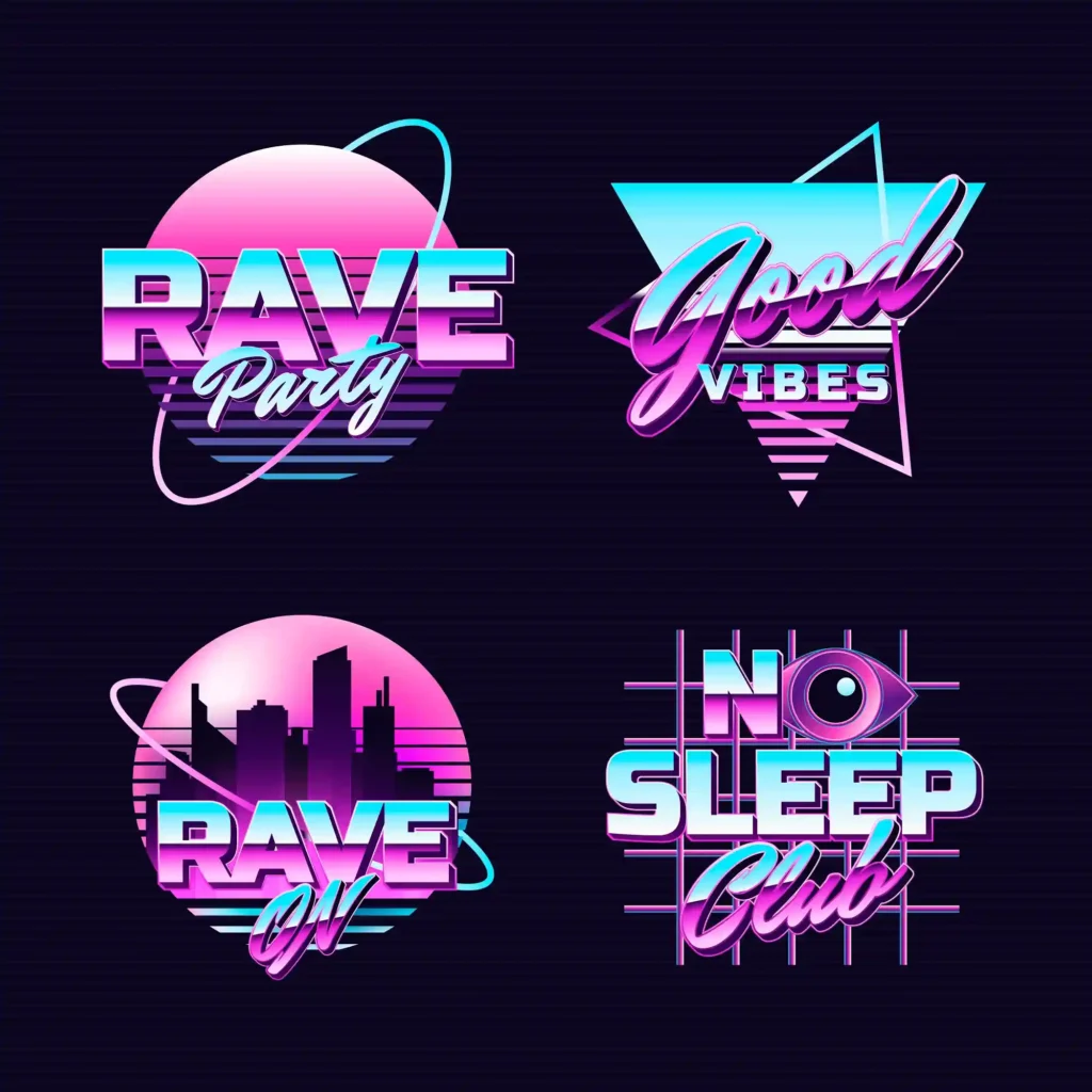
8. Retro-Futurism in Logo Design

visual representation of Retro-Futurism in Logo Design

Retro-futurism is a design style that blends nostalgia with forward-thinking, drawing on the aesthetics of the past (particularly from the mid-20th century) while imagining how those styles might evolve in the future. In logo design, retro-futurism can be combined with vintage colors and typography in vibrant, futuristic shapes. The style is inspired by past decades, particularly the 70s, 80s, and 90s, and incorporates them into a modern context, often with a techno or science-fiction twist.

For example, designers are using bold colors and geometric forms reminiscent of the mid-century modern design movement, but mixing them with sleek, futuristic elements. It’s a trend often used by brands to convey a sense of innovation and nostalgia, combining past and future aesthetics to appeal to a wider audience.

However, designers should be careful when adopting this trend in 2025 for industries that require a more timeless and professional look, as the excessive use of bright colors and playful shapes can reduce the credibility of some brands. Retro-futurism is a great choice for technology, entertainment, and lifestyle brands, but may not be suitable for more conservative industries.

Design Process

  1. Brand Research: Analyze the brand’s desire to strike a balance between nostalgia and newness. Understand industry preferences for future designs while maintaining a connection to the past. This step helps guide the mix of vintage elements and forward-thinking concepts.
  2. Sketching Concepts: Start sketching a logo that incorporates bold, geometric shapes and a retro color palette. Combine elements from different eras — such as 70s or 80s typography — with smooth, modern lines or futuristic iconography.
  3. Testing: After creating a prototype, test the logo on different platforms to ensure it remains appealing and memorable. Seek feedback on how well it combines the aesthetics of the past and future, note its appeal across different age demographics and market segments.

In Conclusion

Staying up to date with logo design trends is key to creating fresh and innovative designs that appeal to a modern audience. As industries evolve, so should a brand’s visual identity. Incorporating new trends like responsive logos, geometric shapes, and a human touch can help businesses connect with consumers in a more personal and engaging way. However, it’s important to find a balance between trend adoption and customization to meet each client’s specific goals and values. Experimenting with these trends can help designers create unique and memorable logos that are true to the brand’s identity.

Remember, logo design is more than just following trends—it’s about understanding a brand’s mission and audience and delivering a design that reflects those elements. Whether you’re working with a startup or an established brand, keeping an eye on these trends ensures your designs stay relevant and impactful.

Latest Posts

Don't Miss

Stay in touch

To be updated with all the latest news, offers and special announcements.