Best Fonts for Graphic Design: Expert Picks You Need to Know
Fonts are the building blocks of communication in graphic design. As a graphic designer, I’ve learned that whether you’re creating a logo, website, or printed material, the font you choose can make or break the effectiveness of your design. With thousands of fonts out there, it can be frustrating to find the right one. But after working on countless projects, I’ve narrowed down the top fonts that designers should prioritize for various purposes.
In this article, I’ll share expert picks for the best fonts for graphic design, highlighting both free and premium options that suit a variety of projects—from sleek sans serif fonts for web design to elegant serif fonts for branding. Whether you’re an experienced designer or just starting, this guide will give you the insight and tools to elevate your work.
1. Why Font Selection Is Key for Graphic Design
Choosing the right typeface is about more than just aesthetics. Fonts affect the mood, readability, and brand perception of your design. For example, a well-chosen display font can grab attention on a billboard, while a clean sans serif typeface ensures good readability on a website.
Moreover, legibility is important — the best fonts are easy to read and naturally guide the viewer’s eye. Your goal is to balance creativity with Usability, ensuring the font works across formats like print and digital.
2. Expert-Recommended Font Categories
Understanding the types of fonts and their roles in different design contexts can help you make better choices.
a. Serif Fonts
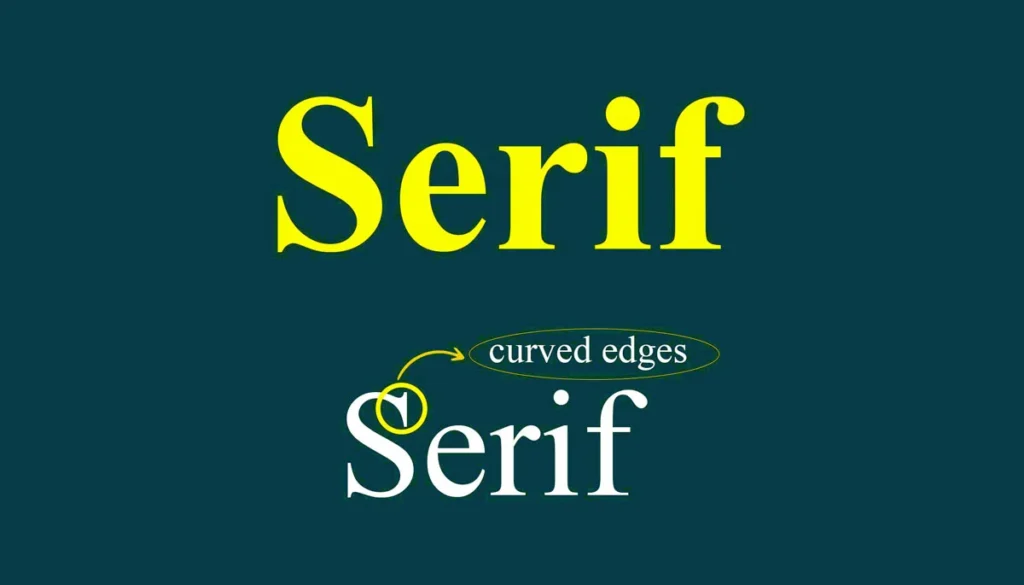
Serif fonts are known for their short strokes or “feet” at the end of letters. They evoke a sense of tradition and professionalism, making them perfect for formal editorial design or corporate branding. Bodoni is a timeless example of a serif font that has adorned everything from magazines to luxury brands. Other popular serif fonts include:
- Times New Roman: A standard in both print design and digital, ideal for body text in long-form content.
- Georgia: Highly readable, even on screens, making it suitable for web designers working on content-heavy sites.
b. Sans Serif Fonts
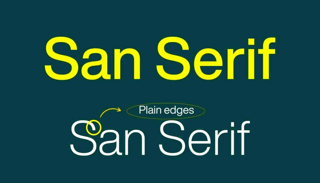
Sans serif fonts are modern and versatile, making them some of the most commonly used fonts for digital design. Without any decorative strokes, they offer clean lines and maximum readability. Top graphic designers often prefer them for web design because of their simplicity. Some expert favourites include:
- Helvetica: This neo-grotesque font designed by Max Miedinger remains a top choice due to its versatility and modern aesthetic. It is widely used across brands and remains one of the most popular fonts in graphic design.
- Futura: With its geometric shapes, Futura gives off a futuristic and minimalistic vibe. It’s perfect for logo design or websites that need a modern touch.
c. Script Fonts
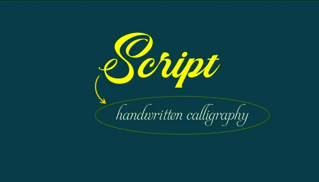
Script fonts copy handwriting and add a personal, artistic touch to designs. These are usually reserved for special projects like wedding invitations, and unique branding efforts. In 2024, some popular script fonts include:
- Dancing Script: Known for its friendly and informal style, it’s great for adding a touch of personality to branding materials.
- Pacifico: With its bold yet casual look, this font brings a stylish vibe to logos and social media graphics.
d. Display Fonts
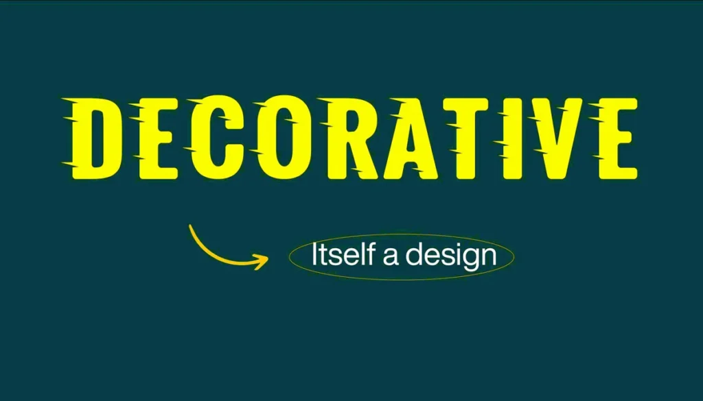
Display or decorative fonts are bold, and eye-catching and are often used for headlines, posters or branding. Their main goal is to grab attention, making them ideal for short, impactful text. Some popular choices include:
- Montserrat: A versatile display font that combines elegance and modernity, often seen in both digital and print designs.
- Playfair Display: An elegant font with high contrast, often used in editorial design and luxury branding.
e. Slab Serif Fonts
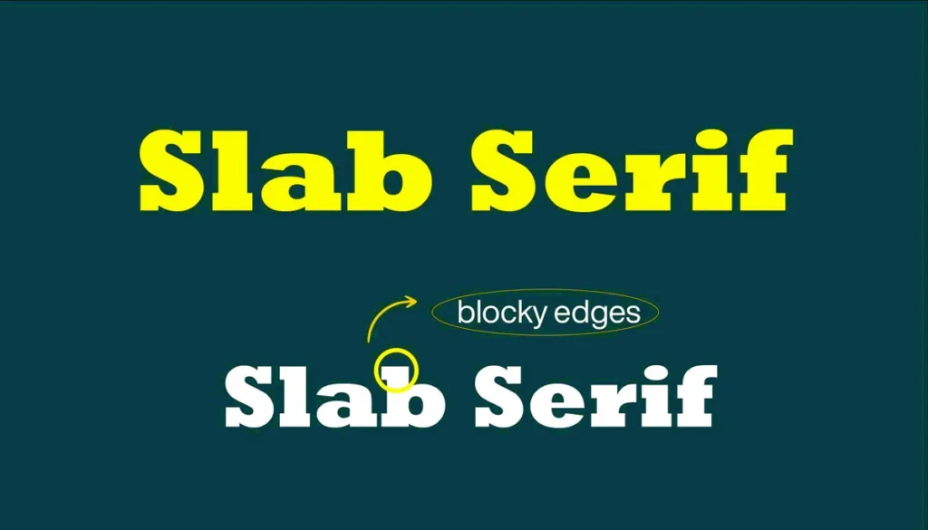
Slab serif fonts are characterized by their thick, block-like serifs, making them a unique hybrid between serifs and display fonts. Their bold, simple look makes them perfect for headlines and logos that need to make a strong statement while maintaining a traditional feel.
- Rockwell: Rockwell is a classic slab serif font, known for its geometric shapes and uniform stroke widths, making it highly legible at large sizes. It is often used in editorial design and print design to add a strong and relatable feel to headlines.
- Clarendon: Another popular slab serif, Clarendon adds character and warmth to designs. It is commonly used in editorial layouts and vintage-style branding for its distinctive, strong appearance.
- Roboto Slab: A modern take on slab serif fonts, Roboto Slab is perfect for digital platforms, combining traditional serif features with a modern, clean aesthetic. It’s great for headlines and subheadings in modern web design.
3. Top Fonts for Graphic Designers
Let’s break down the most sought-after fonts this year that have become the go-to options for top graphic designers around the world.
a. Helvetica
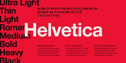
No surprise here, but Helvetica, one of the popular sans serif fonts, is one of the most widely used fonts in graphic design. Designed by Max Miedinger, this sans serif font is known for its clean, minimalist look that works across a variety of industries. Whether you’re creating a tech brand or working on a corporate identity, Helvetica’s versatility makes it a safe and stylish choice.
b. Futura
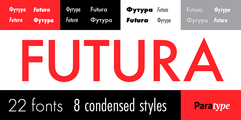
Another classic that’s not going anywhere soon is Futura. This geometric sans serif was designed by Paul Renner and is loved for its simple, creative letterforms. It’s a perfect choice for logo design, websites, and modern branding efforts.
c. Bodoni

For designers seeking elegance, Bodoni is the perfect serif font. Its high contrast between thick and thin strokes gives it a timeless, sophisticated look, ideal for luxury brands, editorial design, and fashion websites.
d. Montserrat
A hugely popular sans serif typeface, Montserrat is a favourite among web designers and digital creators. Its modern, clean lines make it suitable for both headings and body text in online content, ensuring excellent readability on screen.
e. Open Sans
Looking for an open-source font? Open Sans is a versatile, legible font that’s perfect for web design. It’s a top choice for designers working on content-heavy sites like blogs, news portals, or corporate websites.
f. Raleway
Raleway is another sans-serif font that offers multiple font weights and styles, making it a great tool for creating a balanced font family. Its beauty and legibility make it ideal for both print and digital design.
g. Promenade

For designers seeking a modern, handwritten feel, Promenade offers an elegant script option. With its casual yet sophisticated curves, this font is ideal for invitations, branding for creative businesses, or even as an accent font in a larger design system. Its unique style adds elegance and uniqueness to any project.
h. FF Kava
If you’re looking for a font that blends geometric shapes with humanistic details, FF Kava is the perfect choice. Its rounded letters and open shapes give it a friendly, accessible vibe, making it perfect for tech startups, product packaging, and apps where you want to convey warmth without loosing professionalism.
j. Inter
Inter has quickly become a favorite for designers working on digital projects. This clean and highly legible sans-serif font was designed with modern screen-based interfaces in mind, making it perfect for UI/UX design, apps, and websites. Its wide range of weights and styles ensures versatility without compromising readability.
k. Nunito
Nunito is a rounded sans-serif font that offers a soft, friendly feel without compromising readability. It’s great for both body text and headings, especially in web design or mobile apps where readability is key. Nunito’s balanced proportions make it a reliable choice for designers aiming for a clean, modern look.
4. Free Fonts Every Designer Should Know
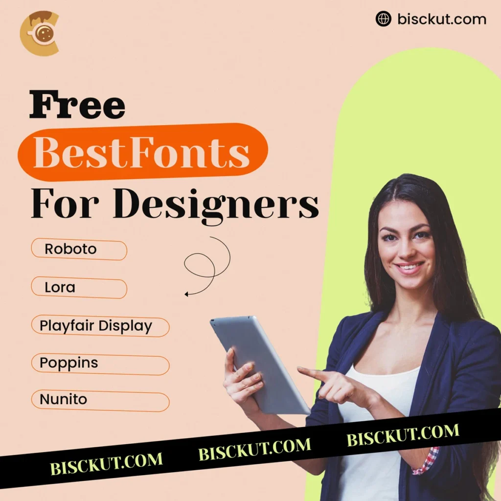
If you’re a designer looking for high-quality free fonts, you’re in luck. Many popular fonts are available for both personal and commercial use. Let’s take a look at some of the best free fonts available today:
a. Roboto
Roboto is a highly legible sans-serif font often used by Google, especially in web design. It’s perfect for apps, websites, and anything requiring clarity in small font sizes.
b. Lora
A beautiful serif font available on Google Fonts, Lora is ideal for body text. Its balanced letterforms make it suitable for both print and digital projects.
c. Playfair Display
Another favourite from Google Fonts, Playfair Display is a bold display font that adds a touch of sophistication to any design. It’s free and suitable for everything from headlines to logos.
d. Poppins
Poppins is a geometric sans serif that has grown in popularity due to its versatility. It’s excellent for both web design and print design projects.
5. How Font Choices Impact User Experience
Choosing the right font isn’t just about looks – it directly impacts user experience. A well-chosen font can increase readability, reduce bounce rates and even improve conversions. This is especially important in web design, where readability and ease of navigation are crucial.
For example, using a clean sans serif like Roboto or Helvetica for body text ensures users can easily understand long articles, while a bold display font like Playfair Display grabs attention for headlines.
But let’s take it a step further:
Readability Across Devices
In today’s multi-device world, font readability on mobile is just as important as on desktop. Smaller screens require fonts that are legible even at smaller sizes. For example, Arial or Verdana are highly recommended for mobile-friendly web design due to their simple, rounded letters. Combining these with a generous font size (14px or larger) and proper line height will improve the user’s reading experience on smartphones and tablets.
Font Accessibility for All Users
Accessibility is another important factor. The typeface you choose should be easy to read for all users, including those with visual disability. OpenDyslexic is a font specifically designed to help people with dyslexia, and combining it with a more traditional sans serif can offer a more inclusive design. When creating content for a diverse audience, always make sure your font choice meets accessibility standards such as WCAG (Web Content Accessibility Guidelines).
Impact on Load Times
Fonts also affect your website’s loading time. Heavy fonts or too many font files can slow down the site, increasing bounce rates. Using web-optimized fonts like Google Fonts or using system fonts (e.g., Arial, Times New Roman) can significantly reduce loading times, making the user experience faster and smoother.
Emotional Response
Typography plays a subtle but powerful role in evoking emotions. A playful script font like Pacifico can convey a message of friendliness, while a geometric sans-serif like Futura can communicate modernity and efficiency. When choosing a font, consider the emotional tone you want to set, as this can subconsciously influence how users view your brand and interact with your content.
Contrast for Better Focus
The contrast between fonts also plays an important role in user experience. For example, pairing a light serif font with a bold sans serif for headings ensures that the user’s eye goes to the most important elements first, improving content hierarchy and flow.
Pro Tip: When it comes to choosing fonts for your design, it’s essential to understand the correct context for each font style. Serif fonts are traditionally used in print mediums like newspapers and books due to their classic, authoritative feel, making them ideal for long-form editorial content. Sans serif fonts, on the other hand, are sleek and modern, perfect for digital platforms, logos, and web designs where clarity and simplicity are key.
Script fonts, with their handwritten style, are best suited for personal and artistic designs, such as wedding invitations or luxury branding, where a unique and elegant touch is required. Meanwhile, slab serif fonts, known for their bold, block-like serifs, are ideal for posters, headlines or logos that need to make a strong statement. Finally, display fonts are primarily used for headlines and advertising material, where attention-grabbing typography is essential but is unsuitable for body text due to its complex and bold design.
6. Font Pairing for Perfect Design Balance
When you’re working with multiple fonts in a design, font pairing becomes an important skill. Good font combinations enhance the visual hierarchy of the design, making your content easier to understand and more aesthetically pleasing. However poor font pairing can lead to confusion and inconsistency.
The secret to font pairing is contrast and harmony. You should choose fonts that are different enough to create a clear contrast but still modern in style, ensuring they don’t clash.
Practical Font Pairing Tips:
- Choose fonts with different purposes: A bold, eye-catching font like Montserrat works well for headings, while a more subtle sans serif like Open Sans ensures readability in body text. Pairings like this ensure that your headings stand out without overpowering the rest of your content.
- Combine serif and sans serif fonts: A classic rule is to mix serifs with sans serifs. For example, using Playfair Display for headings adds a touch of sophistication, while Roboto in main text ensures modern readability. This method finds a good balance between tradition and modern ways..
- Limit the number of fonts: Limit your font choices to two or three. More than that, your design can look cluttered and inconsistent. This simplicity maintains the clarity of the design and allows your font choices to shine.
- Consistency across platforms: Make sure the fonts you add work well on different devices and screen sizes. For example, some display fonts may look great on desktop but may be too elaborate for mobile. Fonts like Lato or Poppin blend well with others and maintain readability on different screen sizes.
By experimenting with these font pairings, you can add depth and visual interest to your designs while keeping the overall flow natural and user-friendly. The right combination will help guide the viewer’s attention to the most important elements, ensuring a smooth, harmonious user experience.
7. Font Licensing: What Designers Need to Know
Not all fonts are free for commercial use. It’s important to check licensing before using a font in your design project. Many free fonts, such as Google Fonts, are free for personal and commercial use, but premium fonts may require a purchase or subscription.
Always make sure the font you’re using is licensed for its intended use, whether it’s for editorial design or a corporate website.
Conclusion: Best Fonts for Your Next Design Project
Choosing the right font is essential to creating great, functional designs. From classic serif fonts like Bodoni to modern sans serif fonts like Helvetica, the fonts you use will shape the tone, clarity, and impact of your design. As a graphic designer, mastering typography and making informed font choices will set you apart from the crowd.
Experiment with these great fonts and take your design projects to the next level!

