A Complete Professional Guide to Graphic Design Posters: Secrets Revealed
Since the early days of print, graphic design posters have played a major role in conveying powerful messages. From iconic wartime posters like “Rosie the Riveter” to modern-day political campaigns like Obama’s 2008 presidential campaign “Hope” poster, effective poster design remains a key communication medium in 2024. As the digital age evolves, creating posters that convey the right message isn’t just about aesthetics—it’s about mastering the art of storytelling through graphics.
Designing posters is no longer just about illustration or bold slogans; it’s about creating a sense of visual hierarchy that grabs attention, simplifying the message, and effectively communicating it to the audience. Whether you’re creating posters for sale, creating custom posters, or creating prints and posters for a gallery, your design tools, color palette, and typography choices play a major role in achieving this.
In 2025, mastering graphic design posters will become even more important as brands continue to seek creative, visually impactful ways to communicate. Trends such as minimalism, retro-futurism, and brutalism are gaining popularity, and designers need to understand not only how to create visually appealing designs, but also how to solve real-world communication challenges through effective graphic design.
2. Common Mistakes in Graphic Design Posters and How to Avoid Them

Poster design may seem simple, but many common mistakes even experienced graphic designers can make. Here are some of the most common mistakes and how to avoid them:
Cluttering the design too much
Posters should be easy to read at a glance. Over-cluttering with too many design elements can confuse the viewer. A great example of a poster that achieves balance is Obama’s 2008 presidential campaign poster, where the focus is on the main message, leaving enough negative space for the typography and portrait to shine. When you add more elemens, think about whether the extra elements create a sense of focus or are just noise.
Poor typography choices
Many designers fail to consider the impact of font on readability and brand alignment. Choosing the wrong font can make your design unclear or clash with the overall theme. For example, if you’re designing a wartime poster, a playful, cartoon-like font will undermine the serious tone.
Consider the slogan and message before deciding on a typeface. When working on a poster design, use two or three consistent fonts to maintain readability and visual appeal. When working with more classic or vintage styles like Art Nouveau, a serif font can add the right amount of sophistication. Always make sure your text is easy to read and supports the overall mood of the design.
Ignoring color contrast
Using too many similar colors can cause your text to blend into the background, making it difficult to read. A strong contrast, such as found in wartime posters, can draw attention away and simplify the poster’s message. Good color palettes are also important to create a balanced and appealing design.
Insufficient visual hierarchy: If all elements are treated equally, important information is lost. Use size, color, and position to establish focal points, for example, bold, large headers should convey the main message, while small, subtle fonts can provide additional information without distracting from the focus.
3. Understanding Graphic Design Styles: A Practical Guide
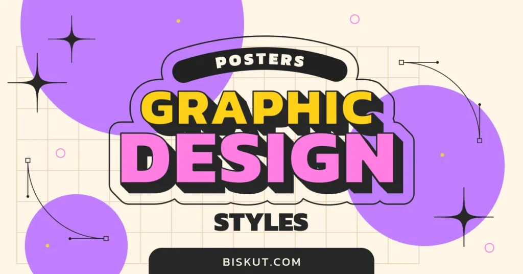
Poster design is evolving, with several graphic design styles gaining prominence. Understanding these styles and how to apply them can take your work to new heights:
Minimalism
Minimalist posters rely on a simplified design process, focusing on essential elements such as typography and negative space. Geometric shapes, sans serif typefaces, and monochromatic color schemes are often used to create a sense of clarity and sophistication. Ideal for brand identity projects where clarity and simplicity are key. Think luxury brands or high-end products where less is more.
Retro-Futurism
Taking inspiration from 1950s sci-fi and art deco styles, retro-futurism blends bright colors with bold, geometric designs. This style is particularly effective for creating posters that grab attention and convey a sense of nostalgia. If you’re working on posters for events like music festivals or tech startups, this style can capture the imagination and create a sense of nostalgia with a dash of modernity.
Brutalism
Known for its raw, unrefined aesthetic, Brutalism rejects traditional design principles in favor of bold, almost cartoon-like magnification. The typography in Brutalism designs is often large and impressive, making it an ideal choice for posters that need to convey a strong, empowering message. Brutalism is great for attention-grabbing, bold designs where the goal is to stand out from more competitors.
Each design style has its place, and choosing the right one depends on your poster’s purpose.
4. How to Choose the Right Fonts for Posters
Typography is the basis of graphic design poster creation. An incorrectly chosen font can reduce the poster’s effectiveness. Here’s how to choose the right font based on the poster design needs:

For food posters
Use fonts that are fun and playful but remain legible. Sans-serif typefaces often work well in these cases, as they offer readability without compromising style.
For event posters
Depending on the tone of the event, you can choose a serif font for a more classic feel or a sans serif for a modern look. Pairing fonts is important; one font should serve as the headline, while the other supports in a smaller size or weight.
Treat font-related issues
Always make sure your font is legible from a distance. Avoid highly stylized or complex fonts that can become unclear when scaled. Use clear fonts that efficiently convey the message while aligning with the brand identity.
5. Color Theory for Impactful Poster Designs
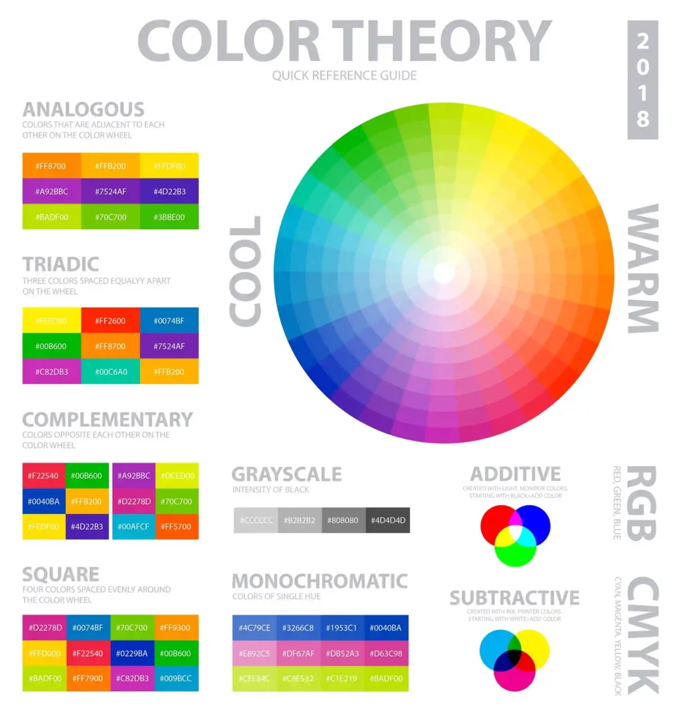
Color is one of the most powerful tools in a designer’s toolkit. It can evoke emotions, capture attention, and communicate messages without the need for words. Here’s how you can use color theory to your advantage:
The psychology of color
Colors can evoke specific emotions – red conveys urgency or excitement, blue can create a sense of calm, and yellow can attract attention and convey happiness. Choose your color palette based on the emotions you want to evoke in your audience.
Before finalizing your poster for print, convert your design from RGB (for digital design) to CMYK (for print design) to ensure color accuracy. Colors that work well on screen may not work the same in print, as the lighting environment affects the appearance. Adjust your hues and saturation as needed to maintain visual consistency in both digital and print formats.
Practical application
For food posters, use warm colors like red, orange and yellow. These colors naturally evoke feelings of hunger and energy, making them ideal for promoting food products or events.
Cool colors like blue, green or purple are good for event posters to create a more calm or professional atmosphere. These colors are especially useful for concerts, exhibitions or business conferences.
Color palette
Consider using monochromatic color schemes for minimalist designs or balanced colors for posters that require more energy and vibrancy. Make sure your color choices support the poster’s overall message, not distract from it.
Use color contrast to highlight important information like headlines or calls to action. High contrast between your background and text ensures readability even from a distance.
6. Tools and Software for Professional Poster Design
Choosing the right tool for poster design is just as important as understanding design principles. Here’s a breakdown of the top design tools available in 2024:
Adobe Photoshop and Illustrator
These are the industry standards, offering unmatched flexibility and precision for creating posters, logos, and illustrations. Illustrator is particularly useful for creating vector-based designs that need to scale without losing quality.
Figma
Gaining popularity for its collaborative features, Figma is an excellent choice for teams working on design projects. It’s also beginner-friendly, making it ideal for designers starting with poster design.
Canva
For those looking to create professional posters quickly, Canva offers a variety of customizable poster templates that simplify the design process. It’s perfect for users who don’t want to dive into complex design software but still need effective communication tools.
Affinity Designer
Known for its affordable price and powerful features, Affinity Designer is a strong alternative to Adobe Illustrator. It offers professional-grade vector editing tools and a user-friendly interface, making it ideal for both beginners and experienced designers. Affinity Designer is perfect for creating complex designs, posters, and illustrations without the subscription model required by Adobe, providing a cost-effective solution for professional poster design.
Remember that every tool has its advantages and the best decision depends on your particular requirements. If you require complex vector illustrations, Illustrator is a must. However, for more easy designs, Canva and Figma are great alternatives.
7. Step-by-Step: Designing a Modern Poster
Creating a modern poster involves more than just combining images and text. It’s about making sure the design grabs attention, communicates a clear message and resonates with the target audience. In this section, we’ll explore the entire design process, providing professional insights that are often left out in basic guides. Whether you’re working on a poster for an event, brand promotion or product launch, these expert tips will help you deliver a stunning final product.
1. Define the Purpose
Every poster should start with a clear purpose. Without it, even well-designed posters can miss the mark. Ask yourself these questions:
- Who is the target audience? Are you designing for a young, vibrant crowd attending a music festival, or for a commercial institution with a community audience? Different audiences will respond to different styles and observations.
- What’s the poster’s key message? Is it about a new product launch, an event or brand awareness? For event posters, focus on the details of the event (name, date, location), while product promotions may require more visual impact.
- What’s the call to action? Whether it’s “Buy Now,” “Attend,” or “Visit Our Website,” make sure the next step for the audience is clear and easy to understand.
A great modern example would be Nike’s “Play New” campaign posters, which use clean visuals, bold fonts, and simple messaging to inspire action. They convey a sense of empowerment and encourage viewers to engage without being overwhelmed.
2. Choose the Right Format
Choosing the right size and orientation for your poster is crucial to ensuring that your design looks great, whether printed or displayed digitally.
- Standard Poster Sizes: Common formats like A3 or 18×24 inches work well for most purposes. However, for certain events, you may need larger or smaller custom sizes depending on where the poster will be displayed.
- Orientation: Vertical is the traditional orientation for posters, but horizontal or square formats can give your design a fresh, modern look. If your poster has a lot of text or a wide image, consider a horizontal format for balance.
- Design Elements: Ensure the layout of text and images complements the format. Spotify’s Wrapped 2023 campaign posters are a good example of how square or non-traditional formats can be eye-catching, especially when displayed on social media platforms.
3. The most important: Creating a Visual Hierarchy
Visual hierarchy is all about guiding the viewer’s eye through your design, making sure they notice the most important parts first. Without this, a poster can feel cluttered or confusing.
Z-Shape Hierarchy
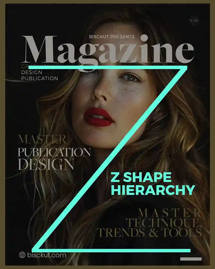
The Z-shape layout follows the natural reading pattern of the human eye, which scans a page from the top left to the top right, then diagonally down to the bottom left, and finally across to the bottom right. This is especially useful for poster designs that have key information at the top (like the event name or call-to-action) and supporting details (such as dates and locations) toward the bottom.
How to Apply It:
- Place the headline or most important element at the top.
- Use an image or focal design element in the middle to guide the eye diagonally.
- Add secondary details, such as dates or logos, at the bottom right.
This Z-shaped visual path works particularly well for more text-heavy posters, making it easier for viewers to process the information quickly.
L-Shape Hierarchy
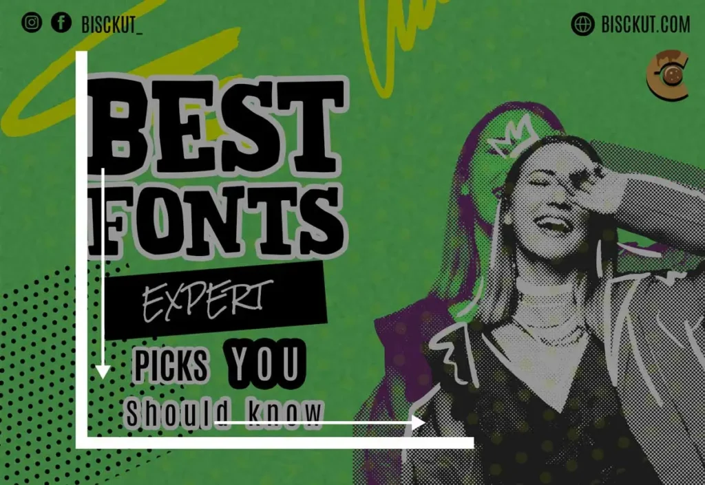
The L-shape layout is another powerful technique, where elements are arranged along the left side and the bottom of the poster. This method helps create a natural reading flow by anchoring the most important information along these two areas.
How to Apply It:
- Place essential elements, like the headline or focal image, along the left-hand side.
- Position secondary information, such as contact details or a call-to-action, along the bottom.
This structure works especially well for minimal or geometric designs, allowing ample negative space and ensuring that your most important content remains readable and uncluttered.
Rule of Thirds

Another important principle for creating a hierarchy is the rule of thirds, which divides your poster into a 3×3 grid. Placing important elements along these lines (especially where they intersect) naturally draws the viewer’s eye.
How to Apply It:
- Align the focal point (like a product or event name) along one of the intersections of the grid.
- Position secondary details like logos or slogans along the other lines for a well-balanced design.
Applying Size, Typography, and Color
- Size: The largest elements should always be the focal point, whether it’s a typographic headline or a key visual such as an illustration. Keep secondary details small but still readable.
- Typography: Use bold sans-serif typefaces for headings to draw attention, and use light or thin fonts to anchor the text. A single bold font in contrast to a light font creates a clear hierarchy.
- Color: Bold, contrasting colors highlight important information, while more neutral tones ensure the focus isn’t scattered. Limiting your color palette also helps keep the design consistent and easy to read.
Pro Tip: To enhance visual hierarchy, use a combination of these techniques. For example, you can combine a Z-shaped layout with the rule of thirds to ensure that key elements (such as a logo or call-to-action) are perfectly aligned for best readability. By incorporating techniques such as an L-shaped flow or the Golden Triangle, you can bring structure and balance to even the most complex poster designs.
An example from Apple’s “Shot on iPhone” campaign demonstrates how clean typography, bold visuals, and thoughtful use of color can work together to create a focused, impactful message
4. Select Fonts and Colors
Font choice and color palettes are at the heart of good poster design. While these decisions may seem straightforward, they can make or break a design.
- Font Readability: Always choose fonts that are easy to read from a distance. Bold, sans-serif fonts are a safe choice for headings, while lighter or more decorative fonts can work for smaller text. Try using modern fonts alongside classic fonts to add depth to your design.
- Color Palettes: Choosing colours isn’t just about aesthetics; it’s about creating the right mood. Warm colours like red and orange tend to feel energetic, while cool colours like blue and green create a calming effect. The 2023 Meta Quest 3 ad campaign used bright, vibrant colours to create excitement about its new VR headset, while keeping text to a minimum for maximum impact.
- Contrast: Ensure there’s enough contrast between the background and text to keep the design readable. High-contrast color combinations help make sure the information stands out.
5. Final Touches: Readability, Balance, and Polish
After completing the main elements of the poster, it’s time to refine the design to make sure everything is balanced and easy to read.
- Readability: Take a step back and review your poster from a distance. Is the main message still understandable? Adjust the font size and color contrast if necessary so that viewers can quickly grasp the information, even from a distance.
- Balance: Balance means an even distribution of visual weight in your design. Make sure the design isn’t cluttered and that there is enough space or negative space for each element to breathe.
- Focal Point: The poster should have a clear focal point – whether it’s an image, logo or main text. This attracts the viewer and directs them to the information they need.
- File Format: Save your design in a high-resolution format for printing, like PDF or TIFF. For digital use, stick with JPG or PNG, ensuring that the colors and details are sharp and vibrant.
Graphic design posters have the power to influence, inspire, and empower audiences when they’re designed with intention and expertise. In 2025, trends like minimalist design, retro-futurism, and brutalism will continue to shape the poster design landscape, but at the core, it’s not just about staying on trend—it’s about solving real communication problems through design.
By avoiding common mistakes, understanding the key design styles, and applying advanced typography and layout techniques, you can create a poster that grabs attention, clearly conveys a message, and leaves a lasting impression. Whether you’re designing a poster for sale, working on a custom poster for a client, or creating prints and posters for an art gallery, the tools and techniques covered in this guide will enable you to improve your designs.
Don’t forget to take advantage of the downloadable resources provided here to simplify your design process. From poster templates to color palettes, these assets will ensure you stay ahead in the competitive world of graphic design. As you continue to upgrade your skills, always remember that the best designs don’t just look attractive – they solve problems, engage audiences and leave a lasting impression.

