Typography is more than just arranging letters—it’s a powerful tool that shapes the way audiences view and interact with your brand. Many graphic designers overlook the essential principles of font psychology, which can have a profound impact on their work. The fonts you choose can evoke emotions, convey credibility, and even increase conversions.
In this guide, we’ll explore key font psychology tips that are often overlooked, diving into the five major font categories—serif, sans serif, slab serif, script, and decorative. We’ll discuss their unique characteristics, and strengths and how leading brands effectively leverage these fonts to enhance their identity and engage their audiences. By understanding these essential tips, you can improve your design work and create more engaging visual messages.
1. Serif Fonts
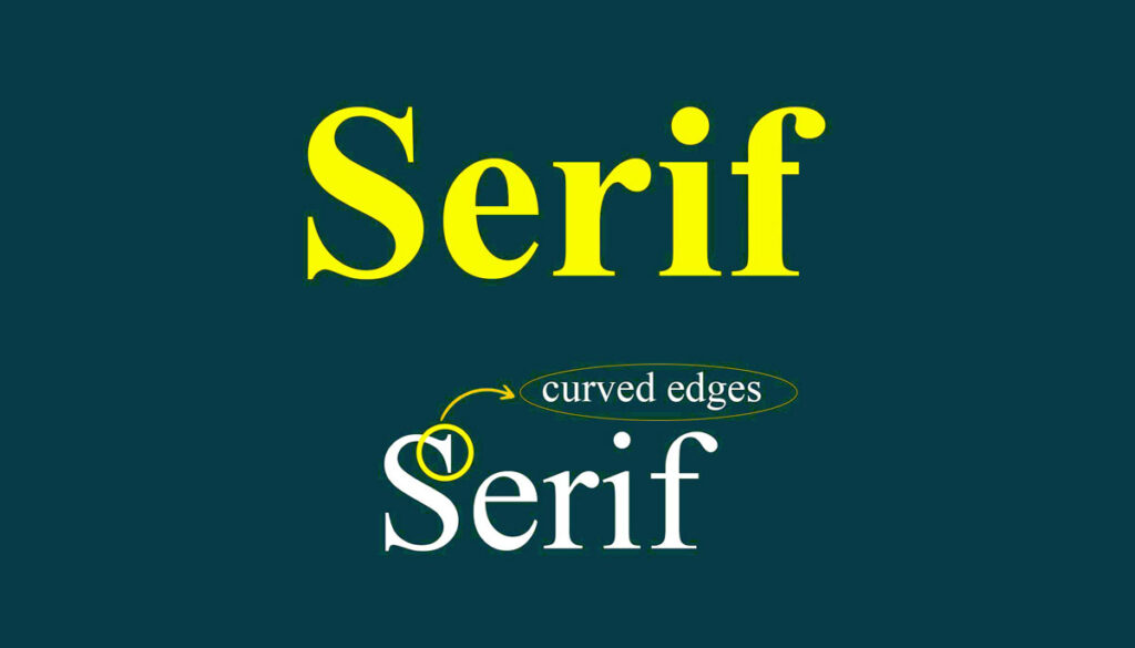
Serif fonts are timeless and have a rich history, originating from Roman inscriptions where small lines, serifs, were engraved on stone to improve readability and prevent cracking. This stylistic choice became a hallmark of formal typography, a symbol of tradition and authority. Over the centuries, serif fonts have evolved in different cultural contexts – from the Renaissance era, where they decorated scholarly works, to their prominence in the publishing industry during the Industrial Revolution.
Their distinctive feature is the small lines or strokes, known as serifs, attached to the end of letters, which contribute to their classic and formal aesthetic. This simple but impactful addition gives serif fonts their classic and formal aesthetic. But what makes them different, and why are they preferred in certain design contexts? Let’s dig deeper.
Feel and Appearance
Serif fonts radiate an aura of elegance, sophistication, and tradition. They are often associated with established institutions, evoking a sense of reliability and trustworthiness. Their intricate designs and wide strokes make them a popular choice for conveying formality and sophistication.
- Psychological Impact: Serif fonts create a sense of reliability, heritage, and authority. They connect well with audiences looking for consistency and professionalism.
- Visual characteristic: The high contrast between thick and thin strokes and decorative serifs creates a distinctive and dazzling look.
Where Serif Fonts Fit
Serif fonts are highly versatile but particularly shine in:
- Print Media: Books, newspapers, and magazines benefit from serif fonts’ exceptional readability over long text passages.
- Luxury Branding: High-end brands use serif fonts to signify exclusivity and timeless elegance.
- Formal Institutions: Universities, banks, and law firms often adopt serif fonts to reinforce their legacy and dependability.
Their structured and complex design conveys a sense of permanence and trust, which is important for industries that rely on tradition and authority. For example, a university logo in a sans serif font may look too informal, failing to convey the seriousness of the institution.
Real-World Brand Examples
- The New York Times: Their serif logo underscores their legacy and journalistic authority, making it synonymous with credible reporting.
- Tiffany & Co.: The serif font in their branding conveys timeless luxury and an air of exclusivity, perfectly complementing their brand ethos.
Famous Serif Fonts
- Times New Roman: A quintessential font for academic and professional documents.
- Garamond: Known for its elegance, often used in literary publications and fine art.
- Baskerville: A classic choice for formal, high-end applications due to its sophistication and readability.
2. Sans Serif Fonts
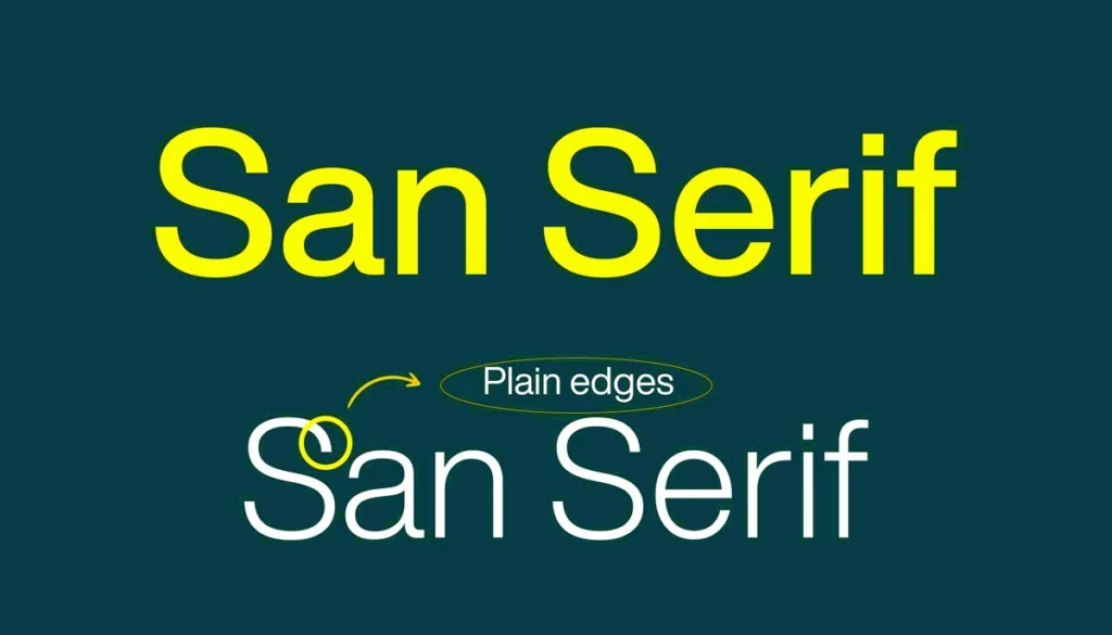
Sans serif fonts emerged as a modern alternative to serif fonts, characterized by their clean and minimalist design. Their rise to prominence is deeply intertwined with the cultural shifts of the early 20th century, particularly the modernist design movement. As society embraced industrialization and functionality, designers sought typefaces that reflected these ideals – discarding the decorative serifs of the past in favor of clarity and simplicity.
For example, the Bauhaus school of design favored sans serif fonts as a symbol of progress, which aligned with their character of form following function. This cultural pivot solidified sans serif typefaces as symbols of modernity and innovation, making them a foremost in contemporary design. The lack of decorative serifs gives them a contemporary and accessible feel, making them crucial in digital and branding design.
Feel and Appearance
Sans serif fonts are straight and highly legible. They are often associated with innovation, simplicity, and openness. Their neutral design allows them to be adapted seamlessly to a variety of contexts.
- Psychological Impact: These fonts evoke clarity, modernity, and a sense of accessibility. They are often seen as inclusive and friendly.
- Visual characteristic: Uniform stroke weights and geometric shapes contribute to their streamlined and uncluttered appearance.
Where Sans Serif Fonts Fit
Sans serif fonts are particularly effective in:
- Digital Interfaces: Their clarity and scalability make them ideal for websites, apps, and other digital platforms.
- Tech and Startups: Brands in this space prefer sans serif fonts for their contemporary and innovative feel.
- Healthcare and Wellness: Clean lines and simplicity help establish trust and convey hygiene.
Unlike serif fonts, which can look too traditional or decorative, sans serif fonts provide a clean slate that aligns with modern user experiences and brand narratives. For example, a tech company using serif fonts can look outdated and less relevant.
Real-World Brand Examples
- Google: Their sans serif logo reflects innovation and accessibility, which aligns perfectly with their user-focused mission.
- Apple: The sleek sans serif typography underscores their minimalist design philosophy, echoing simplicity and sophistication.
Famous Sans Serif Fonts
- Helvetica: A timeless, neutral font favored across industries for its versatility.
- Futura: Known for its geometric precision, it’s a go-to for brands that prioritize design.
- Arial: A practical and widely used font, especially in digital contexts.
3. Slab Serif Fonts
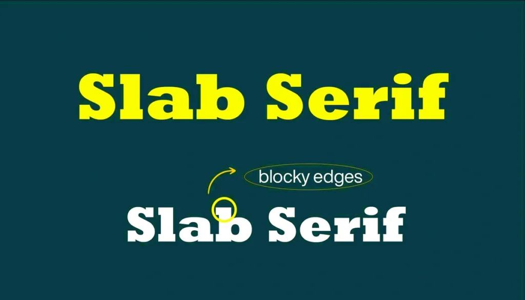
Slab serif fonts are a bold and confident variation of the traditional serif font, with a history dating back to the Industrial Revolution. Their thick, block-like serifs were initially designed to make advertisements and posters more impressive during a time of rapid industrial and commercial expansion.
This era saw a growing need for eye-catching typography to effectively communicate messages in urban environments. Slab serif fonts bring a sense of power and modernity to designs while maintaining a connection to tradition. Their industrial roots and strong appearance make them versatile for a variety of branding needs.
Feel and Appearance
Slab serif fonts balance strength with style. They stand out for their bold and strong look while retaining some of the traditional elements of serif fonts. This combination creates a modern yet grounded aesthetic.
- Psychological Impact: Slab serif fonts convey strength, dependability, and authority.
- Visual Characteristic: Thick serifs, uniform stroke widths, and a strong visual presence make them suitable for impactful designs.
Where Slab Serif Fonts Fit
These fonts are well-suited for:
- Advertising: Their boldness ensures headlines grab attention.
- Sports and Outdoors: Their rugged design aligns with themes of durability and action.
- Corporate Branding: Companies looking to balance tradition with a contemporary twist often choose slab serif fonts.
While serif fonts might feel overly traditional and sans serif too minimal, slab serifs strike a perfect balance, offering both strength and character.
Real-World Brand Examples
- Sony: Their slab serif typography communicates durability and innovation.
- Volvo: The bold slab serif logo strengthens its reputation for safety and strength.
Famous Slab Serif Fonts
- Rockwell: Ideal for bold, impactful headlines.
- Clarendon: A versatile and approachable font used in various display contexts.
- Courier: Known for its monospaced design, reminiscent of typewritten text.
4. Script Fonts
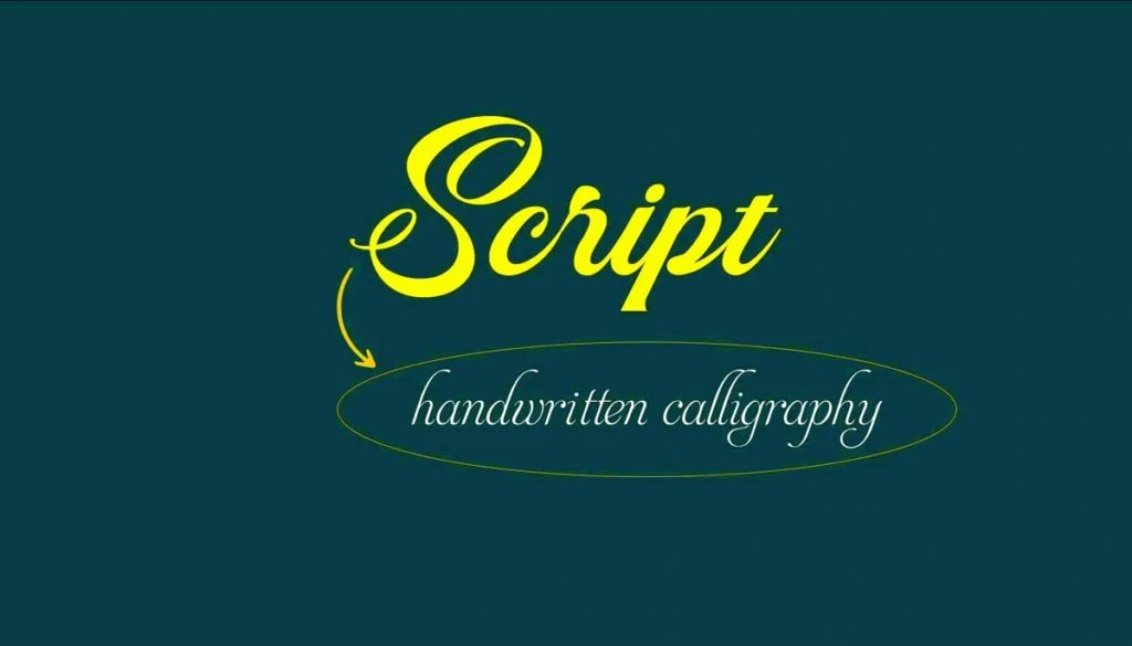
Inspired by cursive handwriting, script fonts bring a sense of elegance and personalization to designs. They can be broadly classified into formal scripts and casual scripts, each of which serves different purposes. Formal scripts, such as those used in wedding invitations or luxury branding, copy traditional calligraphy with intricate and ornate details that convey a message of sophistication and prestige.
Casual scripts, on the other hand, have a more relaxed and accessible style, often used in creative branding or lifestyle industries to evoke warmth and playfulness. This variety makes script fonts versatile for designs that prioritize emotional connection and artistry. They vary from highly formal to playful and casual styles, providing a wide range of applications.
Feel and Appearance
Script fonts are fluid and decorative, with an emphasis on beautiful and intricate letterforms. They often highlight creativity and charm, making them a popular choice for emotional and artistic contexts.
- Psychological Impact: These fonts evoke sophistication, creativity, and personalization.
- Visual Characteristic: Flowing strokes, varied thickness, and ornate details create a distinctive aesthetic.
Where Script Fonts Fit
Script fonts are perfect for:
- Event Invitations: Weddings, parties, and formal events benefit from their elegance.
- Artistic Branding: Creative industries that prioritize uniqueness and individuality.
- Luxury Goods: They emphasize exclusivity and sophistication.
Serif and sans-serif fonts lack the emotional depth and decorative charm that script fonts provide. They draw attention with their artistry, making them ideal for personal and high-end designs.
Real-World Brand Examples
- Coca-Cola: Their iconic script logo conveys nostalgia and tradition, making it instantly recognizable.
Famous Script Fonts
- Brush Script: Casual and approachable, often used in retro designs.
- Pacifico: A playful and modern script font ideal for friendly branding.
- Lobster: Known for its bold and condensed style, perfect for impactful headlines.
5. Decorative or Display Fonts
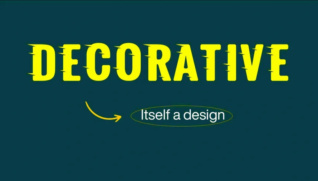
Decorative fonts are unique, artistic, and attention-grabbing. They are designed to make a statement and are rarely used for body text due to their intricate and often unconventional designs. Their roots are associated with various historical and artistic movements, such as Art Nouveau, which emphasized detailed and decorative aesthetics, and the Pop Art era, known for bold and vibrant typography.
These fonts often draw inspiration from cultural and thematic elements, making them highly relevant. For example, Gothic decorative fonts emerged from medieval manuscript traditions, while psychedelic fonts of the 1960s reflected the counterculture and artistic experimentation of the time. By focusing on specific artistic or cultural influences, decorative fonts not only express personality but also evoke the spirit of a particular era or theme, making them powerful tools for storytelling and branding.
Feel and Appearance
Decorative fonts are highly stylized and full of personality. They often incorporate themes or visual elements that resonate with specific audiences or contexts.
- Psychological Impact: Decorative fonts captivate attention, convey individuality, and create strong thematic impressions.
- Visual Characteristic: Elaborate designs, unconventional shapes, and thematic elements dominate decorative fonts.
Where Decorative Fonts Fit
These fonts shine in:
- Entertainment: Movie titles, game logos, and promotional posters.
- Fashion and Art: Industries that thrive on creativity and bold statements.
- Thematic Branding: Products or events with unique themes or niche audiences.
While serif and sans-serif fonts prioritize functionality and readability, decorative fonts focus solely on visual appeal. Their uniqueness makes them ideal for small text elements that need to stand out.
Real-World Brand Examples
- Disney: Their decorative logo captures magic, creativity, and whimsy, resonating with audiences worldwide.
- LEGO: The playful and bold decorative font appeals to their youthful and creative audience.
Famous Decorative Fonts
- Comic Sans: Playful and informal, though often polarizing in professional contexts.
- Papyrus: Evokes an ancient and textured feel, frequently used in thematic designs.
- Metallica Logo Font: Custom-designed to embody the band’s edgy and bold image.
Enhancements Based on Recent Research
Japanese Font Design Research
A 2023 study explored the role of Japanese font design in influencing impression formation and decision-making in text-based communication. This research highlights how font psychology plays a crucial role, as typefaces act as emotional and cultural cues, deeply influencing perceptions. For example, fonts with traditional Japanese aesthetics were found to evoke feelings of authenticity and respect for heritage, while more modern designs convey innovation and accessibility.
These insights into font psychology are invaluable for brands looking to connect with diverse audiences, as they emphasize the importance of cultural sensitivity in font selection. For example, a brand entering the Japanese market may choose a font that aligns with cultural expectations to build trust and engagement. The study highlights typefaces as emotional signs, illustrating how cultural context and visual design can deeply influence perception. For brands targeting an international audience, understanding these nuances through font psychology is essential.
Kolenda Font Model
The Kolenda Font Model provides a framework for explaining how fonts are perceived and associated with specific characteristics. For example, heavier font weights are often associated with strength and stability, while lighter weights suggest fragility and elegance. Fonts with sharp, angular shapes are typically associated with dynamism and assertiveness, reflecting a bold and energetic personality. In contrast, fonts with rounded edges convey a message of warmth, friendliness, and accessibility, making them ideal for brands that want to appear inviting and welcoming.
Italicized or italicized fonts can suggest speed and creativity, adding a sense of fluidity and novelty to their application. These associations provide valuable guidance for aligning font characteristics with the brand’s intended image and emotional resonance. This theory of font psychology can deepen our understanding of why certain fonts evoke specific emotional responses, increasing their effectiveness in brand messaging. For example, fonts with sharp angles are considered strong and energetic, while rounded fonts exude warmth and friendliness.
Conclusion
Typography is more than just a visual element; it’s a communication tool that reveals much about a brand’s personality, values, and aspirations. By understanding the unique characteristics, applications, and psychological effects of serif, sans serif, slab serif, script, and decorative fonts, designers can make informed choices that enhance their message and connect deeply with their audience. The inclusion of recent research, visual examples, and contemporary brand case studies ensures that this guide remains an authoritative and engaging resource for understanding font psychology.

