Unleash Your Creativity with Graphic Design Principles
Most people are familiar with Graphic design principles or may have studied them. But when it comes to applying these principles in real life, you are still incapable of understanding the physics of graphic design, and your work becomes messy. Now! Have you ever thought about how it all works? What’s the science behind it? In this article, you’ll review the important points that will help you unleash your full potential to create a design that stands out!
Balance: The Backbone of Design
Balance shapes the structure of graphic design; according to it, we have to place our elements and shapes, which makes the design look neat and clean.
Symmetrical balance:

Take a blank sheet of paper and draw two circles. One is on the left side, the other on the right side. We will observe the formation of a symmetrical pattern. It gives our design a sense of order and stability. Symmetrical balance is frequently used in formal design and informative graphics.
Asymmetrical Balance

In asymmetrical balance, we place elements and shapes in a manner that makes our design more creative and appealing. This is similar to Tetris, in which we mix different shapes to create an interesting layout. It’s all about combining various elements to make the design look more vibrant.
Radial Balance
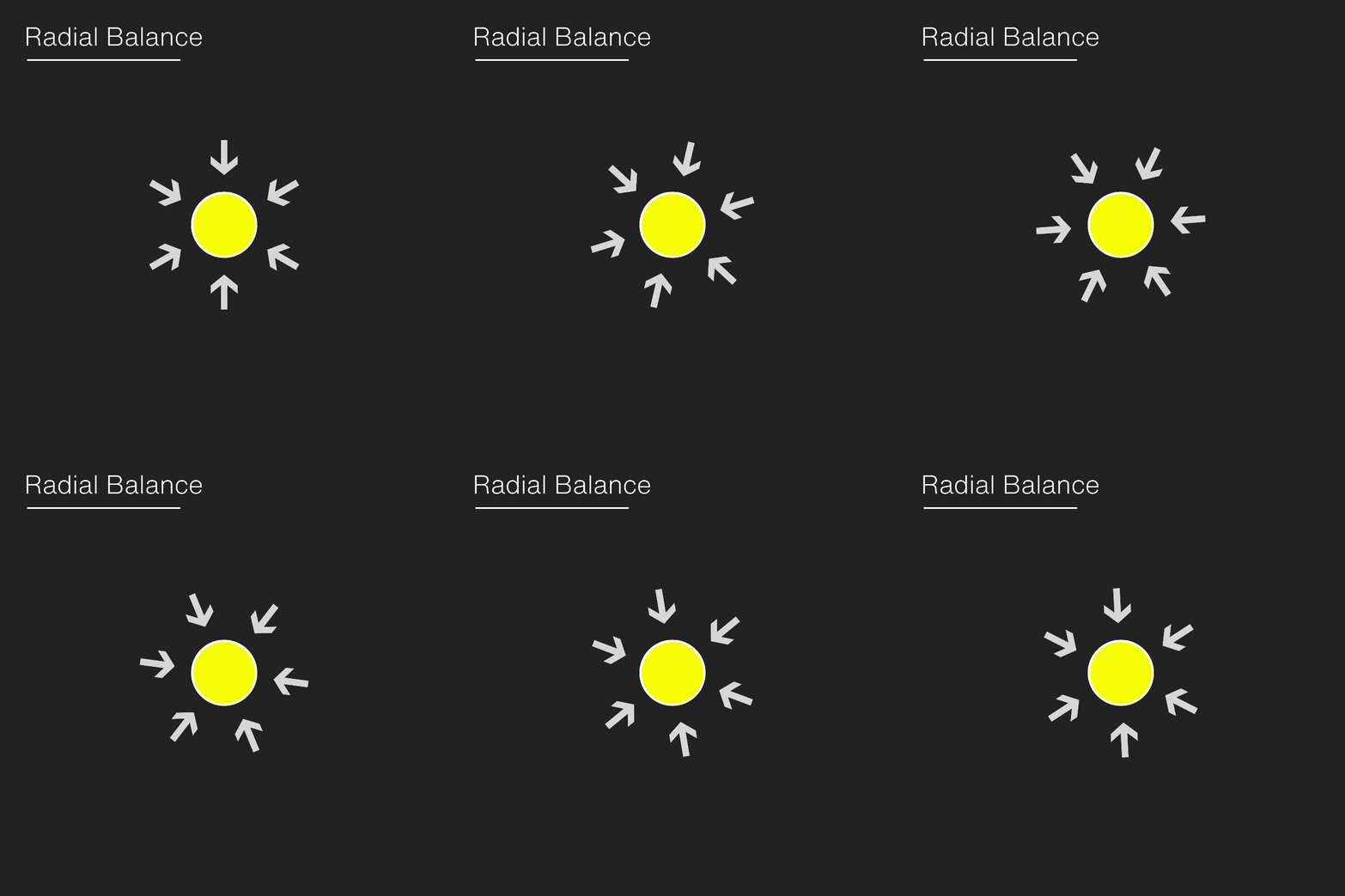
Imagine you throw a pebble into a pond; ripples spread out in all directions. The spot where the pebble fell becomes the focal point, and the ripples forming around it direct viewers toward that focal point. Radial balance creates a sense of movement and energy, which makes the audience view the focus element first.
Tips: Symmetrical balance might be the best option for formal and informative designs.
Contrast: Making Things Pop
Contrast is what makes your design pop out and be attention-grabbing. It is also a crucial part of graphic design principles.
Colour Contrast

Mix light colours with bold colours to highlight the important elements. For example, pairing bright yellow with deep navy blue can create a striking contrast that attracts the eye.
Typography contrast

Play with various fonts and sizes to create accents and hierarchy in your text. To differentiate between the two, choose a bold, uppercase font for headlines and a lighter, smaller font for body content.
Here’s the secret: use a bright background with dark colour fonts. Using this strategy, the essential elements that you wish to highlight will pop out automatically.
Hierarchy is the most important part of graphic design principles.
Hierarchy is like giving your design a roadmap and guiding people through the important stuff. Consider the following points related to hierarchy in graphic design:
Play with typography.
Typography plays an important role in establishing hierarchy in the design. Use different font sizes and weights. Always choose a font that has a light, regular, semi-bold, or bold version of it. Family fonts are always the first choice of a professional graphic designer. For example, if you are creating a social media post, just follow these basic steps:
- Heading: Make the heading larger and use a bold font to make it more notable and attention-grabbing.
- Subheading: Use a semi-bold font in the subheading and make it slightly shorter than the heading.
- Body text: In this, you can choose between regular and light fonts. Body text contains your creative’s information.
Color contrast for striking hierarchy.
If you are using a light-colored background, then the text on it should be dark, and vice versa. It helps to increase the visibility of fonts.
Alignment and negative space

Text placement is also an important part of graphic design. Either align the text (including headings, subheadings, and body) on the left side or place the text in the centre. If you don’t have any elements or images to put in the design, choose centre alignment. On the other hand, in designs that include PNG images or objects, text should be positioned to the left or right.
Negative space gives room to breathe into your design, which avoids cluttering. Space around and between elements helps to create a sense of balance and harmony.
Colour theory- Magical part of Graphic design principles
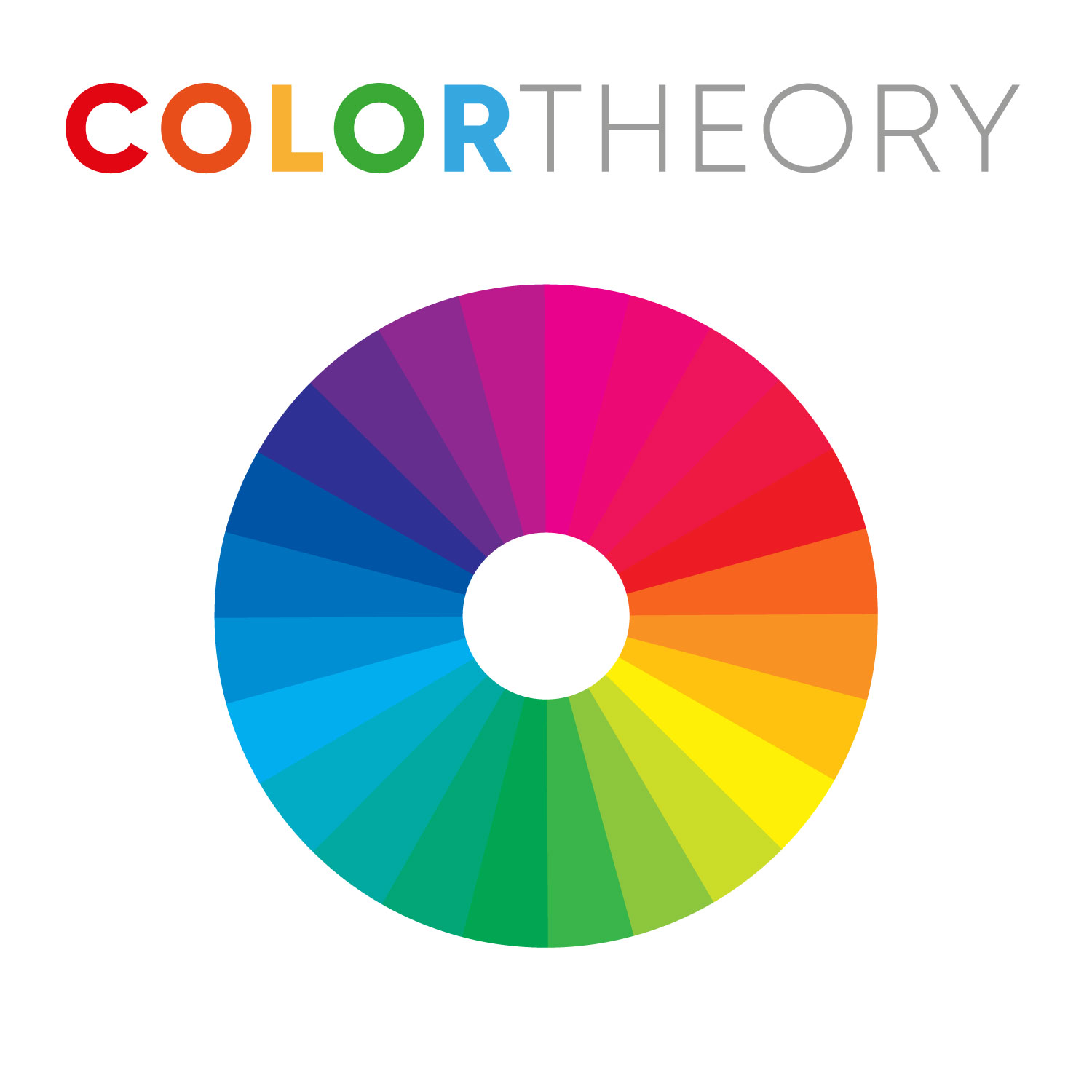
Colour theory represents the tone and emotions of graphic design.
- Select colors wisely. Colour has different meanings, and each colour represents its unique property. Therefore, think about the message you want to convey and choose colours that support your brand.
- Stay consistent. Use the same colour palette across all your designs to build brand recognition. If you want people to recognize your brand and be familiar with it, then stay consistent with your brand colours.
Tip: Nothing beats nature’s color palette. For example, cheetah skin is yellow with black spots. Yellow and black are a great colour combination.
In Conclusion
Graphic design is a concept that you will not be able to learn in one day or a week. Note: Learning and consistency are the keys. The more you learn, the more you will become an expert. These graphic design principles are just the base of graphic design, or you can say they are just like structures or footprints. So whenever you design a logo, poster, or website, these graphic design principles will help you create visually attractive designs. So go ahead, unleash your creativity, and make something amazing.
Next Step: Applying the graphic design principles
Daily Practice and Research
To master any type of skill, practice is important. Download well-designed graphic posts and try to take inspiration from them. Start practising your unique design. The more you practice, the more you become efficient at creating professional designs in the real world.
Build your portfolio.
When you gain experience, start building a portfolio that showcases your best work. A strong portfolio not only represents your skills but also acts as a powerful marketing tool when approaching freelance projects or job opportunities.
Network
Try creating links with your fellow graphic designers, clients, and collaborators through social media platforms like behance, 99 designs or design meetups. Building strong professional relationships can help you earn more.
Stay Inspired
The Internet is full of different varieties of art from which you can take inspiration. It is your daily task to keep searching for design trends, various techniques, and new ways to design better. Even professional graphic designers are in continuous learning mode. Never keep yourself away from learning.
The journey does not end here. Keep challenging yourself and pushing your limits.

