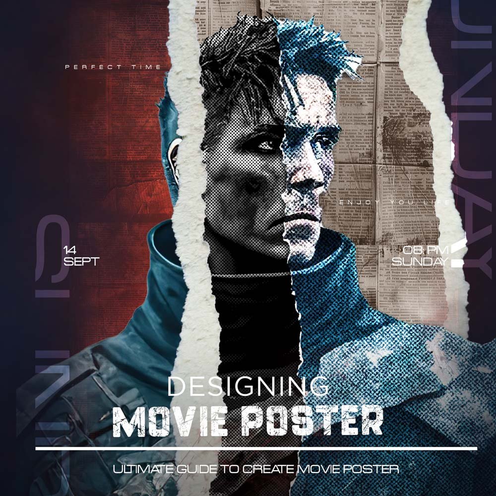
How to Design Movie Poster: A Step-by-Step Guide for Stunning Results
Creating a movie poster is more than just sticking a title on an image. It involves creativity, strategy, and understanding the art of visual communication. Whether you’re a beginner or an experienced designer, here’s how you can design a movie poster that stands out and leaves a lasting impression.
1. Mastering Graphic Design Principles
A great movie poster is built on strong graphic design principles such as alignment, contrast, balance, and hierarchy. These fundamentals make your design look professional and intentionally created, rather than cluttered or amateurish.
- Alignment ensures that each element on the poster has a visual relationship with another element, creating a structured look.
- Contrast helps important elements like the movie title stand out by using colors, shapes, or sizes that oppose each other.
- Balance is about making sure the poster doesn’t feel too “heavy” on one side.
- Hierarchy is what guides the viewer’s eyes through the poster—from the lead actor’s face to the title, then to the credits.
Every poster I’ve designed—whether simple or complex—relies on these principles. Without mastering these, it’s difficult to create any type of graphic, let alone a stunning movie poster.
2. Understanding the Movie’s Theme and Emotion
Before diving into Photoshop, take the time to understand the film’s main message and emotion. The poster should reflect the tone of the film—whether it’s a light-hearted comedy, a dramatic thriller, or an action-packed adventure.
If you don’t capture the essence of the film, your design will fail to communicate with the audience. This is a step that is often missed but is very important. You can do this by reading about the film, watching the trailer, or discussing the project with the film’s director.
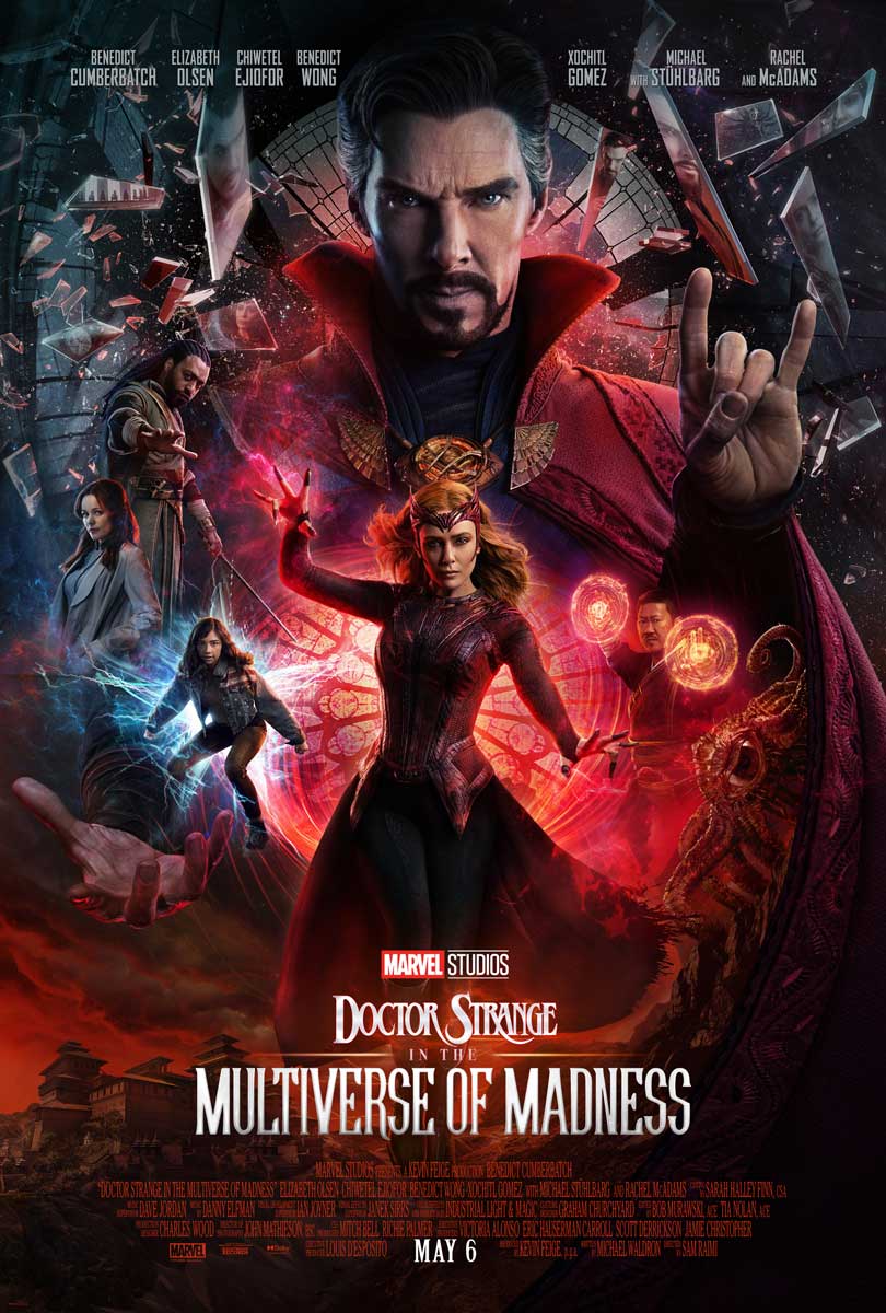
For example, the Doctor Strange in the Multiverse of Madness poster uses chaotic, swirling visuals to reflect the unpredictable, chaotic nature of the multiverse. The bold colors and shapes aren’t just random; they’ve been carefully chosen to evoke feelings of wonder and danger.
3. Why Photoshop is a Designer’s Best Friend
If you’re creating a movie poster for a professional-level project, it’s nearly impossible not to learn Adobe Photoshop. Photoshop offers advanced tools that you won’t find in free software, making it easy to achieve the polished, high-quality look that large companies demand.
- Layer Masks let you smoothly blend images..
- Smart Objects let you resize without losing quality.
- Blending Modes can be used to create lighting effects and dramatic overlays.
Personally, I find Photoshop’s advanced tools important. When I create posters for clients, these features help me bring my creative ideas to life in a way that would be impossible with basic software.
4. Creating an Engaging Layout
Your movie poster layout should be clear, attractive, and appealing to look at. The “rule of thirds” is often used to create balance, with key elements such as the title or the main actor’s face placed further away from the center to create more interest.
Movie posters follow a visual hierarchy, leading the viewer’s eye from the most important element (usually the lead actor or the movie title) to supporting details (such as credits or a tagline). The distance between elements also matters; overcrowding in your design can distract viewers and make the poster difficult to read.
For example, the poster for Doctor Strange features the character front and center, with a vortex-like design surrounding him. This not only puts the focus on the character, but also emphasizes the film’s theme of multiple realities swirling around.
5. Choosing Fonts that Match the Movie’s Tone
Typography is another essential part of movie poster design. It’s not just about readability; it’s about conveying the style and tone of the film. Bold fonts are good for action movies, while more elegant, cursive fonts may be appropriate for romantic dramas.
Tip: When creating a design, avoid using more than two fonts. Too many fonts make the design look cluttered. Please select one font for the title and a matching font for the credits.
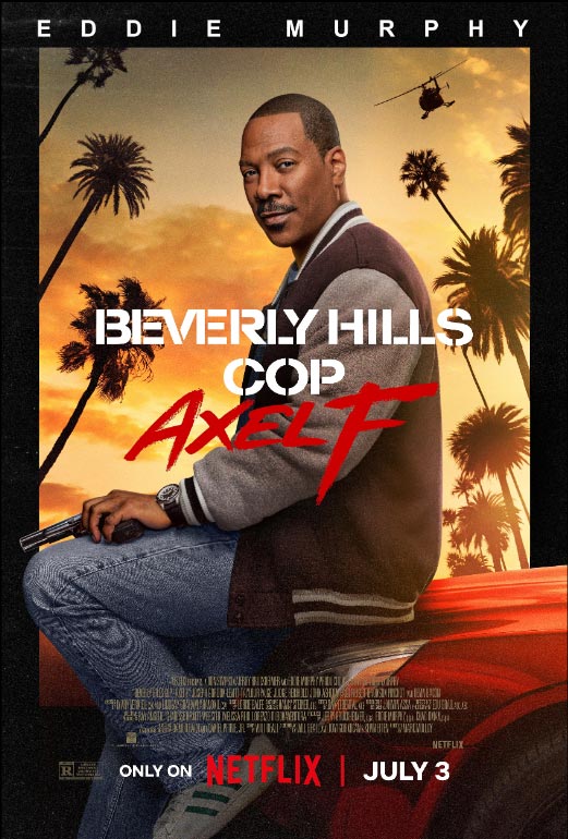
For example: Beverly Hills Cop: Axel F Poster
In the Beverly Hills Cop: Axel F poster, the font choice is a bold, sans-serif typeface and handwritten font. This reflects the action-packed nature of the film while maintaining an element of simplicity. The designer’s choice to use bold typography makes the title stand out without distracting from Eddie Murphy’s confident, cool posture. This balance of simplicity and boldness matches the film’s blend of action and comedy, making it memorable for audiences.
6. Using 3D Effects and Text Enhancements
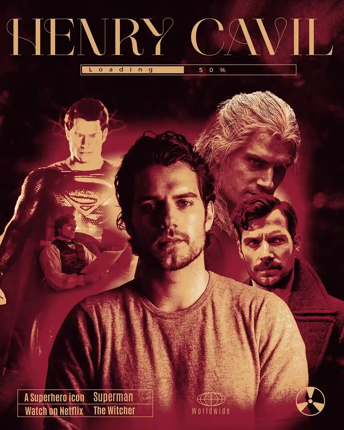
To make your movie poster stand out, adding 3D effects and gradients maps to the text can help create a sense of depth. These techniques draw the viewer’s attention to important information such as the title or release date.
3D effects can make your text look like it’s popping off the page, adding layers and making your design more dynamic. Combining this with subtle gradient maps, transitioning smoothly between colors, can add a professional look to your work.
In my own projects, 3D effects and text enhancements have made basic designs much more attractive and impressive.
7. Color Psychology and Its Role in Poster Design

Colors play a huge role in movie poster design, as they evoke emotions and set the tone for the film. For example, red is often used to symbolize danger or passion, while blue can represent peace or mystery.
In the poster of Doctor Strange, the designer has used a mix of purple and red to depict chaos and magic. These colors immediately grab the attention of the audience and suggest that the film will be both exciting and mysterious.
Pro Tip: Never underestimate the power of color. Even subtle color choices can greatly impact the image of your poster.
8. Use High-Quality Resources for a Polished Look
Quality matters when designing movie posters. High-resolution images, clean vectors, and professional templates can take your design to a whole new level.
Websites like Freepik and Envato provide high-quality resources, from images to icons and textures, that can help you create a professional-looking poster without spending hours drawing or photographing the elements yourself.
When I need great assets, I turn to Freepik and Envato. They have thousands of resources that save me time and ensure my designs look professional and polished.
9. Keeping Up with Design Trends
Trends change quickly in the design world, and movie posters are no exception. Minimalist designs, which focus on clean lines and simple layouts, are currently very popular. Keeping your design aligned with current trends ensures that your poster looks fresh and modern rather than outdated.
For example, trends like negative space (intentionally leaving parts of your design blank) can create a sophisticated, elegant look without overwhelming the viewer with too much information.
In my experience, following design trends isn’t just about aesthetics – it’s about matching the emotional and cultural feel of the film. Design trends often reflect broader social moods, and keeping up with these can make your poster more relatable to viewers.
10. The Importance of a Catchy Tagline and Billing Block
The tagline and billing block (credits below the poster) are small but should never be overlooked. The tagline should summarize the film in just a few words, while the billing block should list the key cast and crew members in a way that does not distract from the main design.
Conclusion
When learning how to design a movie poster, it’s not just about putting images and text together. Every element, from layout and typography to color choices and design principles, plays a key role in creating a great, professional-looking poster. By mastering Photoshop’s advanced tools, understanding the emotional tone of a movie, and using high-quality resources, you can create posters that will captivate and appeal to audiences.
Take inspiration from iconic designs like Doctor Strange or Beverly Hills Cop, and remember that staying updated on trends and using color psychology can give your designs an edge. Now it’s your turn to use these tips to create movie posters that are as unique and powerful as the films they are.

