Your app logo is the first thing people notice. It’s the face of your brand, a small but powerful symbol that speaks volumes before your app even opens. A great logo grabs attention, leaves a lasting impression, and helps people recognize your app instantly.
Think of the most popular apps—Instagram, WhatsApp, TikTok. Their logos are simple, clear, and memorable. This is no coincidence. A well-designed app logo builds trust, stands out in a crowded app store, and makes your app look professional.
In this guide, you’ll learn how to create the perfect app logo. You’ll find expert tips, practical design ideas, and the key elements that make a logo successful. Whether you’re designing it yourself or hiring a designer, this article will help you make the right choice for a strong and effective app logo.
II. Understanding the Role of an App Logo in Branding
Your app logo is more than just a visual—it’s a vital part of your brand identity. It represents your app’s personality, values, and purpose in a single recognizable image. A strong logo tells users what your app is about before they even tap to open it.
Think about colors and shapes. A banking app might use blue to convey trust, while a creative app might use bold, playful colors. Typography also plays a role—rounded fonts feel friendly, while sharp edges feel modern and tech-inspired. Every design choice affects how users perceive your brand.
Simplicity and relevance are the keys to an effective logo. Studies show that people understand simple logos faster and remember them longer. That’s why the best logos avoid clutter and focus on clear, meaningful visuals. Your logo should also match your app’s purpose.
A fitness app with a lightning bolt feels energetic, while a meditation app with soft curves and neutral tones feels calm. Whether you’re creating a new brand or redesigning an existing one, the right logo can help your app stand out. By understanding branding principles and user psychology, you can design a logo that connects with people and leaves a lasting impression.
III. Research and Inspiration
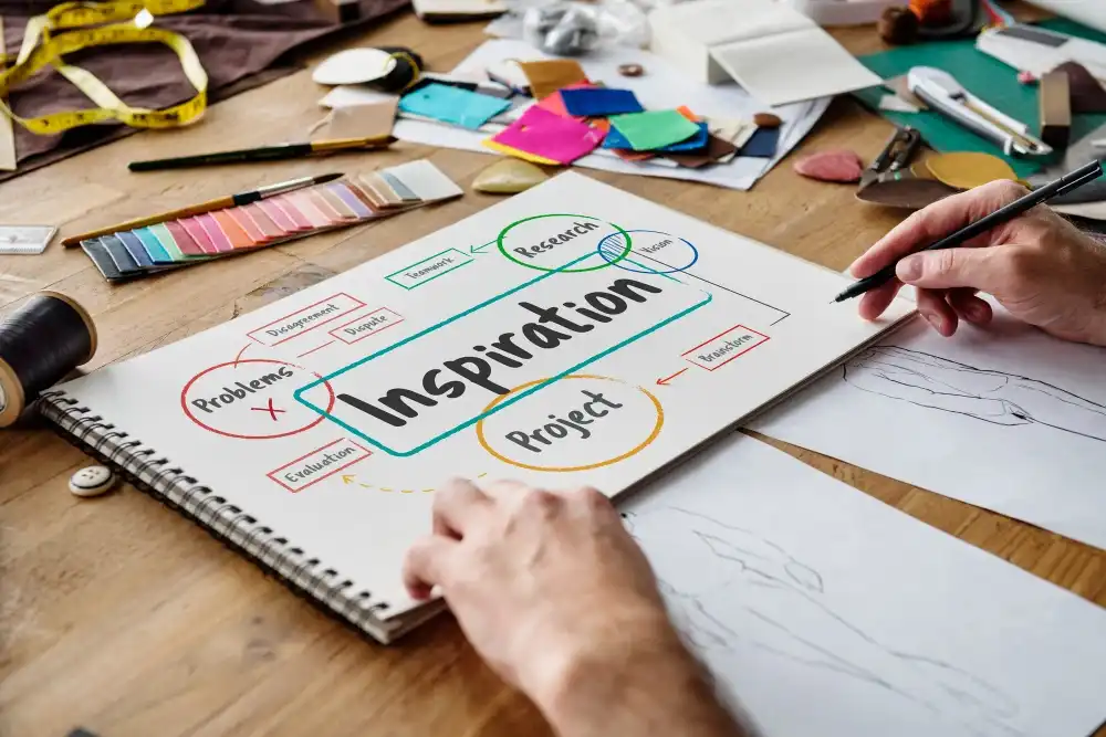
Before you start designing your app logo, it’s important to do your research. Studying competitor logos helps you understand what works in your industry and what to avoid. Look at the top apps in your field—what colors, shapes, and styles do they use? Are they minimal, bold, or playful? This research helps you design something unique while staying relevant to your audience.
Trends keep changing, and keeping up with them ensures your logo doesn’t look outdated. In 2025, some popular trends include gradient effects for depth, geometric shapes for structure, and AI-generated design elements. But trends should enhance your logo, not define it—timeless designs always perform better in the long run.
For inspiration, check out platforms like Behance, Dribbble, and Pinterest. These sites showcase the work of top designers from around the world. Design blogs like Brand New, LogoLounge and Creative Bloq also offer insight into what’s trending and why certain logos are successful.
A great way to organize your ideas is to create a mood board. Gather the logo style, color palette, typography and visual elements that match your brand’s personality. Tools like Milanote, Canva and Adobe Express make it easy to compile references. This step helps you visualize your concept before you begin the actual design process.
By analyzing the market, searching for creative sources and organizing your ideas visually, you create a solid foundation for a great app logo that’s both modern and meaningful.
IV. Key Elements of a Perfect App Logo
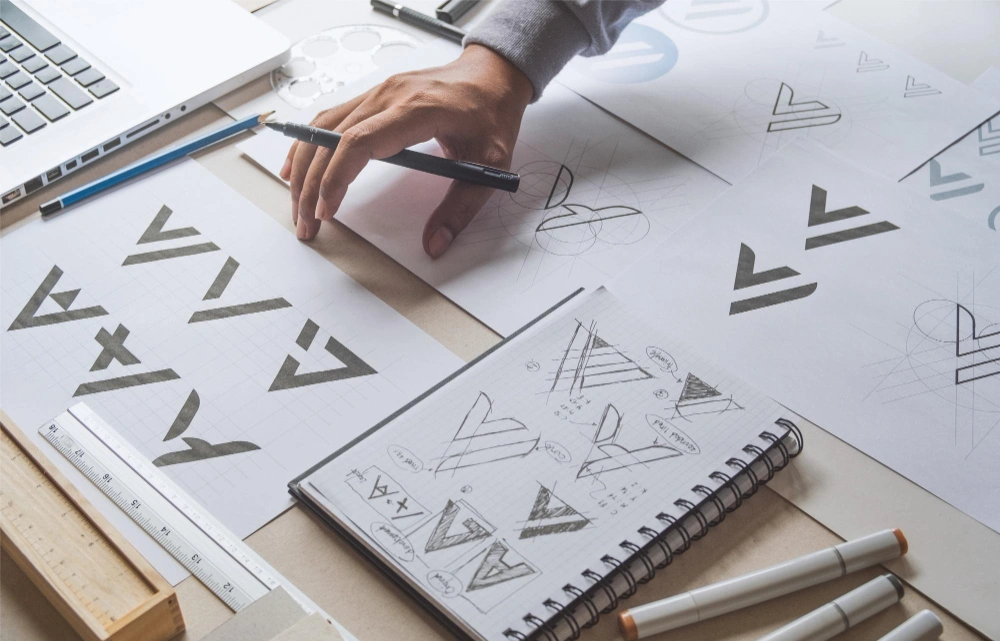
A great app logo is more than just a pretty design—it’s a functional, recognizable, and lasting symbol of your brand. Here’s what makes an app logo truly effective:
1. Simplicity
Less is always more. The best logos are clean, uncluttered, and easy to recognize at a glance. Complex designs don’t scale well, especially for small app icons. Simple logos like Instagram’s camera or Twitter’s bird stand out because they’re minimal yet meaningful.
2. Scalability
Your logo should look great on all screen sizes—from app icons to full-screen promotions. A common mistake is adding lots of small details that get lost when resized. Use vector-based designs and test how your logo looks on different devices.
3. Versatility
A strong logo works in multiple formats. You should have full-color, monochrome, and transparent background versions to meet different marketing needs. A well-designed logo remains impactful whether it’s in an app store, on social media, or in print.
4. Relevance & Timelessness
Trendy designs fade, but timeless logos last a long time. Your logo should be in line with your app’s purpose and evoke the right emotions. For example, a fitness app might use a bold, energetic font, while a meditation app might have soft, rounded designs.
5. Memorability
A great logo is memorable. Unique shapes, custom typography, and different color combinations make logos easy to remember. Think of TikTok’s neon glow or Snapchat’s bright yellow – both are instantly recognizable.
By focusing on these key elements, you ensure that your app logo remains strong, adaptable, and unforgettable.
V. Step-by-Step Process to Designing Your App Logo
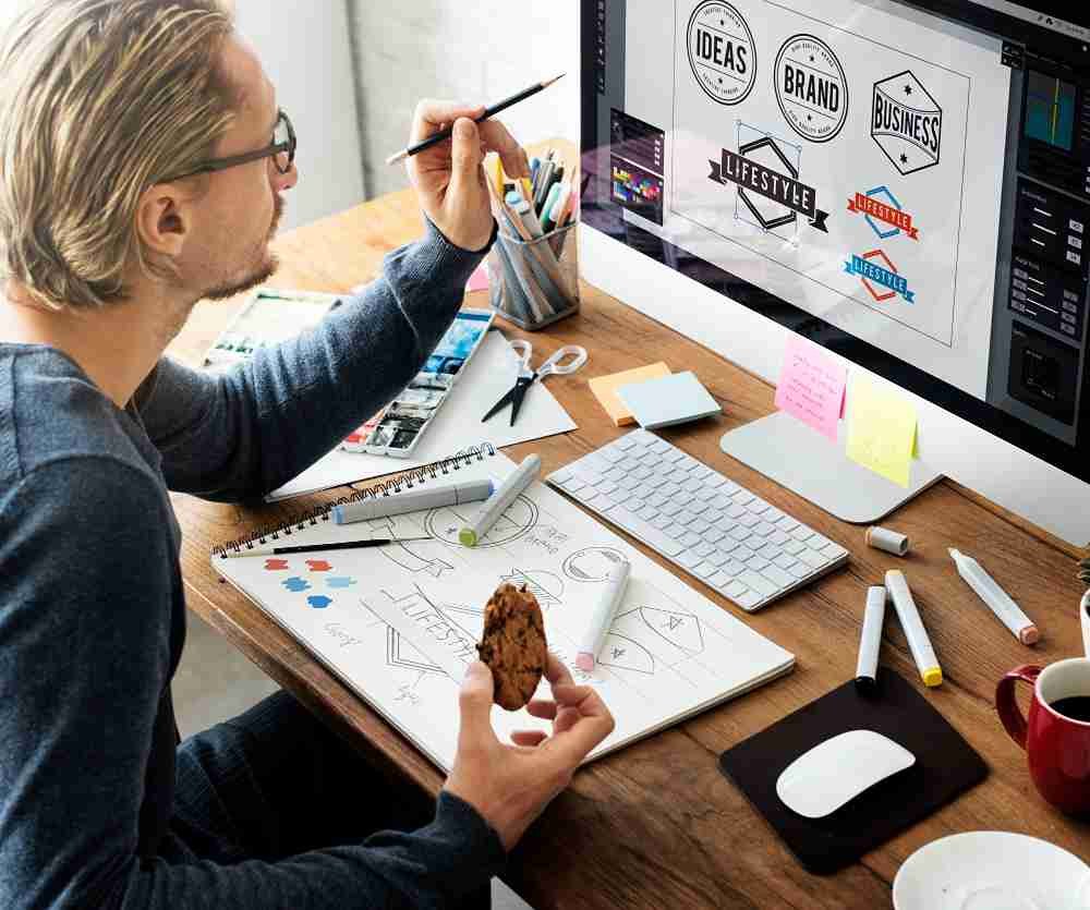
Creating the perfect app logo requires strategy and creativity. Follow these steps to design a logo that’s both functional and visually striking.
1. Define Your Brand Identity
Before you design, get clear on your mission, vision, and values. What message should your logo convey? Who is your target audience? A finance app might need a relatable, corporate feel, while a gaming app might need bold, high-energy visuals. Your brand tone, market positioning, and user expectations should guide your design choices.
2. Brainstorm and Sketch Concepts
Start with mind mapping and rough sketches before diving into digital design. Explore different styles—minimalist, geometric, flat, or 3D. AI-assisted design tools like Adobe Firefly and Midjourney can provide creative directions. Test multiple concepts to find the strongest one.
3. Select the Right Colors and Typography
Colors evoke emotions. Blue boosts trust (LinkedIn), red boosts readiness (YouTube), and green signals growth (Spotify). Use a limited color palette for clarity. When choosing a font, sans-serif styles look modern, while script fonts add personality. Custom typography can also make your logo more unique.
4. Design for Scalability and Adaptability
Your logo should look sharp at every size, from small app icons to large displays. Test it in light mode, dark mode, and different backgrounds to ensure clarity. Tools like Figma and Sketch help visualize responsiveness on different screens.
5. Refine and Iterate
Once you have a strong concept, gather feedback. Show your logo to designers and potential users. Conduct A/B testing to see which version resonates best. Small tweaks—like refining spacing, simplifying shapes, or adjusting contrast—can improve clarity and memorability.
Great logos evolve, so refine your design until it feels just right.
VI. Tools and Resources for App Logo Design
Creating a professional app logo requires the right tools and resources. Whether you’re a beginner or an experienced designer, these tools can help streamline your workflow and enhance your creativity.
1. Professional Design Software
For high-quality, scalable logos, vector-based tools are essential. These professional design apps offer advanced features for precision and flexibility:
- Adobe Illustrator – The industry standard for creating vector logos with custom typography and scalable graphics.
- Figma – A cloud-based tool perfect for collaboration and responsive logo testing across different screen sizes.
- Sketch – A macOS favorite, ideal for UI designers working on app branding.
2. Free and User-Friendly Alternatives
If you’re looking for budget-friendly tools, these platforms offer great functionality without a subscription:
- Canva – A beginner-friendly tool with pre-made logo templates and drag-and-drop features.
- Inkscape – A powerful, open-source vector editor that rivals Illustrator.
- LogoMakr – A quick, web-based logo generator with customization options.
For designers who want ready-to-use resources, you can check out our collection of logo design templates and logo mockups here to speed up your process and present your logos in a professional way.
3. Learning Resources & Communities
Staying updated with design trends is crucial. These platforms help sharpen your skills:
- CreativeLive & Domestika – Online courses taught by industry experts.
- LogoLounge & Brand New – Websites analyzing the latest trends in logo design.
- Dribbble & Behance – Communities where top designers share their work and provide inspiration.
By using the right tools, free resources, and learning from experts, you can create a standout app logo that captures attention and strengthens your brand.
VII. Expert Tips and Best Practices
Creating a standout app logo isn’t just about aesthetics—it’s about strategy, branding, and usability. Here are expert-backed tips to refine your logo design process.
1. Insights from Top Designers
Industry leaders emphasize simplicity, adaptability, and uniqueness in logo design. As Sagi Haviv, a renowned identity designer, says:
“A great logo is three things: appropriate, distinctive, and simple.”
Top brands like Apple, Instagram, and Spotify follow this principle—keeping their logos minimal yet powerful. Paul Rand, the designer behind IBM and UPS logos, also advised that a logo should be timeless, not trendy.
2. Case Studies: What Works and Why
Studying successful app logos can provide valuable insights:
- Instagram: Their rebrand from a detailed camera icon to a simple, colorful gradient helped with brand recognition and scalability.
- Twitter (Now X): The original blue bird was designed for instant recognizability and emotional connection, but the recent shift to “X” shows the power of rebranding based on business evolution.
- WhatsApp: Its logo remains unchanged yet effective, proving that consistency builds trust.
3. A/B Testing for Optimization
Your logo isn’t just for you—it’s for your audience. Testing multiple variations can help determine which version resonates best. Use tools like:
- Google Optimize – To A/B test different logo versions.
- UsabilityHub – To get real user feedback on clarity and appeal.
- Social Media Polls – To gauge reactions in real time.
The key takeaway? A well-tested logo leads to better brand recall and stronger user engagement. Keep refining based on data, not just intuition.
VIII. Common Pitfalls to Avoid
Even the most talented designers can make mistakes when creating an app logo. Here are the most critical pitfalls to avoid and how to design a logo that stands the test of time.
1. Overcomplicating the Design
More detail doesn’t always mean better. Highly intricate logos lose clarity at smaller sizes, especially on app icons. Simplicity improves recognition, scalability, and versatility. Think about Apple, TikTok, or Snapchat—their logos are instantly recognizable because they stick to simple, bold elements.
💡 Pro Tip: If your logo relies on fine details or gradients, test it in a 32×32 px format. If it becomes unrecognizable, simplify it.
2. Ignoring Brand Consistency
A logo that doesn’t align with your brand confuses users and weakens trust. For example, a finance app using playful, neon colors might feel unreliable. A logo should reflect your brand personality, industry, and target audience expectations.
💡 Pro Tip: Keep a brand style guide for logo usage, color schemes, and typography to maintain consistency across your app, website, and marketing materials.
3. Lack of Scalability
Your logo must be clear and effective on all screen sizes, from app icons to full-screen splash screens. If a design loses detail or becomes unreadable when resized, it will fail across different platforms.
💡 Pro Tip: Design in vector format (SVG, AI, or EPS) and always test your logo at different resolutions before finalizing it.
4. Following Trends Blindly
Trendy designs may look modern today but can quickly become outdated. Logos should be timeless yet adaptable, like Facebook’s subtle updates over the years. Avoid gimmicky trends like excessive gradients or overly stylized fonts unless they serve a strategic purpose.
💡 Pro Tip: Focus on strong shapes, meaningful symbols, and clean typography rather than fleeting design fads. A logo should last at least 5-10 years without feeling outdated.
By avoiding these pitfalls, you’ll create a logo that’s versatile, brand-aligned, and built for long-term success.
Conclusion
Designing a great app logo is more than just creating a visually appealing symbol—it’s about building a strong brand identity that your audience will love. In this guide, you learned why app logos play an important role in branding, how to research and gather inspiration, and what key design elements make a logo work.
From simplicity and scalability to versatility and memorability, every detail matters when creating a logo that stands out in a crowded marketplace. You also learned the step-by-step design process, essential tools and resources, expert insights, and common pitfalls to avoid. By applying these principles, you can create a logo that’s not only appealing but also timeless and aligns with your brand’s vision.
Now that you have the knowledge, it’s time to put it into practice. Whether you’re starting from scratch or refining an existing design, take the time to experiment with different colors, typography, and layouts. Design is an iterative process, and the best logos often come from constant refinement and feedback. Don’t hesitate to ask for feedback from other designers, potential users, or your target audience to ensure your logo makes an impact.
We’d love to see what you create! Share your logo concept and get feedback from the design community. If you have any questions or need advice, leave a comment and join the conversation. To help you get started, check out our free logo templates and mockups and bring your ideas to life. Stay connected for the latest design trends, expert tips, and creative inspiration. Your app’s logo will be the first impression users have of your brand—understand its importance and create something that’s truly memorable!

