Swiss graphic design is one of the most influential design styles in the world. It’s known for its clean layouts, precise typography, and focus on simplicity. You’ve seen its influence in posters, book covers, advertisements, and even modern websites. This design style values order and clarity, making it easier for people to understand information at a glance.
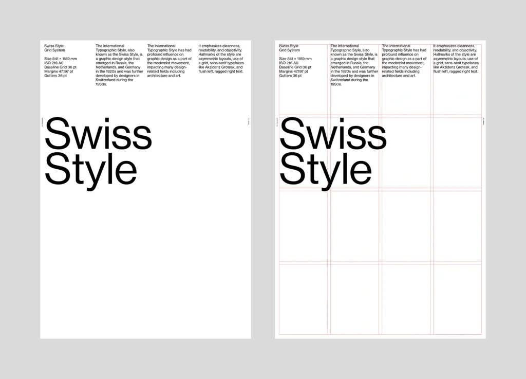
It was born in Switzerland in the mid-20th century and is often called the “international typographic style” because it shaped design trends far beyond its own country. What makes Swiss graphic design stand out is the use of grids. Designers use invisible lines to organize text and images, creating a balanced and professional look.
The style also relies heavily on sans-serif fonts like Helvetica, which was created in Switzerland and is one of the most popular typefaces in the world. Swiss design avoids unnecessary decoration and instead focuses on function — everything in a design has a purpose. Even today, Swiss graphic design influences branding, advertising, and digital design. Many modern companies follow its principles to create simple, effective logos and user-friendly websites.
You can see its influence in Apple’s minimalist approach or corporate branding that uses clean typography and structured layouts. Its timeless nature makes it a favourite among designers who want to create work that looks modern and professional, no matter the decade.
If you’re a designer, understanding Swiss graphic design can help you improve your work. By focusing on clarity, structure, and simplicity, you can create designs that communicate messages effectively. Whether you’re designing posters, websites, or logos, the principles of Swiss design can help make your work more appealing and easier to read.
What is Swiss Graphic Design?

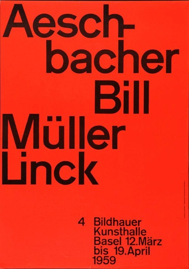
Swiss graphic design is all about simplicity, structure, and clear communication. It focuses on clean layouts, easy-to-read typography, and a strong sense of balance. Instead of using flashy decorations or complex designs, this style keeps things minimal, ensuring that each element has a purpose. You’ll often see lots of empty space, bold sans-serif fonts, and carefully placed images. The goal is to make information easy to understand at a glance, whether it’s a poster, a magazine cover, or a website.
This design style began in Switzerland in the 1950s. At the time, designers wanted to create a more modern and functional approach to visual communication. They developed a system based on grids, which helped organize text and images in a structured way. This made the design look professional and consistent. Designers like Josef Müller-Brockmann and Armin Hoffmann became key figures in shaping this movement, inspiring many others around the world.
One of the biggest contributions of Swiss design is typography. Fonts like Helvetica, Universum, and Akzidenz-Grotesk were created during this period and are still widely used today. These typefaces are simple, clean, and highly readable, making them perfect for both print and digital design.
Even if you don’t realize it, Swiss graphic design is everywhere. From corporate branding to modern websites, its influence is hard to ignore. If you want to create designs that look professional and timeless, learning from Swiss design principles can be a great start.
Core Principles & Elements
Swiss graphic design is built on a few key principles that make it stand out. The focus is on structure, simplicity, and readability. Every design follows a clear system, making it easier to process information. The two most important elements in this style are the grid system and white space.
The grid system is the backbone of Swiss design. It helps organize text and images into a clean and balanced layout. Instead of placing elements randomly, designers use invisible lines to guide their placement. This creates a structured look that feels professional and consistent. Along with the grid, white space (or negative space) plays a big role.
It allows designs to breathe, making them easier to read and visually appealing. White space isn’t empty – it helps guide the eye and improves clarity.
Swiss Typography

Typography is one of the strongest features of Swiss graphic design. Designers prefer sans-serif fonts because they are clean and highly readable. Helvetica, created in 1957, is one of the most famous Swiss fonts, along with Univers and Akzidenz-Grotesk. These typefaces avoid unnecessary details and work well in almost any design. The use of consistent font sizes and alignment also ensures a structured and professional look.
Minimalism and Layout

Swiss design follows a “less is more” approach. It removes distractions and focuses only on the essential elements. Instead of adding complex embellishments, designers use simple shapes, clean lines and well-spaced materials. This makes the design feel timeless and easy to understand. Whether posters, magazines or digital screens, this minimalist approach helps deliver messages clearly and effectively.
Modern Trends & Contemporary Adaptations 2025
In 2025, Swiss graphic design will blend its timeless principles with modern innovations to create visuals that are both classic and fresh. This style is rooted in clarity, simplicity, and functionality, but designers like you are finding new ways to update this look for today’s digital world. Here’s how you can embrace these modern trends and incorporate Swiss design into your projects.
1. Update the Swiss Style with Vibrant Elements
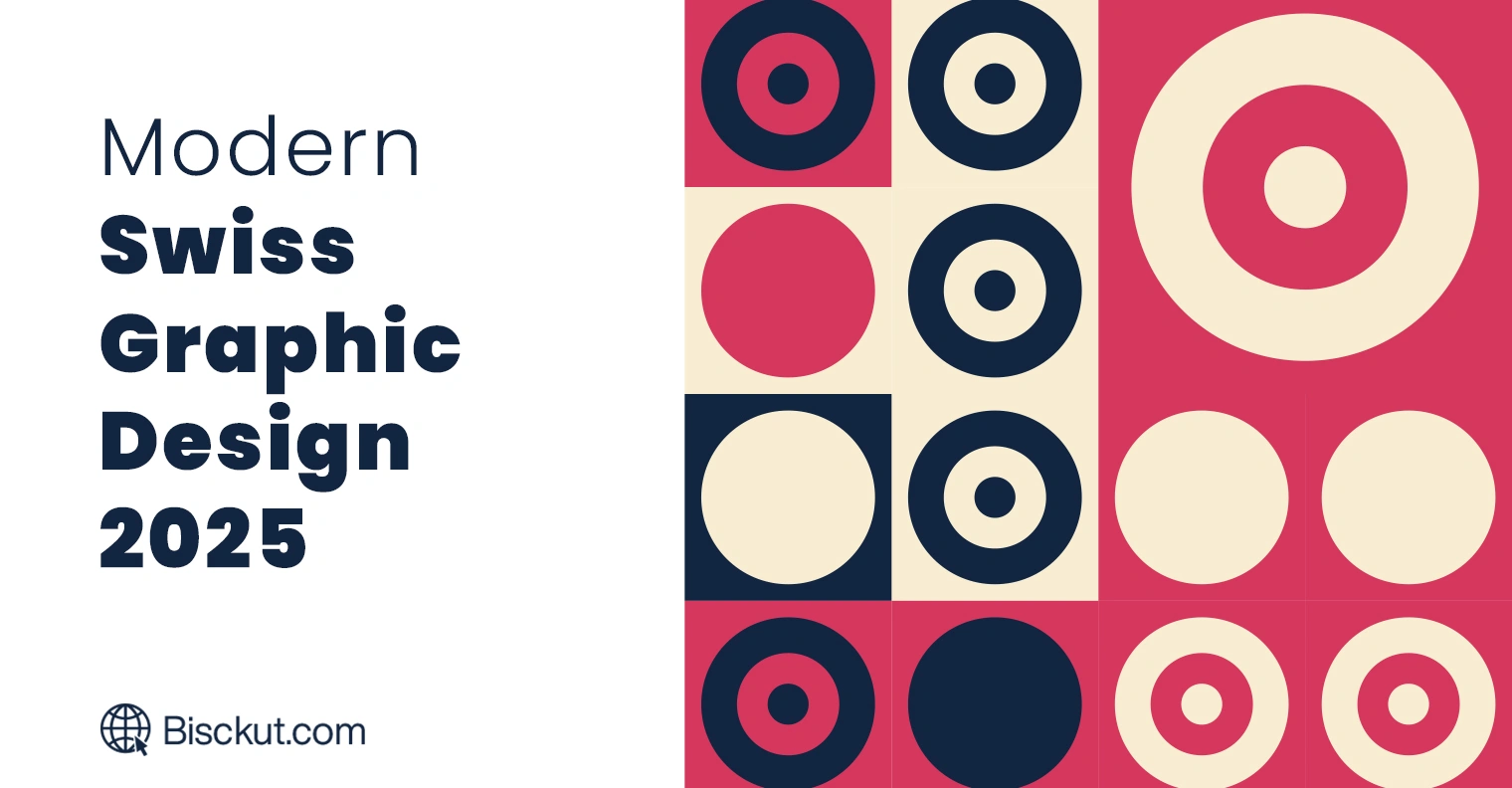
Instead of sticking to traditional neutral colors, try experimenting with vibrant colors. Adding bold colors can make your design more interesting without losing the clean structure that defines Swiss design. For example, you can use red or blue to highlight key elements while keeping the rest of the layout minimal. This not only refreshes the classic look but also aligns with today’s preference for energetic and dynamic visuals.
2. Integrate Hand-Drawn Illustrations and Organic Textures
Consider adding hand-drawn illustrations or organic textures to bring a personal touch to your design. These elements can reduce the rigidity of a strict grid layout and add warmth to your work. Mixing digital and hand-drawn components allows you to maintain the precision of Swiss design while introducing creativity. This combination makes your design feel both personal and professional.
3. Experiment with Innovative Typography
Typography is a key element of Swiss design. While classic fonts like Helvetica and Univers are still great choices, don’t be afraid to try new typefaces for a contemporary feel. One exciting trend is the use of ink trap fonts. These fonts were designed to improve readability in small print, but they now offer a unique look that works well on digital screens. You can also try variable fonts, which can be easily adjusted to different devices while keeping your text clear and attractive.
4. Embrace Fluid and Dynamic Layouts
Although Swiss design traditionally relies on a strict grid, current trends encourage a more flexible approach. Start with a grid as your base, then play with asymmetry and flexible spacing to create a dynamic layout. This method helps guide the viewer’s eye naturally through your design and adapts your work to different screen sizes. You might also consider adding subtle animations or micro-interactions to make the experience more engaging while maintaining order.
5. Leverage Modern Design Tools and Resources
To bring these trends to life, use modern design tools that support flexible grids, advanced typography, and interactive elements. Programs like Figma, Adobe XD, and even new AI-powered design platforms can help you quickly prototype and test new ideas. These tools let you experiment freely while ensuring your designs stick to the core Swiss principles of simplicity and clarity.
In short, Swiss graphic design in 2025 is a blend of traditional techniques and modern creativity. By updating your color choices, incorporating organic elements, experimenting with innovative typography, and adopting dynamic layouts, you can create designs that are both functional and engaging. This approach keeps the Swiss style relevant, influential, and adaptable in the ever-changing world of graphic design.
How to Achieve the Swiss Design Aesthetic
Swiss graphic design is all about balance, clarity, and simplicity. If you want to apply this style to your projects, you need to focus on structure, typography, and minimalism. Here is a step-by-step guide to help you create designs that follow the Swiss aesthetic.
1. Use a Grid System for Structure
The grid is the foundation of Swiss design. It helps organize content, ensuring everything is properly aligned. To start, divide your layout into equal columns and rows. This will guide the placement of your text and images, ensuring a balanced look. Many design tools like Adobe InDesign, Figma, and Canva allow you to easily create grid layouts. Follow these guides to keep your design structured and professional.
2. Choose the Right Typography
Typography is one of the strongest elements of Swiss design. Use sans-serif fonts like Helvetica, Univers, or Akzidenz-Grotesk. These fonts are clean, modern, and highly readable. Keep text sizes consistent and align everything neatly. Avoid decorative fonts or unnecessary variations in type styles. The goal is to make the content easy to read at a glance.
3. Keep It Minimal and Use White Space
Swiss design follows a “less is more” approach. Remove unnecessary elements and focus only on what’s essential. Use plenty of white space to let your design breathe. This makes the content stand out and improves readability. Instead of adding borders, shadows, or extra graphics, let spacing and alignment create a clean, balanced look.
4. Stick to a Simple Color Palette
Swiss design often uses neutral colors like black, white, and gray, but you can also use bold primary colors like red or blue. When using color, use it sparingly – usually for emphasis, not decoration. A splash of color used correctly can help highlight important details while maintaining a minimalist look.
5. Use Asymmetry for a Modern Feel
Although Swiss design is structured, it doesn’t have to be perfectly symmetrical. Many Swiss designers use asymmetry to make the layout more dynamic while still following a grid. Try placing elements off-center while keeping them aligned with the grid system. This creates an interesting, modern feel without losing balance.
6. Prioritize Clarity and Readability
Every part of your design should serve a purpose. Make sure text is easy to read, images are relevant, and the overall layout easily guides the viewer’s eye. Avoid clutter, unnecessary effects, or decorative elements that don’t add value.
7. Use the Right Tools and Resources
To achieve the Swiss design look, use design tools that offer strong typographic control and grid systems. Some great tools include:
- Adobe InDesign – Ideal for structured layouts and precise typography.
- Figma – Great for digital Swiss-style UI/UX designs.
- Canva – Simple but useful for beginners looking to apply Swiss principles.
- Grid calculators – Online tools that help create custom grids for balanced designs.
By following these steps, you can create professional, timeless designs that capture the essence of Swiss graphic design. Whether you’re working on a poster, website, or brand identity, these principles will help you design with clarity and impact.
Conclusion & Future Outlook
Swiss graphic design has left an indelible mark on the creative world. Its focus on simplicity, structure, and clarity has influenced everything from branding to digital interfaces. Swiss style principles — such as grid systems, clean typography, and minimal layouts — are still relevant today, proving that good design is timeless. Whether in print, advertising, or web design, you can still see its influence everywhere.
Looking ahead, Swiss design aesthetics will continue to evolve. Modern designers are experimenting with bolder colors, motion graphics, and interactive elements while maintaining a structured and minimalist approach. The rise of digital tools and AI-assisted design is also shaping the way Swiss principles are applied, making layouts more dynamic and adaptable for different screens and platforms.
At its core, Swiss design is about communication. No matter how trends change, the goal remains the same — to convey clear and engaging messages. As you explore design, incorporating Swiss principles will help you create work that feels professional, balanced, and effective. Whether you follow the classic style or take it in a new direction, the influence of Swiss design will continue to shape the future of visual communications.


