When it comes to creating a strong brand identity, typography plays a huge role. I’ve seen how Extra Bold fonts can completely transform a brand. They not only make a visual statement but also evoke emotions and make a logo stand out in a crowded marketplace.
Think about it—how do you want your brand to be remembered? Whether you’re designing a logo or creating a bold ad, Extra Bold fonts leave a lasting impression. Bold, impactful typography helps build brand recall, which is a must in today’s competitive design world.
In this article, I’m going to walk you through the main benefits of using Extra Bold fonts in branding, and how to choose the right font, and I’ll share some of the best picks I’ve used in my projects. Whether you’re working on a logo, social media post, or packaging, there’s a bold font for every branding need.
What Makes a Font “Extra Bold” in Branding?

As a graphic designer, I’m often confused about which fonts are “extra bold.” While bold fonts are common, extra bold fonts take that strength to the next level. Think of extra bold fonts as the heavy lifters of typography – designed to stand out in visually demanding spaces without overwhelming the design.
From a design perspective, the weight of extra bold fonts serves a strategic purpose. Their meaningful presence not only draws attention but also creates balance. The secret is to use them thoughtfully. Too much boldness can be disturbing, while too little won’t have the desired effect.
Extra bold fonts fall between bold and black fonts. They’re more versatile than black fonts and offer enough boldness to ensure readability even from a distance. This makes them ideal for headlines, banners and logos where you want the message to stand out. These fonts provide the perfect solution when creating brand identities that convey confidence, authority or boldness.
Top 14 Extra Bold Fonts for Memorable Branding Projects
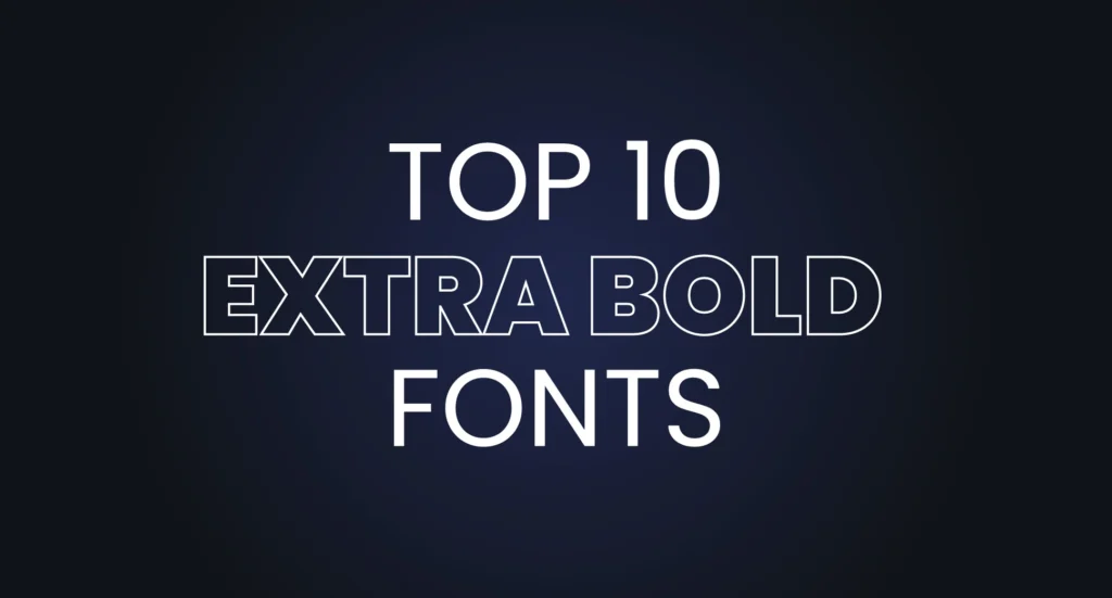
I’ve carefully selected some of the best Extra Bold fonts that are versatile, impactful and available for free. Each of these fonts has something unique to offer depending on your branding needs
Poppins Bold
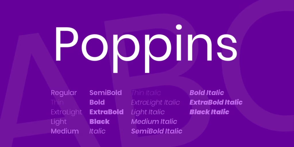
A geometric sans-serif font that’s friendly and modern, perfect for brands looking for an accessible, yet bold identity. Poppins’s clean lines make it a great choice for tech and lifestyle brands.
Oswald Bold
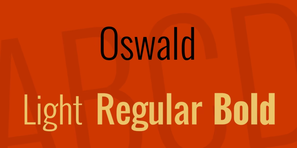
With its concise look, Oswald is great for designs where space is limited, yet you still want the text to stand out. It’s great for social media or poster design.
Anton

Strong, bold and simple. Anton’s wide, blocky look makes it ideal for headlines and banners where you need to grab attention quickly. It’s a versatile font for modern brands that want to make a big statement.
Roboto Bold

With its balanced mix of mechanical and organic shapes, Roboto provides a clean, legible extra bold option that works well for both print and digital designs.
Montserrat Bold
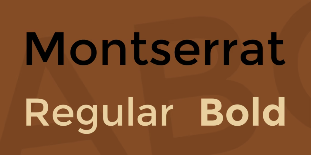
Its elegant curves and bold structure make it an excellent choice for luxury branding and product packaging.
Bebas Neue

This font is perfect for creating posters and social media banners. Its tall, slender form gives the design a dynamic look.
Fjalla One
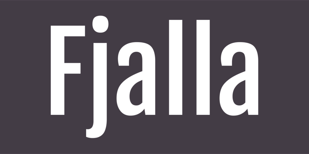
A compact sans-serif that gives you high readability even at small sizes, making it great for advertising materials or packaging.
Raleway Bold
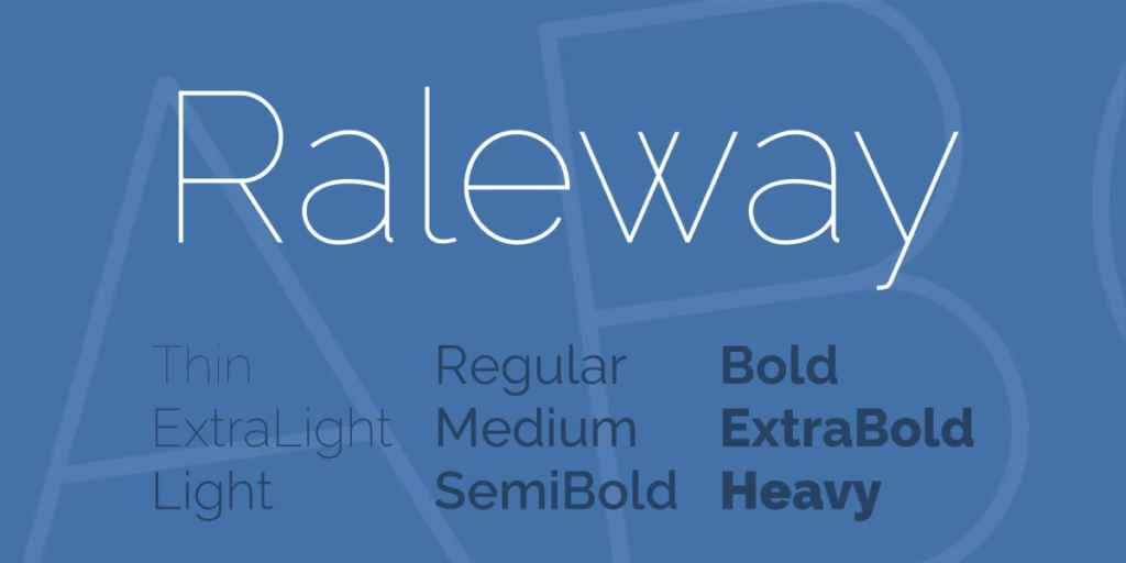
A modern, sans-serif font that strikes a balance of boldness and elegance. It’s great for the creative industry or minimalist branding projects.
Bitter Bold
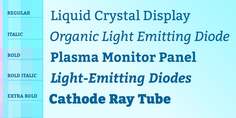
A serif option that brings a classic yet bold feel to branding, ideal for publications or editorial designs.
Work Sans Bold
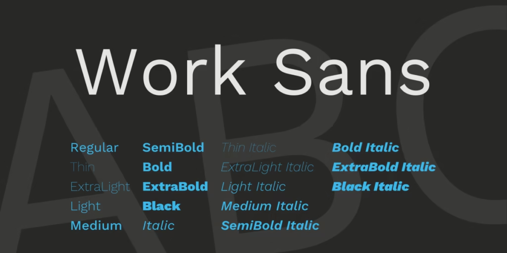
With its sophisticated simplicity, this font works great for modern and minimalist brand identities, especially in the tech or business sectors.
Exo 2 Bold
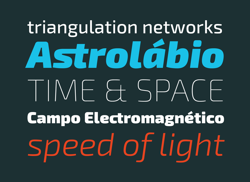
With a futuristic and clean design, the Exo 2 Bold offers a dynamic look perfect for tech companies or modern brands. Its geometric structure gives a sleek and professional touch.
Archivo Black
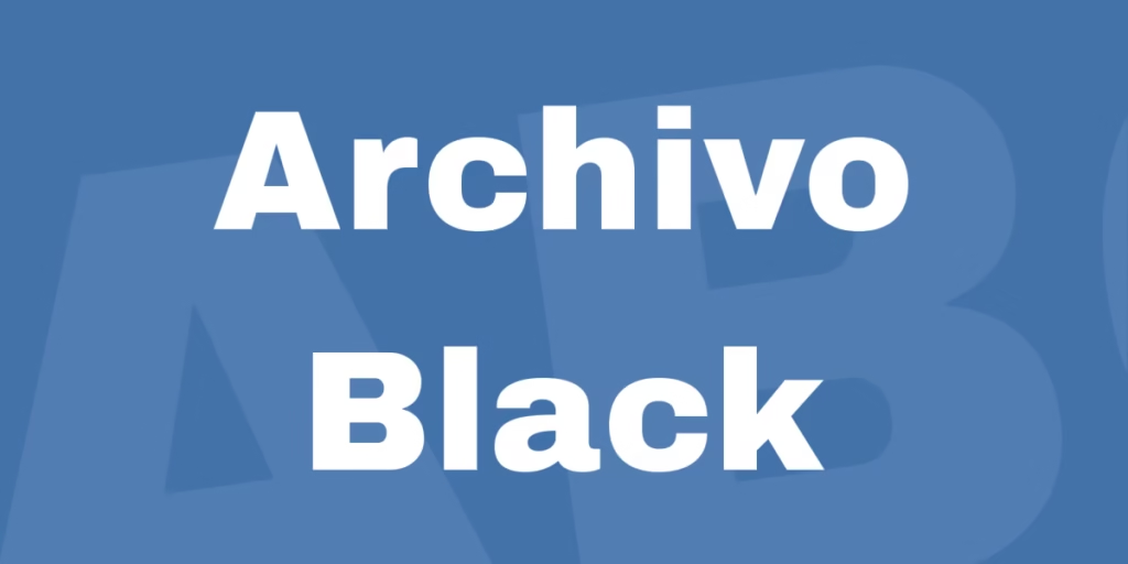
Archivo Black is a versatile sans-serif font that is bold and highly legible even at small sizes. It’s great for digital media, packaging, or any project that requires emphasis without compromising readability.
Playfair Display Bold
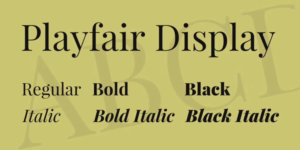
Playfair Display Bold combines traditional elegance with a modern twist. Its sharp, contrasting strokes make it perfect for editorial use, giving headlines a sophisticated and bold flair while maintaining high readability.
Lora Bold
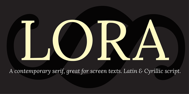
Lora Bold offers a clean, modern feel, with subtle curves that add a touch of personality. Its well-balanced design makes it a versatile option for digital interfaces, magazines, or any project where you need a stylish, professional look.
Tips for Pairing Extra Bold Fonts with Other Typography
Pairing fonts is all about balance. Here are a few more tips:
Hierarchy in Design
Your design should use additional bold fonts, but secondary fonts should support the overall message. Use a simple sans-serif like Open Sans or Lato for body text to create a nice contrast.
Complementary Styles
Choose fonts that have different weights but similar styles. For example, pairing Poppins Bold with a lighter sans-serif like Lato ensures that the design looks consistent without being disturbing the viewer.
Color and Spacing
Pay attention to color and letter spacing when adding additional bold fonts. A tight kerning( spacing between the letters) works well for bold fonts but gives the main text a little more space to maintain balance.
Mixing Serif and Sans-Serif
If you want a more dynamic look, try pairing a bolder sans-serif with a lighter-serif font. For example, combining kerning with Playfair display can add sophistication to your design.
Let’s take a look at some iconic brands and how they’ve effectively implemented the power of extra-bold fonts to make a lasting impression on consumers.
Tip: For finding the perfect font combinations, you can explore Fontpair.co, a great resource that provides expertly well-chosen font pairings to enhance your design projects.
How to Choose the Right Extra Bold Font for Your Brand
Choosing the right Extra Bold font requires a deep understanding of your brand identity. Here are some key factors I always keep in mind as a designer:
Brand Personality
Your font choice should reflect your brand’s tone and values. For example, if you’re designing for a fun, accessible brand, a font like Poppins Bold would work wonders. But if the brand needs to convey seriousness or authority, Futura Extra Bold might be a better choice.
Readability
From a technical perspective, readability is important. Make sure the font is readable at different sizes and on different platforms. Some fonts, like Montserrat Bold, maintain their clarity in both digital and print formats, making them a versatile choice.
Pairing Fonts
Extra Bold fonts look best when paired with lighter, more subdued typefaces. For example, pairing Roboto Bold with a light sans-serif font creates balance and prevents visual overload. This is something I always keep in mind when creating a brand identity.
Conclusion: Enhance your branding with additional bold fonts
If you want your brand to stand out, extra bold fonts are the best choice. They provide a visual impact that ordinary fonts can’t match. Whether you’re creating a logo, designing a poster or creating social media graphics, these bold fonts will help your design make a lasting impression.
Don’t be afraid to experiment! Try some of the fonts I’ve mentioned and see how they can enhance your branding.


