Typography- A powerful guide on how to choose the right fonts
Most people know what typography is, but many struggle to decide what typeface to use in their designs. Typography is the technique of placing text and letters into creative. It involves font style, appearance, and structure, which aim to represent emotions and convey specific messages. In short, typography is what brings the text to life. Today, I will delve into five types of typography styles in detail and guide on choosing the appropriate font for your design.
Serif- Fonts
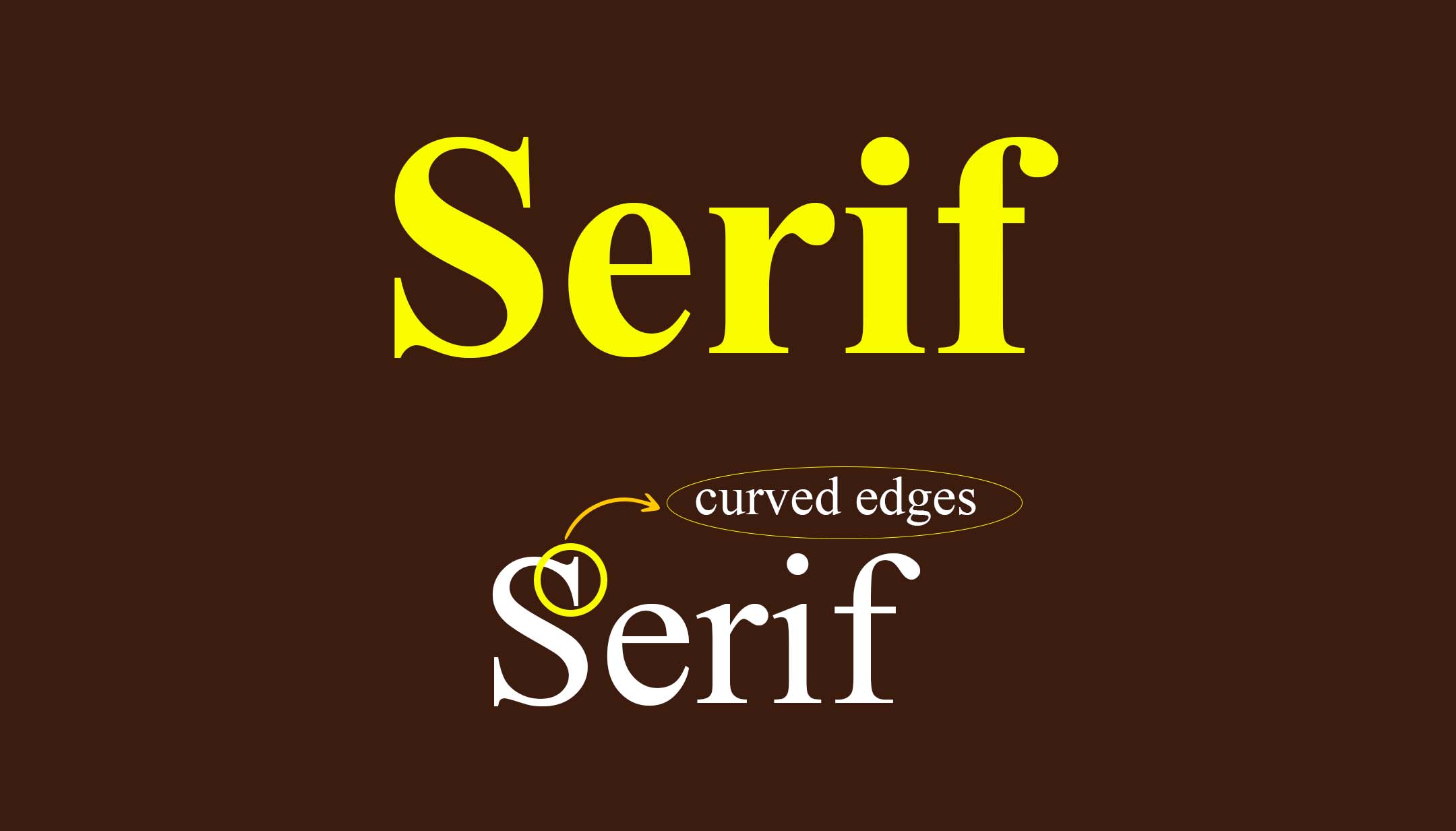
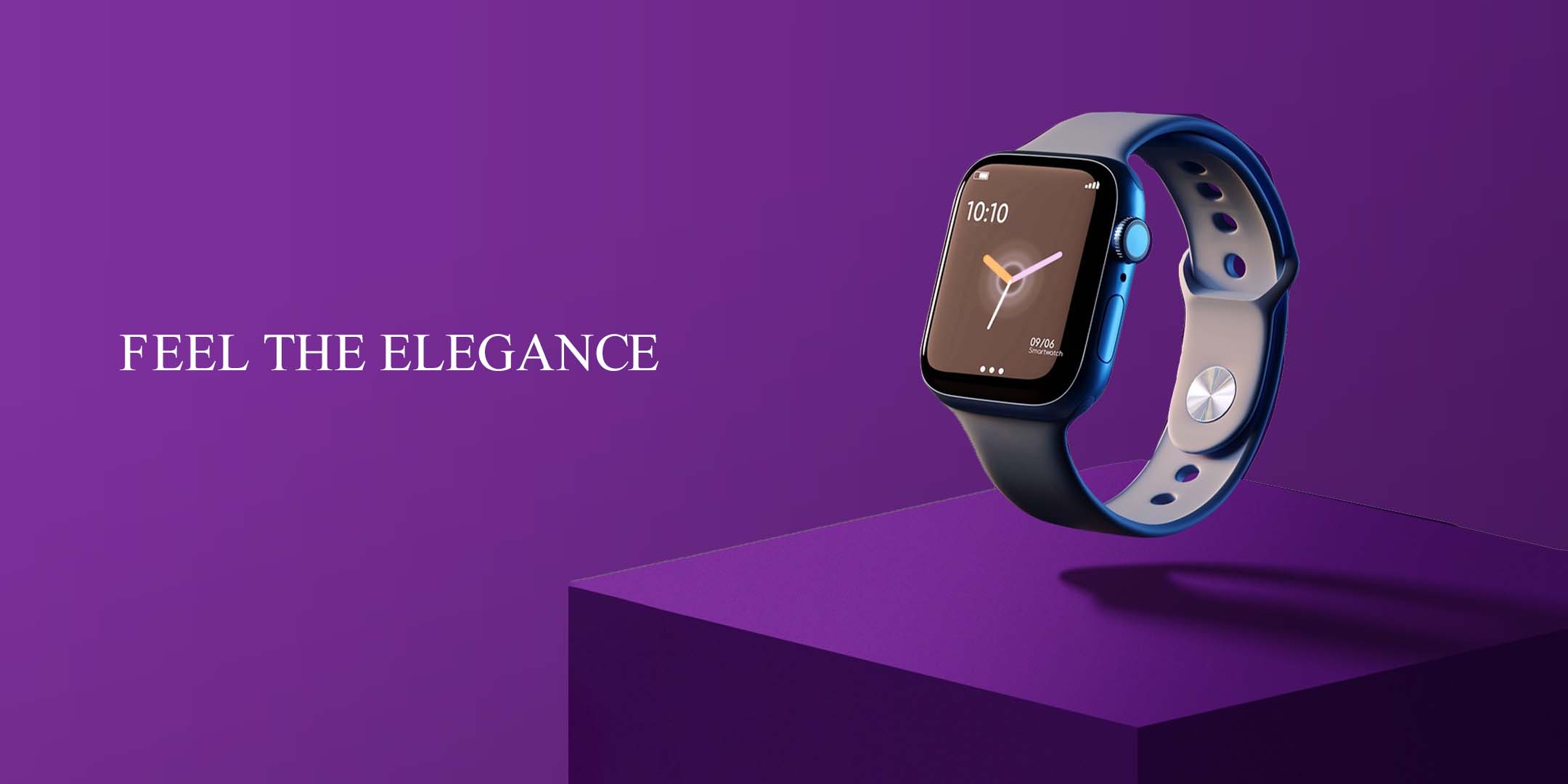
The serif font has small decorative strokes and curved edges. They convey seriousness, elegance, and a touch of class to any design. You can commonly see serif fonts in newspapers, law firms, schools, etc. They also represent luxury and can be used in brands with premium vibes. For example, when you design a premium laptop banner, serif fonts are the best option to define its premiums. You can make it feel more elegant by reducing the font size and increasing letter spacing.
Things to keep in mind:
- Serif fonts are always used in official statements and serious matters (for example, in news-related graphics or newspapers).
- Use them in brands representing luxury, class, and elegance (salon, jewellery, or high-end products).
San-Serif Fonts
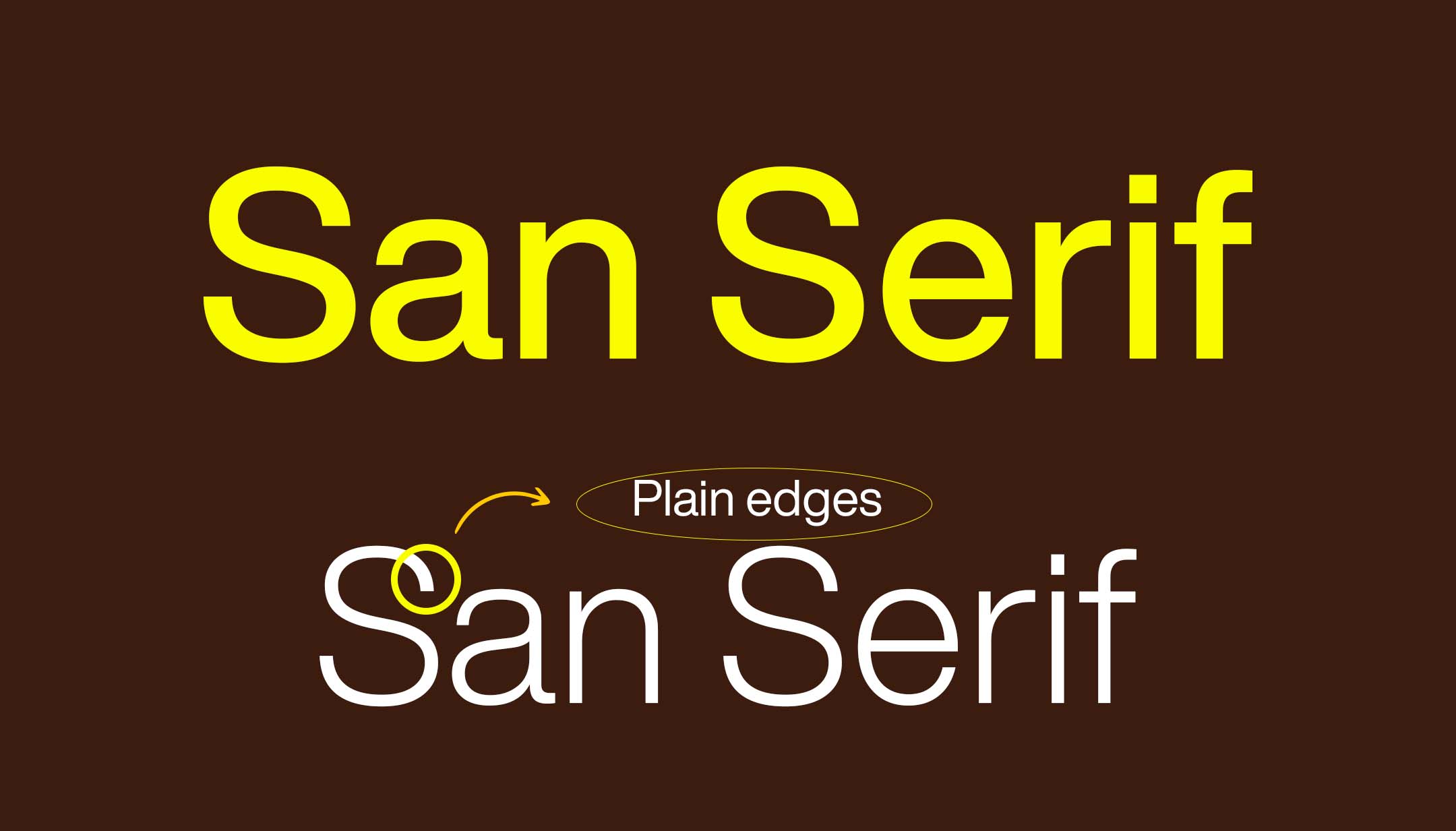
San Serif is clean, sleek, modern, and clean-cut. They do not have small decorative strokes at the end of the letters, resulting in a clean and minimal appearance. San-serif fonts are mainly used in digital interfaces and screens. Helvetica (variants) has been used in logos by brands such as Microsoft and Jeep because of its pleasing aesthetics and versatility. If you’re using sans-serif fonts for your project, keep these guidelines in mind.

- Avoid using bold or heavy sans serifs for long body text.
- Sans serifs work well for tech, sports, fashion, and more.
- Use them to convey clear and direct information.
Tip: If you want to make your design more stylish or elegant, use bold and light versions of San Serif fonts.
Decorative or display fonts.
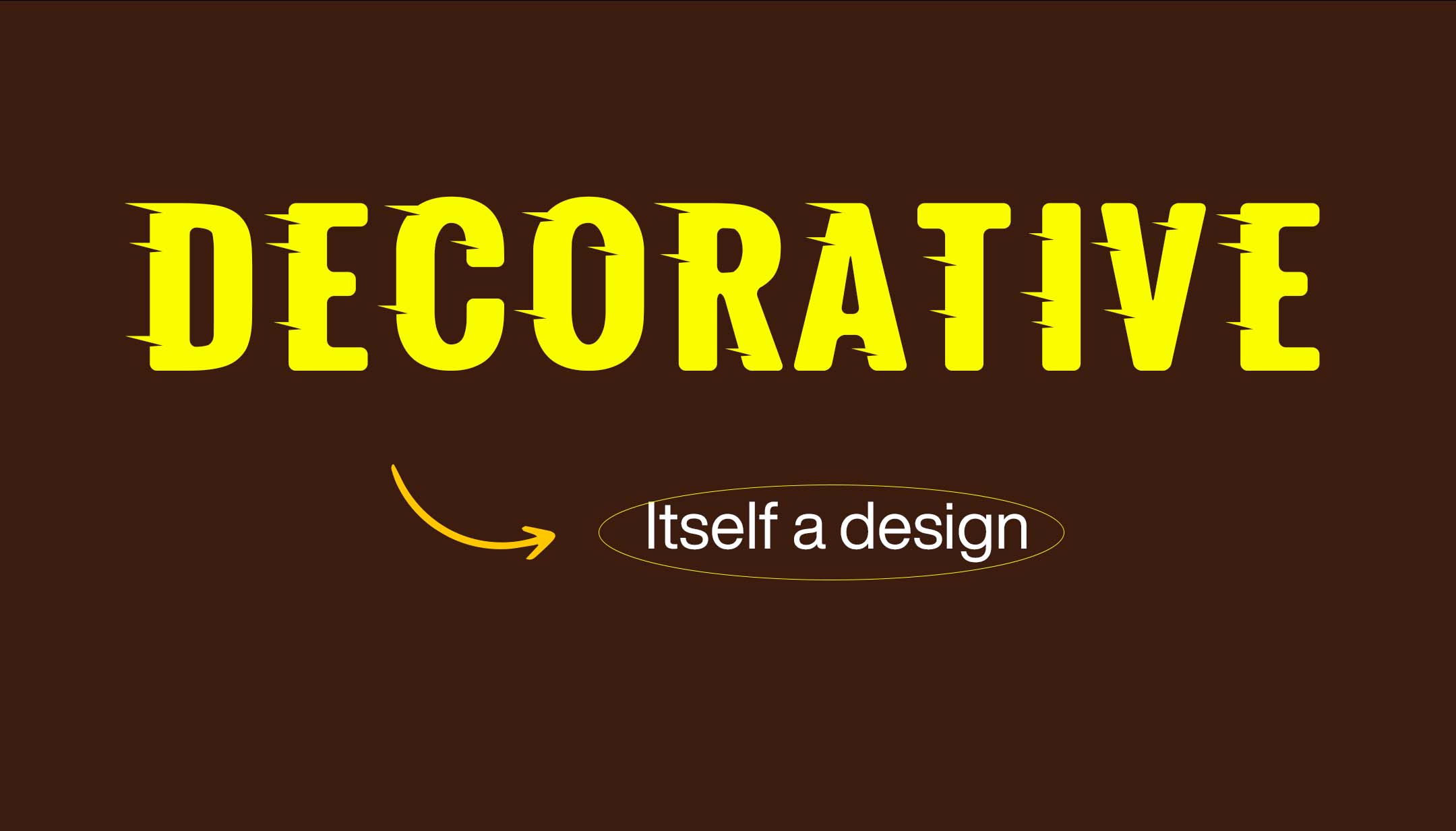
Display fonts trigger a hard emotion expressing speed, energy, and casualness. They are very creatively designed fonts. Using a display font can make the design more memorable and eye-catching. When working on a poster, a logo, or a website, don’t be afraid to experiment with decorative fonts to create a unique and memorable visual identity for your brand.
- Try using them in headings to make them memorable.
- As it shows hard emotions, use them in designs that display hardness (in the gym, sports, and music posters).
Script Fonts
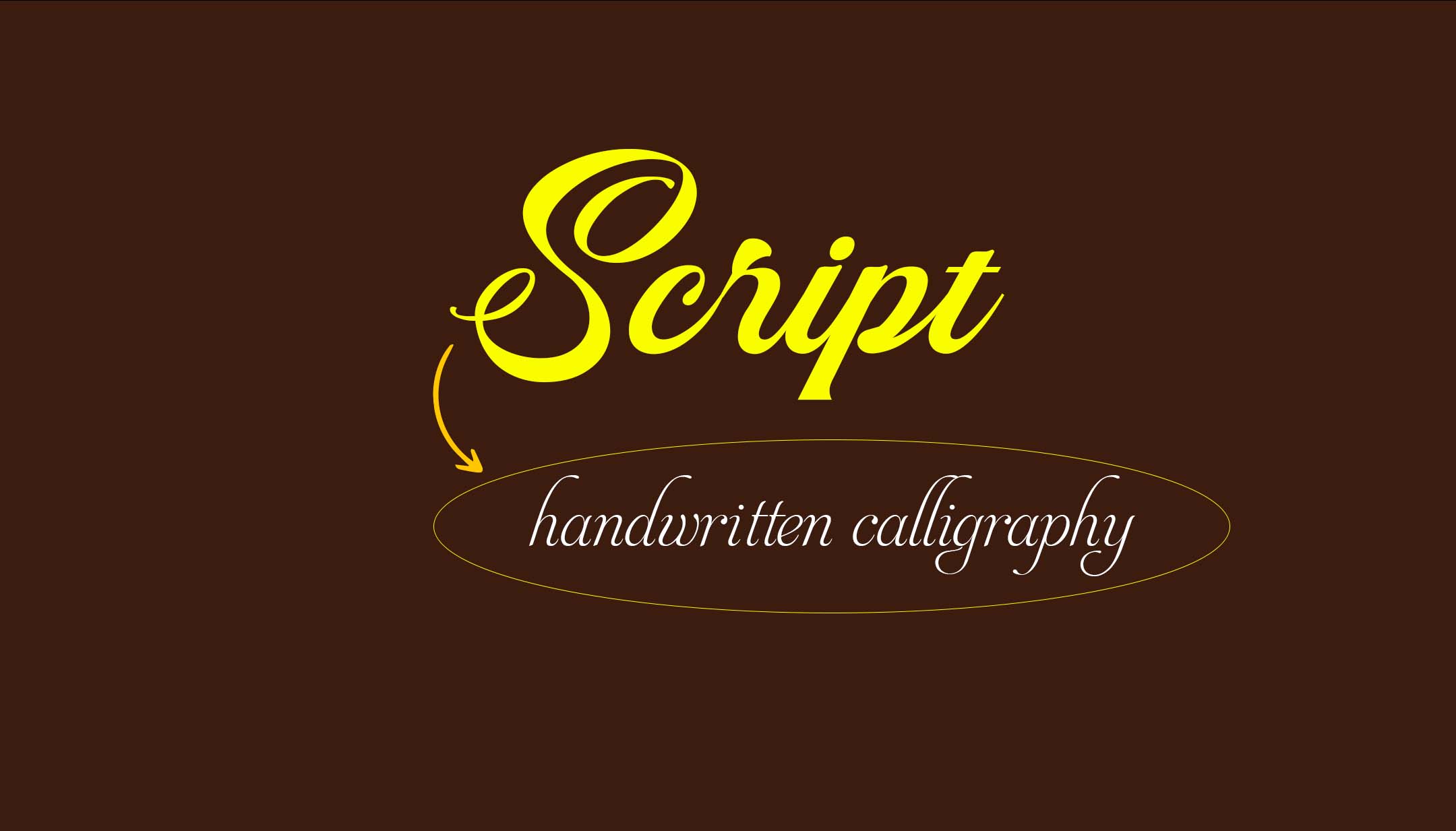
Script fonts are identified by their flowing and handwritten calligraphy or cursive-like appearance. Script fonts show soft emotions that add romanticism and sophistication to any design. Imagine when you create a wedding invitation or a love letter. A beautiful script font always comes to mind first, connecting the words with a sense of intimacy and warmth. These are mainly used in love-themed graphics and makeup creatives, which show a sense of romance and femininity. They are the perfect choice for conveying emotions of love, beauty, and elegance.
- Use them in makeup-related designs, flower shop brands, or designs that show love, softness, and elegance.
- Try to use them in headings.
- Try not to use them in capital letters.
Slab Serif Fonts
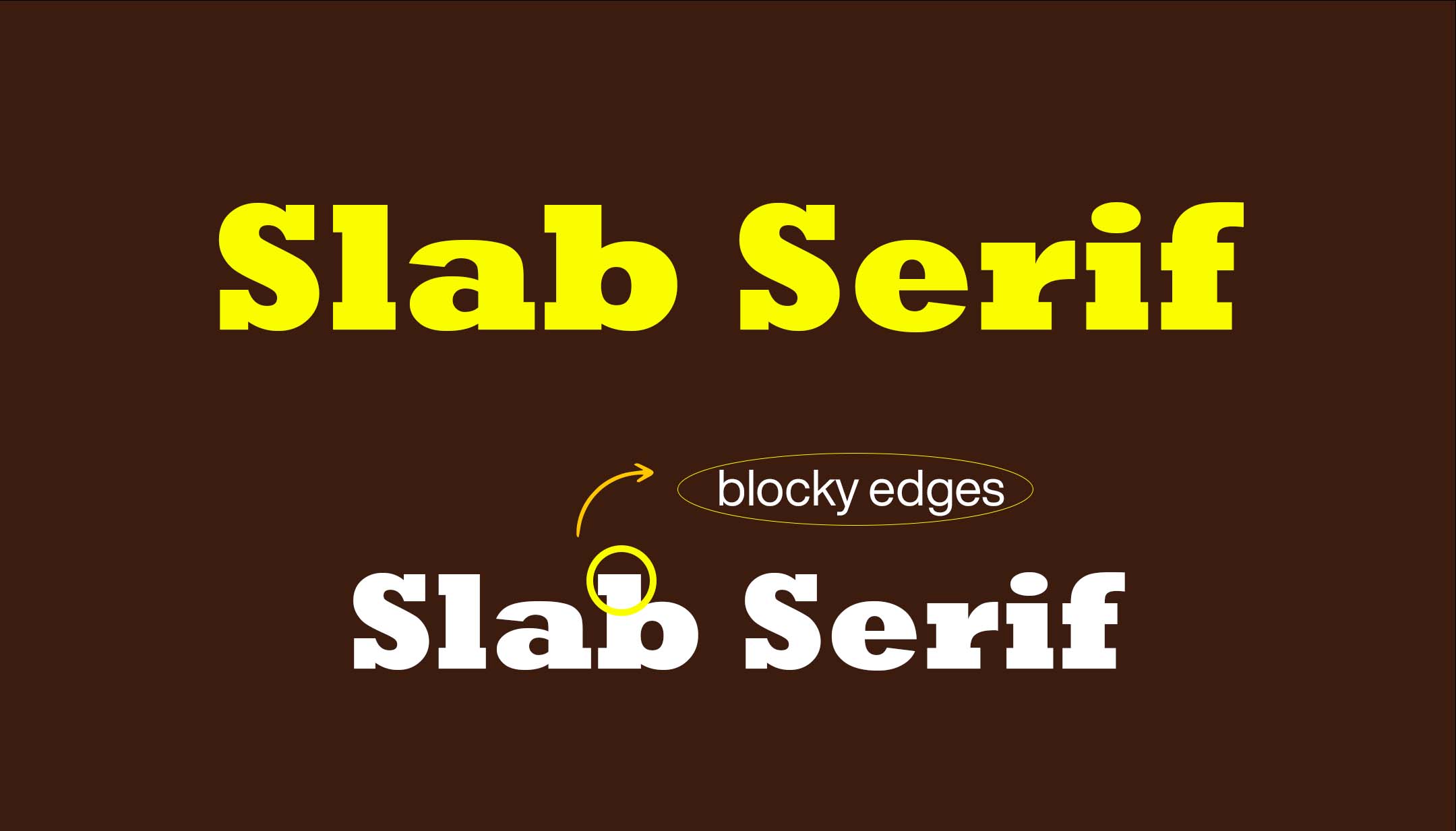
Slab serifs are closely similar to sans serifs but have hard, blocky edges instead of curved ones. These fonts convey both casualness and seriousness at the same time or in the same place. Imagine that when you design a school poster, it needs to be serious because it’s about education, and it also needs to be funny to catch students’ attention. You can use slab serif fonts in movie posters where the movie theme is based on school or student life. So, when designing a poster for a school event or a movie, Slab Serif fonts are a great choice.
- You can mostly use them for brands that show seriousness and fun at the same time.
- Try to choose them for the heading text.
- You can also use them for song posters (with serious and funny emotions)
Typography: Tips and Tricks

- Always try to choose family fonts (which include bold, semi-bold, light, italic, etc.). Choose bold font for the heading, semibold for the subheading, and light fonts for paragraph text.
- It is necessary to choose professional fonts (which are designed by professional artists) for your designs. Avoid using free fonts if you are working professionally.
- Sometimes extra-bold italic versions of sans-serif fonts can be used as display fonts.
- You can pair serif or sans serif with script fonts to make the design more creative and appealing.
- Make “research” and “learning” a part of your daily schedule. Practising regularly will help you master typography in graphic design.
- Typography is a powerful tool for graphic designers. Mastering it boosts your confidence and takes you one step further into your design journey.
- Readability always comes first. Don’t use over-decorative fonts for your designs, and ensure balanced contrast between text and background.
- Follow the grid system to align text and other elements neatly. This brings order to your design and makes it visually appealing.
- Avoid using too many font styles in one design. Do not try to use more than two font typefaces.
- White space can have a powerful impact on the readability of your design. You need to ensure there’s enough space between lines and between letters.
Tools for Typography
- Google Fonts: A great library of free-to-use web fonts. It is one of the best resources to download free and professional fonts.
- Adobe Fonts: A premium collection of fonts is available with Adobe Creative Cloud. You have to pay a premium to use Adobe fonts.
- WhatFont: A Chrome browser extension to identify fonts on web pages.
- Font Squirrel: A resource for free and high-quality fonts.
Typography in Design Software
- Adobe Illustrator and Photoshop offer advanced typography tools for clear-cut control over your text. It gives you the option to add gradients to designs.
- Canva: It is an easy-to-use design tool with a variety of fonts and templates.
- Figma: Figma is great for web and app design, and it also provides collaborative typography tools.
Conclusion
Typography in graphic design is a little bit of both: art and science. It’s about choosing the right type of font, size, and spacing, and how you arrange all that in your design. If you understand basic types and at least keep up with modern trends, you will be able to create something that not only looks good but also captures your audience’s attention and helps deliver the message.

